Summer Research With Galaxy Zoo
The below blog post was written by Alex Todd, an Ogden Summer Intern who spent the summer working on Galaxy Zoo related research projects at the University of Portsmouth. Alex is now off to his next adventure – starting his undergraduate degree in Natural Sciences at the University of Bath.

Alex hard at work on his Galaxy Zoo project.
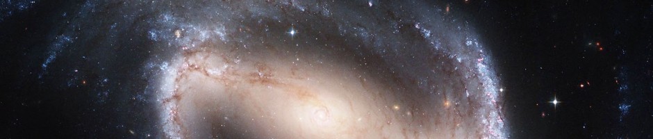
I have been working with the Galaxy Zoo team at the Institute of Cosmology and Gravitation, in Portsmouth, for 8 weeks this summer. I have been analysing the results of Galaxy Zoo 2, and more specifically the region of the sky known as Stripe 82. In this area, the Sloan Digital Sky Survey (SDSS) took many images of the same patch of sky, instead of only one. These images were combined to produce a single, higher quality image, which showed fainter details and objects. Both these deeper images and the standard depth images of stripe 82 were put into galaxy zoo, and I have been comparing the resulting classifications. I learned to code in python, a programming language, and used it to produce graphs from the data I downloaded from the Galaxy Zoo website. I started by comparing the results directly, comparing the number of people who said that the galaxy had features in each of the image depths.

On the graph, each blue dot is a galaxy (there are around 4,000) and the red dashed line shows the overall trend. As you can see from the graph, when the proportion of people who see features is low, there is a good match between the two image depths. However, when the proportion is high, there is a much bigger difference between the two image depths, with the proportion being higher in the deep image. This is because fainter features are visible in the deeper image.
I then plotted graphs of the difference between the proportions (P(Features)) against the brightness of the galaxy. To measure the brightness, I used the apparent magnitude, a measure of how bright the galaxy appears to us (as opposed to how bright it actually is).
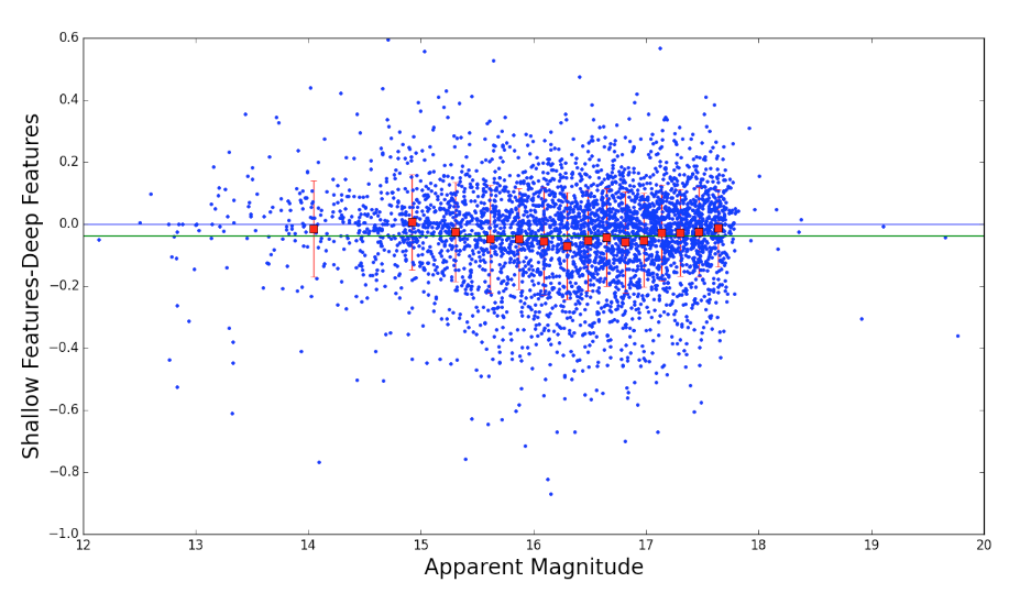
The graph below shows the difference in P(Features) plotted against the apparent magnitude. The blue line is at y=0, and the green line represents the average value of the difference between P(Features). As you can see, there is not much difference between the values of P(Features) when the galaxy is particularly bright (Small apparent magnitude) or when it is particularly dim (large apparent magnitude). However, when the galaxy has an average brightness, the difference is quite substantial. We think this is because in bright galaxies, features can be seen in both images, whilst in dim galaxies they can be seen in neither. In medium brightness galaxies, however, they can only be seen in the deeper image. The fact that there are differences between the classifications means that it would be a good idea to classify deeper images of the rest of the sky, to hopefully improve the accuracy of the classifications.
I have greatly enjoyed my time working on at the ICG on galaxy zoo, and would certainly seize the opportunity to pursue it further.
It’s been a pleasure working with Alex this summer. He really impressed me with the speed at which he picked up programming languages. This information about the differences in perception of morphological features between deeper and shallower images is very useful to us as a science team as we plan for future generations of the Galaxy Zoo project with new, more sensitive images from current and ongoing astronomical surveys.
New images in the Zoo
As you may already have heard, Galaxy Zoo has new images in it this week!
You may remember my post in September which described how we’ve added images from SDSS’s ‘Stripe 82’. This is an area of the Sloan survey that has been repeatedly imaged to do things like supernova detection (much like that in Supernova Zoo – you have to look at the same place more than once to see what has changed). A benefit of this is that we can add all these images up to make an image that’s like having a much longer exposure than the ordinary SDSS uses.
Stripe 82 and colour images from Sloan
As Chris blogged yesterday, Galaxy Zoo now contains colour images from the Sloan Digital Sky Survey’s Stripe 82.
The new Stripe 82 images you see are made of an addition of approximately 50 ordinary SDSS images, which means we can see things about 2 magnitudes fainter (about 7 times less light). It’s only over a relatively small patch of the sky – 270 square degrees compared to the full survey which is nearer 8000 square degrees – but the extra depth should be useful to us in many ways even though it’s only over a smaller area.
Many users will already have noticed that the standard images supplied through the Navigator interface are in black and white – they’re just in the r band (SDSS has 5 bands named u, g, r, i and z of which g, r and i are normally mapped to blue, green and red respectively). Naturally, we wanted to supply the Zoo with colour images like those in the ordinary Sloan survey.
This proved to be somewhat tricky as access to the data needed to compile the colour images comes in fairly large chunks called ‘fields’ – each field is 2048 by 1489 pixels, large enough to more than fill a typical computer monitor. So we had to download several of these images for each galaxy (one for each of the red, green and blue parts), combine them together, and extract just the bit around the galaxy we wanted to show you, scaled to the size of a normal Galaxy Zoo image. This took a fair bit of programming and many days worth of computer time for the downloads of the data and processing.

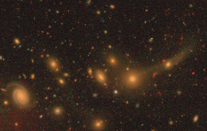
Two images from the same area, the upper from a standard SDSS image, and the lower from the coadded stack of about 50 images
Another complication was that astronomical images usually come in a format that’s not immediately suitable for viewing. They can have a tremendous dynamic range, from the tiny amount of light that comes from the dark bits of sky to the dramatic overloading the camera gets when it images a bright star. The task of reducing this down to fit in the brightness scale of 256 levels of each of red, green and blue that a computer monitor will display is not easy.
Fortunately, this problem had already been solved. For those interested in the gory details, there is a paper here by Lupton et al., which describes the system used in these images and the ordinary SDSS images you’ve been seeing before. It’s a bit mathematical, but what it does is three important things:
- For faint objects, the brightness of the pixel is roughly in proportion to the amount of light received. This shows up faint details nicely but…
- For bright objects, we’d hit the cap of 256 levels on the monitor too quickly, so it starts to scale things logarithmically instead. This means that doubling the light wouldn’t double the value of the pixel but just add a certain amount on. If 10 units of light were collected we might have a pixel value of 1, 100 units would be 2, and 1000 units would be 3, and in this way we can fit the brightest objects nicely into the range our monitors provide us with. This is the same way that astronomical magnitudes work as well.
- Lastly, we want to get the colour of objects right. If we had a really bright object we might find that even though it was very red, it still gave off so much green and blue light that the pixel ended up with high values of red, green and blue, and end up looking white as a result. The code we use compensates for that and makes sure everything has its actual colour represented properly.
In order to use this, we need to decide on how steep the slope of our conversion from light to pixel values is, and also at what point we tilt over from our function for faint light to our different function for strong light sources. This takes a bit of fiddling, and to be honest it’s as much an art as a science, and we have to use different values to the ordinary SDSS images as we have a different amount of light overall in them. This is why our background sky ends up looking more speckled than usual (there’s more background noise and having it more visible is the price we pay for having faint features of galaxies visible too) and the galaxies themselves look like they’re stretched differently.
One of the developers of this technique, Robert Lupton, has a webpage which shows part of the Hubble Deep Field coloured the conventional way and using this technique, and you can see how the colours of the galaxies are better preserved this way.
I hope that gives a bit more insight into these images, how they were made and why they look a little different from the usual. We look forward to finding out how the classifications go!
Stripe 82 : Digging Deeper
Anyone who has been classifying galaxies today may well have noticed a big change in the Zoo; the addition of some new images that don’t look quite like the previous set. These new galaxies come from a very special part of the sky known to the Sloan team as “Stripe 82”.

Over the first seven years of the Sloan survey, the telescope returned again and again to this part of the sky, comparing images from each visit in an attempt to discover supernovae (exploding stars) and detect objects which change in brightness. A nice side effect, though, is that we can add the different images together. This produces the same result as having left the telescope pointing at the same place for longer; images which show fainter objects and (hopefully) more detail in familiar ones.
This was too good an opportunity for us to pass up, and so we’ve added the Stripe 82 images to the Zoo. They look a bit different – more background noise, slightly different colours – but these are the deepest, most detailed images we’ve ever presented to Galaxy Zoo users. There are more than 40,000 new images – so get clicking!
