Bayesian View of Galaxy Evolution
The Universe is pretty huge, and to understand it we need to collect vast amounts of data. The Hubble Telescope is just one of many telescopes collecting data from the Universe. Hubble alone produces 17.5 GB of raw science data each week. That means since its launch to low earth orbit in April 1990, it’s collected roughly a block of data equivalent in size to 6 million mp3 songs! With the launch of NASA’s James Webb Telescope just around the corner – (a tennis court sized space telescope!), the amount of raw data we can collect from the Universe is going to escalate dramatically. In order to decipher what this data is telling us about the Universe we need to use sophisticated statistical techniques. In this post I want to talk a bit about a particular technique I’ve been using called a Markov-Chain-Monte-Carlo (MCMC) simulation to learn about galaxy evolution.
Before we dive in into the statistics let me try and explain what I’m trying to figure out. We can model galaxy evolution by looking at a galaxy’s star formation rate (SFR) over time. Basically we want know to how fast a particular galaxy is making stars at any given time. Typically, a galaxy has an initial constant high SFR then at a time called t quench (tq) it’s SFR decreases exponentially which is characterised by a number called tau. Small tau means the galaxy stops forming stars, or is quenched, more rapidly. So overall for each galaxy we need to determine two numbers tq and tau to figure out how it evolved. Figure 1 shows what this model looks like.

Figure 1: Model of a single galaxy’s SFR over time. Showing an initial high constant SFR, follow by a exponential quench at tq.
To calculate these two numbers, tq and tau, we look at the colour of the galaxy, specifically the UVJ colour I mentioned in my last post. We then compare this to a predicted colour of a galaxy for a specific value of tq and tau. The problem is that there are many different combinations of tq and tau, how to we find the best match for a galaxy? We use a MCMC simulation to do this.
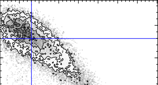
The first MC – Markov-Chain – just means an efficient random walk. We send “walkers” to have a look around for a good tq and tau, but the direction we send them to walk at each step depends on how good the tq and tau they are currently at is. The upshot of this is we quickly home in on a good value of tq and tau. The second MC – Monte Carlo – just picks out random values of tq and tau and tests how good they are by comparing the UVJ colours and our SFR model. Figure 2 shows a gif of a MCMC simulation of a single galaxy. The histograms shows the positions of the walkers searching the tq and tau space, and the blue crosshair shows the best fit value of tq and tau at every step. You can see the walkers homing in and settling down on the best value of tq and tau. I ran this simulation by running a modified version of the starpy code.
Figure 2: MCMC simulation for a single galaxy, pictured in the top right corner. Main plot shows density of walkers. Marginal histograms show 1D projections of walker densities. Blue crosshair shows best fit values of tq and tau at each step.
The maths that underpins this simulation is called Bayesian Statistics, and it’s quite a novel way of thinking about parameters and data. The main difference is that instead of treating unknown parameters as fixed quantities with associated error, they are treated as random variables described by probability distributions. It’s quite a powerful way of looking at the Universe! I’ve left all of the gory maths detail about MCMC out but if you’re interested an article by a DPhil student here at Oxford does are really good job of explaining it here.
So how does this all relate to galaxy morphology, and Galaxy Zoo classifications? I’m currently running the MCMC simulation showing in Figure 2 over the all the galaxies in the COSMOS survey. This is really cool because apart from getting to play with the University of Oxford’s super computer (544 cores!), I can use galaxy zoo morphology to see if the SFR of a galaxy over time is dependent on the galaxy’s shape, and overall learn what the vast amount of data I have says about galaxy evolution.
Galaxy Zoo and the COSMOS Survey.
Hello present, and hopefully future volunteers!
I’m a summer research intern on the Zooniverse Project, based at the University of Oxford. I’m currently at university in London and I’ll be going into my fourth year of studying Theoretical Physics. I’m three weeks into my internship, and I want to share with you how the hundreds-of-thousands of galaxies you’ve worked hard to classify are being used in research.
I’m working with Galaxy Zoo Hubble (GZH) data, which are classifications of galaxies from the Hubble Space Telescope Legacy survey. The classifications for this data have just been submitted for publication by a group of researchers from Galaxy Zoo, and you can read about it here. Specifically I’m working with a subset of this data from the Cosmic Evolution Survey, or COSMOS. This survey is specially designed to help us understand how galaxies evolve over time, and how their local environments in the universe affect this.
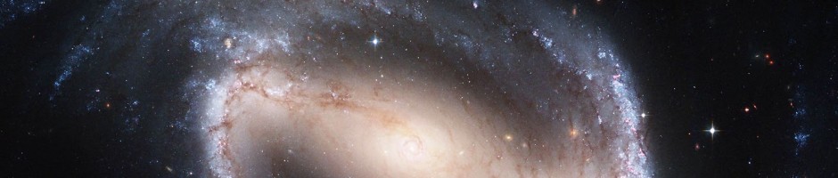
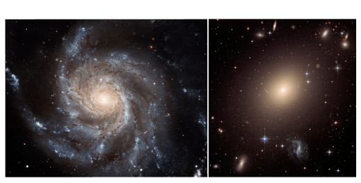
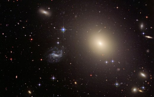
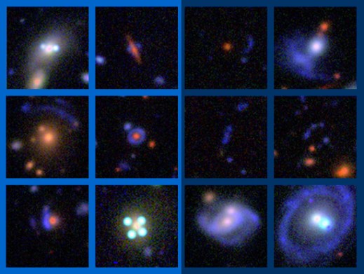
Up to now I’ve been using GZH data to add morphology to data currently found in the literature, in the hope that we can learn something new about galaxy evolution. In this post I want to share with you a particular striking example of how GZH classifications have transformed current data. Figure 1 shows two rows of colour-colour plots. The vertical axis is U-V colour, which is a measure how much recent star formation is going on in a galaxy – the higher up a galaxy is in the plot the more recent star formation is going on. The horizontal axis is V-J colour which is a measure of how much Infrared light compared to visible light a galaxy is emitting – the further left a galaxy is in the plot the generally older and more ‘dead’ it is. The first row (top) is found in a paper (Muzzin et al 2013), on analysis of galaxies in the COSMOS survey, written by researchers from the US, Denmark, Netherlands, UK, and Chile. The second row (bottom) shows the same data but with GZH classifications overlaid. Red and blue points represent featured and smooth galaxies respectively. Banner image shows a featured spiral galaxy (left), and and smooth elliptical galaxy (right).

Figure 1: colour-colour plots Galaxies from the COSMOS survey (top) before (bottom) after GZH classifications data added. Red and blue points represent featured and smooth galaxies respectively.
No need to ask which one looks more interesting! Lets understand what these plots mean. Each point on each plot represents a different galaxy. On each row the plots are sorted by z or redshift; you can think of this as being different snapshots of galaxies in the universe at different times. The most recent snapshot being on the left, and the oldest on the right of each row.
The important thing to take away from this data is that there are two distinct blobs or populations of galaxies in each plot. Galaxies in the top left blob are called star forming (SF) and galaxies in the longer bottom right blob are non-star forming, or ‘quiescent’. From the overlay of GZH classifications data on Figure 1 (bottom), we can see that the nearly complete absence of galaxies with features in the top left population of SF galaxies – something that we didn’t know before!
So why do we care about analysing colour-colour plots of galaxies? As a galaxy evolves through its lifetime it moves from the SF population to the quiescent through that bit in-between the two blobs, which is called the ‘Green Valley’ (I’ll save more on that for another blog post), and the truth is nobody quite knows how this happens. Overall, we hope GZH classifications may shed some light on this, and help us understand how galaxies evolve.
To help us finally understand the evolution of galaxies, get involved right now at www.galaxyzoo.org, we’d be happy to have you on-board!
(Galaxy) Bars in the Summer
This is a guest post by Freya Pentz, who has spent much of this summer doing research with Galaxy Zoo.
Hi Galaxy Zoo volunteers!
I’m a summer student at the Zooniverse. I’m at university studying natural sciences about to go into my second year and for the past 5 weeks I’ve been working at the Zooniverse office here in Oxford. I wanted to let you know what I’ve been doing during that time.
I’ve been using data from the Galaxy Zoo: Bar Lengths project, writing code to process the information and making sure it looks sensible. Before I started working at the Zooniverse, I had done very little computing so I had to learn a lot! For those of you who are interested, I’ve been using python to extract the measurements you did on the galaxies and plotting graphs with all the data. Learning how to use python was like learning another language but it was definitely worth it.
The first thing I did was to find out how many of the galaxies that you’ve classified have bars. That meant looking at the answers to the first question about the galaxy in the Bar Lengths project ‘Does this galaxy have a bar’ and seeing for each galaxy if most people answered ‘Yes’ or if most people answered ‘No’.

Remember this question?
Luckily, the code could do that for me; otherwise I would have had to look at over 66000 answers! So far, 4960 galaxies have been classified out of a total of 8612 in the project. Your classifications show that 700 of these have a bar, meaning that the fraction of classified galaxies with a bar is around 14%. This is similar to the 10% bar fraction referred to in the study recently done by the Galaxy Zoo and CANDELS teams on bar fractions out to z=2 (blog post & paper). This number will probably change a little bit as more galaxies get classified, but it’s good that it is similar to known values so far.
The next thing was of course to find the lengths and widths of the bars. When you draw lines on the galaxy to mark the length and width, the database records this as coordinates. Each line has four coordinates, 2 x coordinates and 2 y coordinates. Once you have the coordinates, it’s fairly simple to turn them into lengths. All you need is some Pythagoras. When plotting a histogram of the lengths, the shape was a Gaussian distribution, or a bell curve. This shows that most of the galaxies have lengths between certain limits (5-15 kpc) and then as you go beyond these limits, the number of galaxies decreases.
During my time here, I found some interesting galaxies. When I first looked at the redshifts, there was a galaxy with a redshift of 4.25. I mentioned this to a couple of people on the Zooniverse team and they all said there wouldn’t be a galaxy with such a high redshift in the sample. I checked it out and this is the galaxy in question:

The galaxy that fooled the computer into thinking it had a redshift of 4.25
You can see that there is a bright blue smudge in the top left of the galaxy. When I first saw this, I thought it was a lens. It looks like one, and you can just see a small bit of blue on the other side of the galaxy’s core, suggesting a lens even more. According to the experts in the Zooniverse however, this is probably not a lens, as the galaxy does not look massive enough to lens light. Also, the blue curve is well inside the galaxy, instead of being around the outside. Usually, all the mass of the galaxy is needed to lens an object so the light would appear around the edge. The blue curve is most likely an unusual feature of the galaxy itself, which can explain why the reported redshift is so high. The redshift for this galaxy was measured photometrically. This is where astronomers use galaxy colours across a wide range of wavelengths to predict the likely redshift. This method of measuring redshift is much more prone to error than spectrometry (where the absorption lines for certain elements in a galaxy are observed and the shift of these lines is measured) so the blue smudge could have easily made the telescope think the redshift was higher than it is. This redshift is therefore almost definitely a mistake. We also know this from the high resolution of the image. You normally wouldn’t be able to see a galaxy with even a redshift of 1 this well!
The reason telescopes have to use photometric redshifts sometimes even though they are often wrong is that there is not enough time to take a spectrum of every galaxy when you are conducting a large survey of the sky. Telescope time is expensive and photometric measurements allow you to get a bit of information about lots of galaxies which can sometimes be more useful that getting a lot of information about a few.
When running into problems like this it was really useful to be able to look at a picture of the galaxy on the Galaxy Zoo: Bar Lengths website. Looking at the galaxies and seeing in real life what the data on the graphs was telling me was probably my favourite part of my time at the Zooniverse. It’s so amazing that thanks to the Sloan Digital Sky Survey, the Hubble Space Telescope projects and other mass surveys of the universe, we can actually look at pictures of thousands of galaxies easily.
A cool barred galaxy you can see in Bar Lengths
The Zooniverse is such a cool organisation and I’m lucky to have worked for them this summer. The great thing about them is that you can get involved too! I know from my work with Bar Lengths that even if a few people log on and classify in any of the projects, it can be really helpful. None of the science can be done without you providing the data.
Measure some galaxies here:
www.zooniverse.org/projects/vrooje/galaxy-zoo-bar-lengths/classify/
Or have a look at some of the other projects here:
Freya
Galaxy Zoo Continues to Evolve
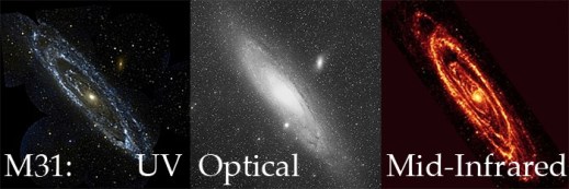
Over the years the public has seen more than a million galaxies via Galaxy Zoo, and nearly all of them had something in common: we tried to get as close as possible to showing you what the galaxy would actually look like with the naked eye if you were able to see them with the resolving power of some of the world’s most advanced telescopes. Starting today, we’re branching out from that with the addition of over 70,000 new galaxy images (of some our old favorites) at wavelengths the human eye wouldn’t be able to see.
Just to be clear, we haven’t always shown images taken at optical wavelengths. Galaxies from the CANDELS survey, for example, are imaged at near-infrared* wavelengths. But they are also some of the most distant galaxies we’ve ever seen, and because of the expansion of the universe, most of the light that the Hubble Space Telescope (HST) captured for those galaxies had been “stretched” from its original optical wavelength (note: we call the originally emitted wavelength the rest-frame wavelength).
Optical light provides a huge amount of information about a galaxy (or a voorwerpje, etc.), and we are still a long way from having extracted every bit of information from optical images of galaxies. However, the optical is only a small part of the electromagnetic spectrum, and the other wavelengths give different and often complementary information about the physical processes taking place in galaxies. For example, more energetic light in the ultraviolet tells us about higher-energy phenomena, like emission directly from the accretion disk around a supermassive black hole, or light from very massive, very young stars. As a stellar population ages and the massive stars die, the older, redder stars left behind emit more light in the near-infrared – so by observing in the near-IR, we get to see where the old stars are.
The near-IR has another very useful property: the longer wavelengths can mostly pass right by interstellar dust without being absorbed or scattered. So images of galaxies in the rest-frame infrared can see through all but the thickest dust shrouds, and we can get a more complete picture about stars and dust in galaxies by looking at them in the near-IR.

Even though the optical SDSS image (left) is deeper than the near-IR UKIDSS image (right), you can still see that the UKIDSS image is less affected by the dust lanes seen at left.
Starting today, we are adding images of galaxies taken with the United Kingdom Infrared Telescope (UKIRT) for the recently-completed UKIDSS project. UKIDSS is the largest, deepest survey of the sky at near-infrared wavelengths, and the typical seeing is close to (often better than) the typical seeing of the SDSS. Every UKIDSS galaxy that we’re showing is also in SDSS, which means that volunteers at Galaxy Zoo will be providing classifications for the same galaxies in both optical and infrared wavelengths, in a uniform way. This is incredibly valuable: each of those wavelength ranges are separately rich with information, and by combining them we can learn even more about how the stars in each galaxy have evolved and are evolving, and how the material from which new stars might form (as traced by the dust) is distributed in the galaxy.

1 galaxy, 4 redshifts.
In addition to the more than 70,000 UKIDSS near-infrared images we have added to the active classification pool, we are also adding nearly 7,000 images that have a different purpose: to help us understand how a galaxy’s classification evolves as the galaxy gets farther and farther away from the telescope. To that end, team member Edmond Cheung has taken SDSS images of nearby galaxies that volunteers have already classified, “placed” them at much higher redshifts, then “observed” them as we would have seen them with HST in the rest-frame optical. By classifying these redshifted galaxies**, we hope to answer the question of how the classifications of distant galaxies might be subtly different due to image depth and distance effects. It’s a small number of galaxies compared to the full sample of those in either Galaxy Zoo: Hubble or CANDELS, but it’s an absolutely crucial part of making the most of all of your classifications.
As always, Galaxy Zoo continues to evolve as we use your classifications to answer fundamental questions of galaxy evolution and those answers lead to new and interesting questions. We really hope you enjoy these new images, and we expect that there will soon be some interesting new discussions on Talk (where there will, as usual, be more information available about each galaxy), and very possibly new discoveries to be made.
Thanks for classifying!
* “Infrared” is a really large wavelength range, much larger than optical, so scientists modify the term to describe what part of it they’re referring to. Near-infrared means the wavelengths are only a bit too long (red) to be seen by the human eye; there’s also mid-infrared and far-infrared, which are progressively longer-wavelength. For context, far-infrared wavelengths can be more than a hundred times longer than near-infrared wavelengths, and they’re closer in energy to microwaves and radio waves than optical light. Each of the different parts of the infrared gives us information on different types of physics.
** You might notice that these galaxies have a slightly different question tree than the rest of the galaxies: that’s because, where these galaxies have been redshifted into the range where they would have been observed in the Galaxy Zoo: Hubble sample, we’re asking the same questions we asked for that sample, so there are some slight differences.
Top Image Credits and more information: here.
Evolutionary Paths In Galaxy Morphology: A Galaxy Zoo Conference

This week much of the team has been in Sydney, Australia, for the Evolutionary Paths In Galaxy Morphology conference. It’s a meeting centered largely around Galaxy Zoo, but it’s more generally about galaxy evolution, and how Galaxy Zoo fits into our overall (ever unfolding) picture of galaxy evolution.

There’s a lot to that legacy already, and it’s still being written.
The first talk of the conference was a public talk by Chris, fitting for a project that would not have been possible without public participation. Chris also gave a science talk later in the conference, summarizing many of the different results from Galaxy Zoo (and with a focus on presenting the results of team members who couldn’t be at the meeting). For me, Karen’s talk describing secular galaxy evolution and detailing the various recent results that have led us to believe “slow” evolution is very important was a highlight of Tuesday, and the audience questions seemed to express a wish that she could have gone on for longer to tie even more of it together. When the scientists at a conference want you to keep going after your 30 minutes are up, you know you’ve given a good talk.
In fact, all of the talks from team members were very well received, and over the course of the week so far we’ve seen how our results compare to and complement those of others, some using Galaxy Zoo data, some not. We’ve had a number of interesting talks describing the sometimes surprising ways the motions of stars and gas in galaxies compare with the visual morphologies. Where (and how bright) the stars and dust are in a galaxy doesn’t always give clues to the shape of the stars’ orbits, nor the extent and configuration of the gas that often makes up a large fraction of a galaxy’s mass.

Karen explains her simple and clear diagram showing different galaxy evolutionary processes.
This goes the other way, too: knowing the velocities of stars and gas in a galaxy doesn’t necessarily tell you what kinds of stars they are, how they got there, or what they’re doing right now. I suspect a combination of this kinematic information with the image information (at visual and other wavelengths) will in the future be a more often used and more powerful diagnostic tool for galaxies than either alone.
Overall, the meeting was definitely a success, and throughout the meeting we tried to keep a record of things so that others could keep up with the conference even if they weren’t able to attend. There was a lot of active tweeting about the conference, for example, and Karen and I took turns recording the tweets so that we’d have a record of each day of the Twitter discussion. Here those are, courtesy of Storify:
Also, remember at our last hangout when we said we’d have a hangout from Sydney? That proved a bit difficult, not just because of the packed meeting schedule but also because of bandwidth issues: overburdened conference and hotel wifi connections just aren’t really up to the task of streaming a hangout. We eventually found a place, but then it turned out there was construction going on next door, so instead of the sunny patio we had intended to run the hangout from we ended up in an upstairs bedroom to get as far away from the noise as possible. Ah, well. You can see our detailed discussion of how the meeting went below, including random contributions from the jackhammer next door (but only for the first few minutes):
(click here for the podcast version)
And now we’ll all return (eventually) to our respective institutions to reflect on the meeting, start work on whatever new ideas the conference discussions, talks and posters started brewing, and continue the work we had set aside for the past week. None of this is really as easy as it sounds; the best meetings are often the most exhausting, so it takes some time to recover. I asked our fearless leader Chris if he had a pithy statement to sum up his feeling of exhilarated post-meeting fatigue, and he took my keyboard and offered the following:
gt ;////cry;gvlbhul,kubmc ;dptfvglyknjuy,pt vgybhjnomk
I’m sure that, if any tears were shed, they were tears of joy. This is a great project and it’s only getting better.

Left to Right: Tom, Kevin, Bob, Amit, Ed, Chris S, Bill, Kyle, Chris L, Ivy, Brooke, Karen, Julie
Quench Boost: A How-To-Guide, Part 4
Now that we’ve been initiated into the cool waters of Tools (Part 1), we’ve compared our *own* galaxies to the rest of the post-quenched sample (Part 2), and we’ve put your classifications to use, looking for what makes post-quench galaxies special compared to the rest of the riff-raff (Part 3), we’re ready for Part 4 of the Quench ‘How-To-Guide’.
This segment is inspired by a post on Quench Talk in response to Part 3 of this guide. One of our esteemed zoo-ite mods noted:
There are more Quench Sample mergers (505) than Control mergers (245)… It seems to suggest mergers have a role to play in quenching star formation as well.
Whoa! That’s a statistically significant difference and will be a really cool result if it holds up under further investigation!
I’ve been thinking about this potential result in the context of the Kaviraj article, summarized by Michael Zevin at http://postquench.blogspot.com/. The articles finds evidence that massive post-quenched galaxies appear to require different quenching mechanisms than lower-mass post-quenched galaxies. I wondered — can our data speak to their result?
Let’s find out!
Step 1: Copy this Dashboard to your Quench Tools environment, as you did in Part 3 of this guide.
- This starter Dashboard provides a series of tables that have filtered the Control sample data into sources showing merger signatures and those that do not, as well as sources in low, mid, and high mass bins.
- Mass, in this case, refers to the total stellar mass of each galaxy. You can see what limits I set for each mass bin by looking at the filter statements under the ‘Prompt’ in each Table.
Step 2: Compare the mass histogram for the Control galaxies with merger signatures with the mass histogram for the total sample of Control galaxies.
- Click ‘Tools’ and choose ‘Histogram’ in the pop-up options.
- Choose ‘Control’ as the ‘Data Source’.
- Choose ‘log_mass’ as the x-axis, and limit the range from 6 to 12.
- Repeat the above, but choose ‘Control – Merging’ as the ‘Data Source’.
The result will look similar to the figure below. Can you tell by eye if there’s a trend with mass in terms of the fraction of Control galaxies with merger signatures?
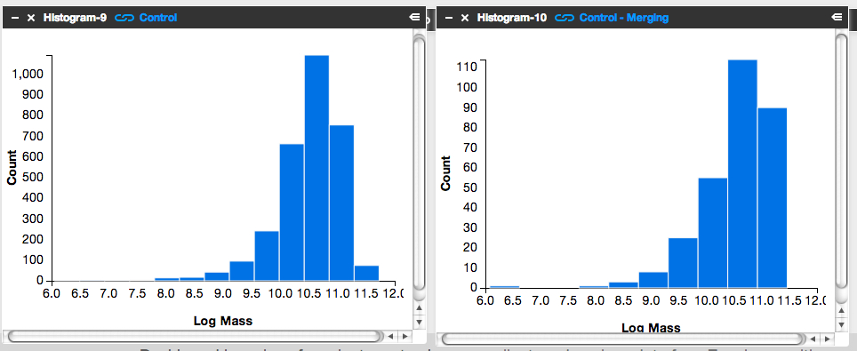
It’s subtle to see it in this visualization. Instead, let’s look at the fractions themselves.
Step 3: Letting the numbers guide us… Is there a higher fraction of Control galaxies with merger signatures at the low-mass end? At the high-mass end? Neither?
To answer this question, we need to know, for each mass bin, the fraction of Control galaxies that show merger signatures. I.e.,
![]()
Luckily, Tools can give us this information.
- Click on the ‘Control – Low Mass’ Table and scroll to its lower right.
- You’ll see the words ‘1527 Total Items’.
- There are 1527 Control galaxies in the low mass bin.
- Similarly, if you look in the lower right of the ‘Control – Merging – Low Mass’ Table, you’ll see that there are 131 galaxies in this category.
- This means that the merger fraction for the low mass bin is 131/1527 or 8.6%.
- Find the fraction for the middle and high mass bins.
Does the fraction increase or decrease with mass?
Step 4: Repeat the above steps but for the post-quenched galaxy sample.
You may want to open a new Dashboard to keep your window from getting too cluttered.
Step 5: How do the results compare for our post-quenched galaxies versus our Control galaxies? How can we best visualize these results?
- In thinking about the answer to this question, you might want to make a plot of mass (on the x-axis) versus merger fraction (on the y-axis) for the Control galaxies.
- On that same graph, you’d also show the results for the post-quenched galaxies.
- To determine what mass value to use, consider taking the median mass value for each mass bin.
- Determine this by clicking on ‘Tools’, choosing ‘Statistics’ in the pop-up options, selecting ‘Control – Low Mass’ as your ‘Data Source’, and selecting ‘Log Mass’ as the ‘Field’.
- This ‘Statistics’ Tool gives you the mean, median, mode, and other values.
- You could plot the results with pen on paper, use Google spreadsheets, or whatever plotting software you prefer. Unfortunately Tools, at this point, doesn’t provide this functionality.
It’d be awesome if you posted an image of your results here or at Quench Talk. We can then compare results, identify the best way to visualize this for the article, and build on what we’ve found.
You might also consider repeating the above but testing for the effect of choosing different, wider, or narrower mass bins. Does that change the results? It’d be really useful to know if it does.
Quench Boost: A How-To-Guide, Part 3
I’m very happy to be posting again to the How-To-Guide. We’ve made a number of updates to Quench data and Quench Tools. Before I launch into Part 3 of the Guide, here are the recent updates:
- The classification results for the 57 control galaxies that needed replacements have been uploaded into Quench Tools.
- We’ve applied two sets of corrections to the galaxies magnitudes: the magnitudes are now corrected for both the effect of extinction by dust and the redshifting of light (specifically, the k-correction).
- We’ve uploaded the emission line characteristics for all the control galaxies.
- We’ve uploaded a few additional properties for all the galaxies (e.g., luminosity distances and star formation rates).
- We corrected a bug in the code that mistakenly skipped galaxies identified as ‘smooth with off-center bright clumps’.
In Part 1 of this How-To-Guide to data analysis within Quench, you learned how to use Tools and were introduced to the background literature about post-quenched galaxies and galaxy evolution.
In Part 2 you used Tools to compare results from galaxies *you* classified with the rest of the post-quenched galaxy sample.
In Part 3 we’re going to use the results from the classifications that you all provided to see if there’s anything different about the post-quenched galaxies that have merged or are in the process of merging with a neighbor, and those that show no merger signatures.
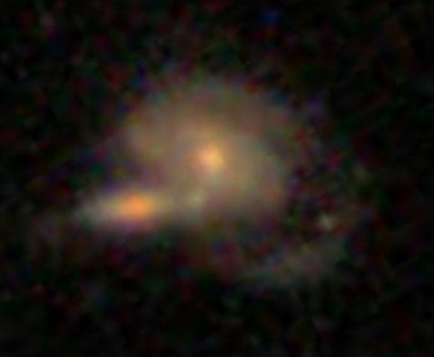
The figure below is of one of my favorite post-quenched galaxies with merger signatures. Gotta love those swooping tidal tails!
Let’s get started!
Step 1: Because of the updates to Tools, first clear your Internet browser’s cache, so it uploads the latest Quench Tools data.
Step 2: Copy my starter dashboard with emission line ratios ready for play.
- Open my Dashboard and click ‘Copy Dashboard’ in the upper right. This way you can make changes to it.
- In this Dashboard, I’ve uploaded the post-quenched galaxy data.
- I also opened a Table, just as you did in Part 2 of this How-To-Guide. I called the Table ‘All Quench Table’.
- In the Table, notice how I’ve applied a few filters, by using the syntax:
filter .’Halpha Flux’ > 0
- This reduces the table to only include sources that fulfill those criteria.
- Also notice that I’ve created a few new columns of data, just as you did in Part 2, by using the syntax:
field ‘o3hb’, .’Oiii Flux’/.’Hbeta Flux’
- That particular syntax means that I took the flux for the doubly ionized oxygen emission line ([0III]) and divided it by the flux in one of the Hydrogen emission lines (Hbeta).
- This ratio and the ratio of [NII]/Halpha are quite useful for identifying Active Galactic Nuclei (AGN).
- It’d be really interesting if we find that AGN play a role in shutting off the star formation in our post-quenched galaxies. A major question in galaxy evolution is whether there’s any clear interplay between merging, AGN activity, and shutting off star formation.
Step 3: Create the BPT diagram using the ratios of [OIII]/Hb and [NII]/Ha.
- BPT stands for Baldwin, Phillips, and Terlevich (1981), among the first articles to use these emission line ratios to identify AGN. Check out the GZ Green Peas project’s use of the BPT diagram.
- Click on ‘Tools’. Choose ‘Scatter plot’ in the pop-up options.
- In the new Scatterplot window, choose ‘All Quench Table’ as your ‘Data Source’.
- For the x-axis, choose ‘logn2ha’. For the y-axis, choose ‘logo3hb’.
- Adjust the min/max values so the data fits nicely within the window, as shown in the figure below.
- Remember that you can click on the comb icon in the upper-left of the plot to make the menu overlay disappear.
- Do you notice the two wings of the seagull in your plot? The left-hand wing is where star forming galaxies reside (potentially star-bursting galaxies) while the right-hand wing is where AGN reside. Our post-quenched sample of galaxies covers both wings.

Step 4: Compare the BPT diagram for post-quenched galaxies with and without signatures of having experienced a merger.
- To do this, you’ll need to first create two new tables, one that filters out merging galaxies and the other that filters out non-merging galaxies.
- Click on ‘Tools’. Choose ‘Table’ in the pop-up options.
- In the new Table window, choose ‘All Quench Table’ as the ‘Data Source’. Notice how this new table already has all the new columns that were created in the ‘All Quench Table’. That makes our life easier!
- Look through the column names and find the one that says ‘Merging’. Possible responses are ‘Neither’, ‘Merging’, ‘Tidal Debris’, or ‘Both’.
- Let’s pick out just the galaxies with no merger signatures.
- Under ‘Prompt’ type:
filter .Merging = ‘Neither’
- If you scroll to the bottom of the Table, you’ll notice that you now have only 2191 rows, rather than the original 3002.
- Call this Table ‘Non-Mergers Table’ by double clicking on the ‘Table-4’ in the upper-left of the Table and typing in the new name.
- Now follow the instructions from Step 3 to create a BPT scatter plot for your post-quenched galaxies with no merger signatures. Be sure to choose ‘Non-Mergers Table’ as the ‘Data Source’.
- You might notice that this plot looks pretty similar to the plot for the full post-quenched galaxy sample, just with fewer galaxies.
What about post-quenched galaxies that show signatures of merger activity? Do they also show a similar mix of star forming galaxies and AGN?
- To find out, create a new Table, but this time under ‘Prompt’ type:
filter .Merging != ‘Neither’
- The ‘!=’ syntax stands for ‘Not’, which means this filter picks out galaxies that had any other response under the ‘Merging’ column (i.e, tidal tails, merger, both). Notice how there are 505 sources in this Table.
- Now create a BPT scatter plot for your ‘Mergers Table’.
- Make sure this plot has a similar xmin,xmax,ymin,ymax as your other plots to ensure a fair comparison.
- You might also compare histograms of log(NII/Ha) for the different subsamples.
What do you find? Do you notice the difference? What could this be telling us about our post-quenched galaxies?!
Before you get too carried away in the excitement, it’s a good idea to compare the post-quenched galaxy sample BPT results against the control galaxy sample.
This comparison with the control sample will tell you whether this truly is an interesting and unique result for post-quenched galaxies, or something typical for galaxies in general. You might consider doing this in a new Dashboard, as I have, to keep things from getting too cluttered. In that new Dashboard, click ‘Data’, choose ‘Quench’ in the pop-up options, and choose ‘Quench Control’ as your data to upload. Now repeat Steps 1-4.
Do you notice any differences between your control galaxy and post-quenched galaxy sample results? What do you think this tells us about our post-quenched galaxies?
Stay tuned for Part 4 of this How-To-Guide. I’d love to build from your results from this stage, so definitely post the URLs for your Dashboards here or within Quench Talk and your questions and comments.
What is a Galaxy? …the return
The first time I gave a public talk, I spent an hour describing why galaxy classification is fundamentally important to the study of the Universe, the origins of Galaxy Zoo, the amazing response of the volunteers and the diverse results from their collective classifications of a million galaxies near and far. I showed many gorgeous galaxy images, a few dark matter simulations and even a preview of the Hubble image of Hanny’s Voorwerp.
As I finished my talk and the Q&A began, I braced myself for the inevitably interesting and challenging questions (I seem to get a lot of questions about black holes and spacetime).
A brief pause, and then the first question echoed from somewhere in the darkened auditorium: …”What’s a galaxy?”
Oops. Apparently I’d forgotten that little detail at the start of the talk. So I described a typical galaxy (if there is such a thing): a collection of stars, gas, dust, dark matter, all gravitationally bound together. Then I made a joke about scientists forgetting to define their terms, and we moved on to the next raised hand.
Turns out, though, it’s not such an easy question. Even though my casual definition works fine for most galaxies, it’s not at all an agreed-upon standard. We’ve discussed this on the blog before, and even in the short time (astronomically speaking) since Karen wrote that very nice post, more work has been done to find galaxies that push the boundaries and force us to re-think what it really means to be a galaxy.

The circled stars (plus a lot of dark matter you can’t see) are Segue 1, one of the smallest galaxies we know about. To read more on this, click the image.
So, spurred by a very broad interpretation of a question left for us in the comments on the post announcing this hangout, we decided to re-visit the discussion, covering the various properties a galaxy must have, should have, could have, and can’t have. We discussed the smallest galaxies, found by counting and measuring each of their individual stars. We discussed the biggest, brightest galaxies in the universe, living in rich environments and grown fat by eating other galaxies. And everything in between.
Note: when we talk about Segue 1 and 2, I say that these galaxies are unique because they have low mass-to-light ratios. Despite the pause that indicated I was trying to keep from inverting numerator and denominator… that’s exactly what I did. The galaxies have very few stars compared to the amount of dark matter in them, so their mass is high and their light is low, so their mass-to-light ratios are high. Oops (again)!
Clicking 10 Billion Years Into The Past
Astronomers use funny units. We have the light-year, which sounds like a time but is actually a distance. There’s the parsec, a historical (but still used) unit of distance that was famously mis-used as a time in Star Wars. And then there’s redshift, which is actually a velocity — distance divided by time — but which, because of the expansion of the universe, astronomers get to use as a proxy for distance.
While it may be convenient for us to use distance units where we set a mind-blowingly large number equal to 1, it doesn’t really help us communicate our work to the public. If I note that the galaxy images from CANDELS look a little different from the galaxies in the SDSS because the CANDELS galaxies are typically at a redshift of 2, that’s pretty meaningless. But it’s a little different to think of the fact that, when you classify a galaxy from CANDELS, you may be looking three-quarters of the way to the edge of the visible universe, and seeing the galaxy as it was 10 billion years ago.

Okay, that’s kinda cool.
During this hangout, we announced that your clicks and classifications of the CANDELS galaxies have been moving at such an impressive rate that the first round is finished. Every galaxy has enough classifications for us to get a very good sense of what its morphology is. It may be that, for some of the galaxies where there are clearly more details to flush out, we will ask for a few more classifications per galaxy. And there will probably be future CANDELS images from survey fields that are still being completed. So, don’t worry, there will still be plenty of opportunities to classify galaxies as they were 10 billion years ago!
In the meantime, though, we’re getting ready not just to do the scientific analysis, but to share Galaxy Zoo results with our colleagues around the world. The summer conference season is upon us, and many of us have given and are giving talks and posters at various meetings in various cities. This includes not just the recent meeting highlighting the importance of galaxy morphology in the era of large surveys at the Royal Astronomical Society and the upcoming ZooCon in Oxford and Galaxy Zoo meeting in Sydney, but also several more general conferences, including the 222nd American Astronomical Society meeting and the upcoming UK National Astronomy Meeting. Spreading the word about the scientific results we’re finding with Galaxy Zoo is one of the most important parts of our job — and it doesn’t hurt that in order to do that we have to visit some very interesting places. During the hangout we chatted a bit about that and also took some of your questions:
Note: although it was a beautiful sunny day in Oxford, the variable audio quality is not because I was occasionally distracted looking out the window. I don’t think it was the new microphone, either. We’ll look into it, but in the meantime I’ve tried to equalize the podcast version with some after-editing, so hopefully that is slightly better.
Using Space Warps to Discover and Weigh Galaxies
John Wheeler once summarized General Relativity as “Matter tells space how to curve, and space tells matter how to move.” While that is a handy description, and while there have been many textbooks written, lectures given and websites constructed to explain this, the quote itself doesn’t address what happens to the light streaming through the universe as it encounters the warped space curved by matter.
 The simple answer is: it curves too, and Einstein’s equations provide predictions for exactly how it works. In fact, observations of the bending of starlight around the Sun were one of the first implemented tests of General Relativity, and it passed with flying colors. On the scale of the Universe, the Sun isn’t that massive, but it’s massive enough to bend the light just a little, and by exactly the amount the equations predicted.
Those equations say that more matter in the same place is more likely to produce a strong lens effect, distorting and magnifying a background source. So what happens when you have a *lot* of matter, say, in a big galaxy or a cluster of galaxies?

From left to right: a) an Einstein cross (credit: NASA/ESA); b) an example from the Space Warps dataset; c) a known lens in CANDELS that Galaxy Zoo users spotted.
Some pretty impressive configurations, which are rare but which humans are best at finding — hence Space Warps, the Zooniverse’s newest project and our astronomical project sibling. Co-lens-experts Phil Marshall and Aprajita Verma joined us during this hangout to describe how they use gravitational lenses to weigh galaxies. In particular, they can tell the difference between Dark Matter and “matter that’s dark” — the former being the exotic particles that are very different from stars and gas and planets and people, and the latter being normal matter that isn’t bright, such as brown dwarf “stars” that never actually ignited.
Note: Google+ was feeling a bit out of sorts, so the first minute or so of the broadcast was cut off, during which time Bill Keel showed us the first known image of a gravitational lens, from 1903. We went on to talk about all of the above, and more besides, including the importance of simulated lenses, why the images Space Warps uses are specially tuned to help us find lenses, and how the science team (which includes citizen scientists from Galaxy Zoo!) plan to turn our clicks into discoveries.
(or download the podcast mp3 here)
Notice my swapping of pronouns to “we” — I’m not on the Space Warps science team, but I’ve done nearly 100 classifications now myself! I can’t wait to see the results start to come in from this project.
