Bayesian View of Galaxy Evolution
The Universe is pretty huge, and to understand it we need to collect vast amounts of data. The Hubble Telescope is just one of many telescopes collecting data from the Universe. Hubble alone produces 17.5 GB of raw science data each week. That means since its launch to low earth orbit in April 1990, it’s collected roughly a block of data equivalent in size to 6 million mp3 songs! With the launch of NASA’s James Webb Telescope just around the corner – (a tennis court sized space telescope!), the amount of raw data we can collect from the Universe is going to escalate dramatically. In order to decipher what this data is telling us about the Universe we need to use sophisticated statistical techniques. In this post I want to talk a bit about a particular technique I’ve been using called a Markov-Chain-Monte-Carlo (MCMC) simulation to learn about galaxy evolution.
Before we dive in into the statistics let me try and explain what I’m trying to figure out. We can model galaxy evolution by looking at a galaxy’s star formation rate (SFR) over time. Basically we want know to how fast a particular galaxy is making stars at any given time. Typically, a galaxy has an initial constant high SFR then at a time called t quench (tq) it’s SFR decreases exponentially which is characterised by a number called tau. Small tau means the galaxy stops forming stars, or is quenched, more rapidly. So overall for each galaxy we need to determine two numbers tq and tau to figure out how it evolved. Figure 1 shows what this model looks like.

Figure 1: Model of a single galaxy’s SFR over time. Showing an initial high constant SFR, follow by a exponential quench at tq.
To calculate these two numbers, tq and tau, we look at the colour of the galaxy, specifically the UVJ colour I mentioned in my last post. We then compare this to a predicted colour of a galaxy for a specific value of tq and tau. The problem is that there are many different combinations of tq and tau, how to we find the best match for a galaxy? We use a MCMC simulation to do this.
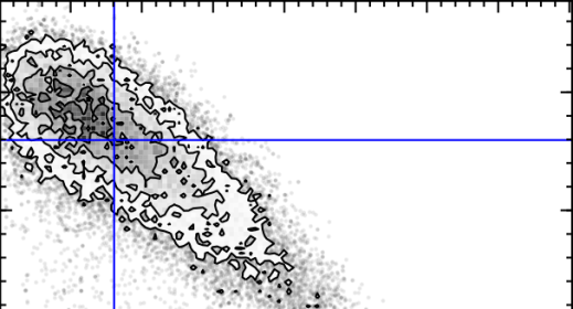
The first MC – Markov-Chain – just means an efficient random walk. We send “walkers” to have a look around for a good tq and tau, but the direction we send them to walk at each step depends on how good the tq and tau they are currently at is. The upshot of this is we quickly home in on a good value of tq and tau. The second MC – Monte Carlo – just picks out random values of tq and tau and tests how good they are by comparing the UVJ colours and our SFR model. Figure 2 shows a gif of a MCMC simulation of a single galaxy. The histograms shows the positions of the walkers searching the tq and tau space, and the blue crosshair shows the best fit value of tq and tau at every step. You can see the walkers homing in and settling down on the best value of tq and tau. I ran this simulation by running a modified version of the starpy code.
Figure 2: MCMC simulation for a single galaxy, pictured in the top right corner. Main plot shows density of walkers. Marginal histograms show 1D projections of walker densities. Blue crosshair shows best fit values of tq and tau at each step.
The maths that underpins this simulation is called Bayesian Statistics, and it’s quite a novel way of thinking about parameters and data. The main difference is that instead of treating unknown parameters as fixed quantities with associated error, they are treated as random variables described by probability distributions. It’s quite a powerful way of looking at the Universe! I’ve left all of the gory maths detail about MCMC out but if you’re interested an article by a DPhil student here at Oxford does are really good job of explaining it here.
So how does this all relate to galaxy morphology, and Galaxy Zoo classifications? I’m currently running the MCMC simulation showing in Figure 2 over the all the galaxies in the COSMOS survey. This is really cool because apart from getting to play with the University of Oxford’s super computer (544 cores!), I can use galaxy zoo morphology to see if the SFR of a galaxy over time is dependent on the galaxy’s shape, and overall learn what the vast amount of data I have says about galaxy evolution.
Galaxy Zoo and the COSMOS Survey.
Hello present, and hopefully future volunteers!
I’m a summer research intern on the Zooniverse Project, based at the University of Oxford. I’m currently at university in London and I’ll be going into my fourth year of studying Theoretical Physics. I’m three weeks into my internship, and I want to share with you how the hundreds-of-thousands of galaxies you’ve worked hard to classify are being used in research.
I’m working with Galaxy Zoo Hubble (GZH) data, which are classifications of galaxies from the Hubble Space Telescope Legacy survey. The classifications for this data have just been submitted for publication by a group of researchers from Galaxy Zoo, and you can read about it here. Specifically I’m working with a subset of this data from the Cosmic Evolution Survey, or COSMOS. This survey is specially designed to help us understand how galaxies evolve over time, and how their local environments in the universe affect this.
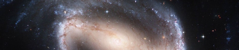
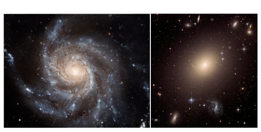
Up to now I’ve been using GZH data to add morphology to data currently found in the literature, in the hope that we can learn something new about galaxy evolution. In this post I want to share with you a particular striking example of how GZH classifications have transformed current data. Figure 1 shows two rows of colour-colour plots. The vertical axis is U-V colour, which is a measure how much recent star formation is going on in a galaxy – the higher up a galaxy is in the plot the more recent star formation is going on. The horizontal axis is V-J colour which is a measure of how much Infrared light compared to visible light a galaxy is emitting – the further left a galaxy is in the plot the generally older and more ‘dead’ it is. The first row (top) is found in a paper (Muzzin et al 2013), on analysis of galaxies in the COSMOS survey, written by researchers from the US, Denmark, Netherlands, UK, and Chile. The second row (bottom) shows the same data but with GZH classifications overlaid. Red and blue points represent featured and smooth galaxies respectively. Banner image shows a featured spiral galaxy (left), and and smooth elliptical galaxy (right).

Figure 1: colour-colour plots Galaxies from the COSMOS survey (top) before (bottom) after GZH classifications data added. Red and blue points represent featured and smooth galaxies respectively.
No need to ask which one looks more interesting! Lets understand what these plots mean. Each point on each plot represents a different galaxy. On each row the plots are sorted by z or redshift; you can think of this as being different snapshots of galaxies in the universe at different times. The most recent snapshot being on the left, and the oldest on the right of each row.
The important thing to take away from this data is that there are two distinct blobs or populations of galaxies in each plot. Galaxies in the top left blob are called star forming (SF) and galaxies in the longer bottom right blob are non-star forming, or ‘quiescent’. From the overlay of GZH classifications data on Figure 1 (bottom), we can see that the nearly complete absence of galaxies with features in the top left population of SF galaxies – something that we didn’t know before!
So why do we care about analysing colour-colour plots of galaxies? As a galaxy evolves through its lifetime it moves from the SF population to the quiescent through that bit in-between the two blobs, which is called the ‘Green Valley’ (I’ll save more on that for another blog post), and the truth is nobody quite knows how this happens. Overall, we hope GZH classifications may shed some light on this, and help us understand how galaxies evolve.
To help us finally understand the evolution of galaxies, get involved right now at www.galaxyzoo.org, we’d be happy to have you on-board!
