Galaxy Zoo and the COSMOS Survey.
Hello present, and hopefully future volunteers!
I’m a summer research intern on the Zooniverse Project, based at the University of Oxford. I’m currently at university in London and I’ll be going into my fourth year of studying Theoretical Physics. I’m three weeks into my internship, and I want to share with you how the hundreds-of-thousands of galaxies you’ve worked hard to classify are being used in research.
I’m working with Galaxy Zoo Hubble (GZH) data, which are classifications of galaxies from the Hubble Space Telescope Legacy survey. The classifications for this data have just been submitted for publication by a group of researchers from Galaxy Zoo, and you can read about it here. Specifically I’m working with a subset of this data from the Cosmic Evolution Survey, or COSMOS. This survey is specially designed to help us understand how galaxies evolve over time, and how their local environments in the universe affect this.
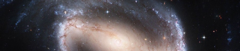
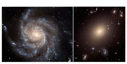
Up to now I’ve been using GZH data to add morphology to data currently found in the literature, in the hope that we can learn something new about galaxy evolution. In this post I want to share with you a particular striking example of how GZH classifications have transformed current data. Figure 1 shows two rows of colour-colour plots. The vertical axis is U-V colour, which is a measure how much recent star formation is going on in a galaxy – the higher up a galaxy is in the plot the more recent star formation is going on. The horizontal axis is V-J colour which is a measure of how much Infrared light compared to visible light a galaxy is emitting – the further left a galaxy is in the plot the generally older and more ‘dead’ it is. The first row (top) is found in a paper (Muzzin et al 2013), on analysis of galaxies in the COSMOS survey, written by researchers from the US, Denmark, Netherlands, UK, and Chile. The second row (bottom) shows the same data but with GZH classifications overlaid. Red and blue points represent featured and smooth galaxies respectively. Banner image shows a featured spiral galaxy (left), and and smooth elliptical galaxy (right).

Figure 1: colour-colour plots Galaxies from the COSMOS survey (top) before (bottom) after GZH classifications data added. Red and blue points represent featured and smooth galaxies respectively.
No need to ask which one looks more interesting! Lets understand what these plots mean. Each point on each plot represents a different galaxy. On each row the plots are sorted by z or redshift; you can think of this as being different snapshots of galaxies in the universe at different times. The most recent snapshot being on the left, and the oldest on the right of each row.
The important thing to take away from this data is that there are two distinct blobs or populations of galaxies in each plot. Galaxies in the top left blob are called star forming (SF) and galaxies in the longer bottom right blob are non-star forming, or ‘quiescent’. From the overlay of GZH classifications data on Figure 1 (bottom), we can see that the nearly complete absence of galaxies with features in the top left population of SF galaxies – something that we didn’t know before!
So why do we care about analysing colour-colour plots of galaxies? As a galaxy evolves through its lifetime it moves from the SF population to the quiescent through that bit in-between the two blobs, which is called the ‘Green Valley’ (I’ll save more on that for another blog post), and the truth is nobody quite knows how this happens. Overall, we hope GZH classifications may shed some light on this, and help us understand how galaxies evolve.
To help us finally understand the evolution of galaxies, get involved right now at www.galaxyzoo.org, we’d be happy to have you on-board!

Trackbacks / Pingbacks