Ferengi-2 Images Launched!
Hey volunteers! This is Mel G from the Minnesota science team, and I’m excited to announce the launch of the second set of FERENGI images on Galaxy Zoo today!
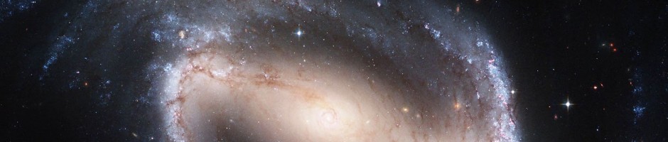
Some of you may remember classifying the first batch of FERENGI images back in 2013. For new volunteers, or experienced volunteers who need a refresher, FERENGI is a code that takes an image of a nearby galaxy and produces a new, simulated image of what that galaxy would look like if it was actually much farther away. 288 galaxies that were already classified by Galaxy Zoo volunteers were selected to be “ferengified” in that first sample; from these, 6,624 images were created of these galaxies at different distances and brightnesses. With your help, all images were classified and used to measure how distance affects classifications, which enabled us to debias and finally release the Galaxy Zoo: Hubble catalog just last month!

original SDSS galaxy + 4 ferengified images at increasing distances
Recently, I found another use for these FERENGI classifications as I worked on my project on red disk galaxies, which will go into my PhD thesis to be completed this summer (coming up soon, yikes!). For this project I’ve been using data from Galaxy Zoo: Hubble to study the transformation of star-forming disk galaxies into non star-forming (aka “dead”) ellipticals between now and 6 billion years ago. Part of this research involves tracking the galaxy colors over time, which are indicators of whether the galaxies are still forming stars or not. A common way to distinguish star-forming galaxies from dead galaxies is to use a color-color diagram (this blog post goes into the details quite well, for the interested!). The short version is that galaxies in the upper-left of this plot, the “red sequence”, are no longer forming stars, and the lower-right portion, the “blue cloud”, are still producing lots of new stars. Typically the blue cloud is full of disk galaxies and the red sequence is full of ellipticals, but that statement is not 100% true; there are actually quite a few disk galaxies mixed in with ellipticals up in the red sequence. We think these might represent a “transition” stage between blue/active disks and red/passive ellipticals, and studying how this population evolves with time will tell us more about how the shutting down of star formation is related to the morphological transformation.
What does this have to do with FERENGI? Well, detecting disk galaxies at high redshift is pretty hard – as we learned during the data reduction of the GZH catalog. Using raw Galaxy Zoo classifications, disks tend to be classified very similarly to ellipticals if they are very far away, so the number of disks we count is probably smaller than the true value. Using the FERENGI data, however, we can predict how many disks we should be detecting as a function of distance, and use that information to adjust the numbers of disks we count in the real Hubble data! The catch is that since galaxies with different colors tend to look a little different on average, it’s important to measure this incompleteness for both the red sequence and the blue cloud galaxies. Here comes the problem: in the original FERENGI sample,only 44 of the 300 galaxies have color data, leaving only 9 red sequence and 36 blue cloud galaxies to study. Unfortunately those numbers are too small to get a good measurement!

color-color plots of the original and Ferengi-2 samples
So, as a sequel to the original FERENGI project, and as motivation to take proper measurements of red disks over time for my thesis, I’ve created FERENGI-2: a new set of FERENGI images from 936 galaxies. Each has been ferengified to 8 different distances, producing a total of 7,488 images that I need your help classifying. As you can see in the color-color plots here, these classifications will allow me to measure incompleteness for 388 galaxies in the red sequence (previously only 9) and 548 galaxies in the blue cloud (previously 36). This increase in data is huge, and will help not only the completion of my thesis, but many future projects that benefit from debiasing of Hubble data. Thanks again for your help!
12 responses to “Ferengi-2 Images Launched!”
Trackbacks / Pingbacks
- - March 6, 2017
- - March 7, 2017

bonjour je suis bénévole sur galaxie zoo depuis deux ans merci de votre confiance et je suis content de participer au classement
je suis astronome amateur depuis 1997 .
cordialement Discala
________________________________ De : Galaxy Zoo Envoyé : lundi 12 décembre 2016 15:44:28 À : alaindi30@hotmail.com Objet : [New post] Ferengi-2 Images Launched!
melsimba23 posted: “Hey volunteers! This is Mel G from the Minnesota science team, and I’m excited to announce the launch of the second set of FERENGI images on Galaxy Zoo today! Some of you may remember classifying the first batch of FERENGI images back in 2013. For new vo”
Cool project!
Question: the color-color plot seems to show that the transition from red to blue is smooth, with no distinct break. Is that true?
Thank you, and excellent question! In reality there is a pretty distinct break between the red sequence and blue cloud; the reason it’s hard to see in this particular plot is due partially to the particular colors used here and partially because there are relatively few galaxies shown. In larger samples of galaxies you can really see the densities piling up well above and below the demarcation lines separating the two regions, but there is definitely a small portion of galaxies that still lie in the intermediate area which has been dubbed the “green valley”. Part of my current work with this project will be doing a slightly more sophisticated version of the plot shown, where I will exclude galaxies from the analysis that fall too close to that intermediate range.
I recommend checking out this Galaxy Zoo paper that goes into great detail about the different regions – see specifically the color-color plot Figure 7 which shows ~20,000 galaxies. The separation between the red and blue is much easier to see. http://arxiv.org/abs/1402.4814
Thanks!
I checked that paper – love the “Green Valley is a Red Herring” title! – and I can see that the red and blue clouds are quite distinct, in the plots (Figures) in that paper. However, they (seem to) have quite different axes than the plot in this blog post: Figure 7, for example, has “NUV-u colour (dust-corr.)” on the y-axis, and “u-r color (dust-corr.)” on the x; whereas your plot has “MNUV-M(R)” and “M(R)-M(J)”, respectively. And the shape of the boundary between the two clouds seems quite different too.
Can you explain please?
A question on Ferengification (new word?): how does the process deal with the fact that the angular-to-physical scale changes (non-linearly) with redshift (e.g. 1 arcsec at z=0.2 is a very different number of kpc than the same 1″ at z=2, say)?
Hi Jean! So I alluded a little bit in my first reply about how different choices of colors for color-color plots affect the shapes of the distributions a bit, but I’ll elaborate more: There are several combinations of colors (and/or magnitudes) that one can use when creating a plot, and the choice of colors probes slightly different physics. For my study, I picked NUV – r / r-J colors because these have been recently shown to be better indicators of star formation activity than other combinations (like NUV – u / u-r or others). So picking the particular color combinations has to do partly with what physics you’re trying to probe, and partly to do with the available data you have on hand 🙂 Since different color or mass measurements have different absolute values, the shape of the plots and additionally placement of demarcation lines separating regions will appear slightly different to the eye, but relatively speaking they are measuring almost equivalent things.
In response to your question on the ferengification (yes new words are sometimes made up when talking about ferengi 🙂 ) that’s an excellent question: So the first step in ferengi’s algorithm is to compute the change in angular size from the low/input redshift to the high/output redshift, taking into account the pixel scale of both the input image (in my case, SDSS which is 0.396 arcsec/pixel) and the pixel scale of desired output image (in my case, HST ACS which is 0.03 arcsec/pixel). Since angular size is proportional to a ~ d/(1+z)^2 (a being angular size, d being distance, and z being redshift), the change in angular sizes can be written simply as a_lo/a_hi = d_lo/d_hi * (1+z_hi)^2/(1+z_lo)^2, so you can see it takes into account the 1+z correction to account for the cosmological expansion influence on angular diameter distance (which is what I think you were referring to in your comment.) After computing the new angular size, it simply converts that to pixel units to create the new image.
Thanks again!
Follow-on on Ferengification: no matter what the pixel scale is, the SDSS and HST ACS PSFs (point spread functions) will be very different, even when scaled (hah!) appropriately. For example, the SDSS PSF varies quite a bit from field (“frame”) to field, with a FWHM as low as 0.7″ and as high as almost 2.0″ (from memory); the HST ACS PSF varies by wavelength, but hardly at all between fields (not sure what they call the equivalent of frame) (also from memory). How is this handled?
And yes, I was referring to how redshift, distance and apparent angular size are related, in Ferengification. I guess it doesn’t matter whether you use Planck cosmological values or “737” ones; the deltas are too small to see.
One more: in Ferengifying an object, do you ever need to consider what to do for objects like Green Peas or EELRs, which emit ~all their light, in any particular band, in one (or at most a few) narrow emission lines? I guess where the 400nm cliff is is important; it affects apparent colors in SDSS images so strongly that you can quite easily guess that a fuzzy elliptical – or even a giant spiral – has a redshift >~0.38 or not.
Ferengi does a pretty good job of incorporating the different PSFs into the equation – you’re right that the SDSS psf widths vary quite a bit; for this reason the PSF corresponding to *each* image (which can be downloaded directly from sloan) is used as input in the code. Ferengi deconvolves a typical ACS PSF corresponding to the target wavelength (in my case, I or V-band) with the input SDSS PSF. The new PSF is then convolved with the redshifted image to produce a more realistic looking image.
Regarding odd objects like Green Peas – that’s a really good question, and I suppose the short answer is that I’m not sure whether Ferengi would do a good job with such an input! In our studies so far we’ve been mostly concerned with more typical-looking ellipticals and disks, but it would be an interesting future project to try this with outliers.
Wow, this Ferengification is quite sophisticated!
I have still more questions (sorry to be a hog, but no one else seems to be writing comments, so I hope you don’t mind). In choosing the 936 ‘new’ galaxies to be Ferengified, you obviously sought to cover the red sequence, blue cloud, and green valley, and – possibly as a result? – seem to have a fairly even (if random) coverage of a large part of the color-color plane. How complete is this, in terms of the outer fringes of all three regions? In other words, what fraction of local galaxies lie beyond the region covered by the 936?
If you look at one of the Hubble Deep Fields, and plot the rest-frame colors of high-z galaxies (to the extent that this is possible), would there be a significant fraction which lie beyond the region today occupied by red sequence/blue cloud/green valley? From a different perspective: do you have a handle on what fraction of high-z galaxies would be outside the region covered by the 936, if they were local (if you understand what I mean)?
Hi again! So if I understand your question (correct me if I’m wrong), you’re wondering how much of the population of all galaxies resides in the unrepresented regions of color-color space in this plot (as in, above/below and left/right)? For the most part, the region represented by the Ferengi2 galaxies spans the whole possible space; that is, there are very few galaxies which would have colors that extend beyond the maxima and minima shown in the plot; in other words, adding more galaxies here would simply make the current regions denser, not larger in area.
When selecting galaxies for this sample, I used 3 criteria: First, they had to already have classifications from Galaxy Zoo 2 (which by default represents almost everything in SDSS with magnitude r<17.) Next, only really nearby galaxies are able to be Ferengied to the redshfits I wanted for this study (0.3 < z < 1.0); this has to do with limitations in deconvolving the ACS PSF with the SDSS PSF. So, of the galaxies with GZ2 classifications, only galaxies with z<0.013 were selected. Last, of these, only those with NUV, r, and J magnitude data were used (so there was nothing restricting where the galaxies would lie on the plot, only that they had color data necessary to be plotted in the first place). In the end, all 936 galaxies which fit these criteria made up the sample.
Last, to your question about how the distributions would compare to Hubble rest-frame colors – that is exactly what the end goal of the project is trying to answer! For example, the blue cloud is more heavily dominated at high redshift while the red sequence is more dominated at low redshift (since the average star formation rate was higher in the past). That part is known – but what I'm looking at more specifically is how the disk population specifically moves along this distribution from z=1 to z=0.3.
Hi again too, and thanks heaps for all your great comments!
Yes, you understood pretty well (sorry if I wasn’t all that clear).
Part of what I’m asking ties in with the EELR/Green Peas/Green Beans/voorwerpjies/etc galaxies I also mentioned. To some extent.
I get that you’ve got the local universe pretty well covered, at least in the sense of “if it’s a GZ2 galaxy”. But what if, in the high-z universe, there are lots of galaxies clustered around (-4, 5), or (1, -1) in the color-color plot (I picked these at random, nothing deep)? These have no local analog, and are well outside the region covered by the 936. Or do they? Where do Green Beans (for example) live, in that color-color plot?
Another question (it seems I always have yet another one, doesn’t it? Sorry if it’s too much): I’ve been reading Lang+ (2016) (a GAMA paper, “M* − Re relations of z = 0 bulges, discs and spheroids”; my copy is arXiv1607.01096), and they mention LBS (“little blue spheroids”), which I don’t remember coming across before. It may be that they’re too faint, or too small for GZ2 (though plenty are local; the Lange+ paper has 0.002<z<0.06 as a selection criterion), and even if not, they're likely well within the region covered by the 936 (not to mention that there'd be no point Ferengifying them anyway, a little spheroid will look like a small round blob, or perhaps a star, anyway).