From data to art
When I started writing my post series about the HST (which will be continued soon), I got an email from Zolt Levay from STScI in Baltimore (Space Science Institute, ‘Hubble headquarters’) about how the beautiful HST images are actually made there. We then decided that he would write this up as one of the posts here and we would post it once the GalaxyZoo: Hubble explanations are online on how those special images are made. Now that this has happened, it is time to posts Zolt’s much more general post here.
Enjoy!
Boris
______________________________________________________________
Thanks to Boris for inviting me as a guest blogger here. I have been fortunate to be able to work on the Hubble Space Telescope mission for quite some time. I have spent a lot of that time working with Hubble images. I wanted to use this opportunity to say a few words about how Hubble’s pictures come about. Along the way I hope to give a flavor of the sorts of choices we make to present the pictures in the best possible way, to answer some questions and to correct some possible misconceptions.
The images we see from Hubble and other observatories are a fortunate by-product of data and analysis intended to do science. Hubble’s images are especially high quality because they don’t suffer the distorting effects of the atmosphere since Hubble is orbiting high above the Earth. I won’t go into a lot more detail about Hubble’s technology since Boris has described that nicely in his post “Why build the Hubble Space Telescope?“.
We do aim to produce images that are visually interesting and that reproduce as much as possible of the information in the data. I should also say that these techniques are not unique to Hubble. The cameras used at every large telescope operate pretty much the same way and the same techniques are used to produce color images for the public.
We begin with digital images from Hubble’s cameras, which are built for science analysis. The cameras produce only black and white images because they are designed to make the most precise numerical measurements. They do include a selection of filters which allow astronomers to isolate a specific range of wavelengths from the whole spectrum of light entering the telescope. The black & white (or grayscale) data include no color information other than the range of wavelengths/colors transmitted by the filter. By assigning color and combining images taken through different filters, we can reconstruct a color picture. Every digital camera does this, though it happens automatically in the most cameras’ hardware and software.
We produce color images using a three-color system that reflects the way our eyes perceive color. Most of the colors we can see can be reproduced by a combination of three “additive primary” colors: red, green and blue. Every color technology depends on this technique with some variations: digital cameras, television and computer displays, color film (remember that?), printing on paper, etc.
Here are three images of the group of galaxies known as Stephan’s Quintet from Hubble’s new Wide Field Camera 3 (WFC3). The three exposures were made through different filters: I-band, transmitting red and near-infrared light (approximately 814nm in wavelength); V-band (yellow/green, 555nm), and B-band (blue, 435nm). It may not be obvious, but if you examine the image closely you can see there are differences between them. The spiral arms of the galaxies are more pronounced in the B image while the central bulges are smoother and brighter in the I.
We can then assign a color (or hue) to each image. Two things mainly drive which colors we choose: the color of the filter used to take the exposure and the colors available in the three-color model. In this case we assign red to the I-band or reddest image, green to the V-band, and blue to the B-band or bluest image, which are pretty close to the visible colors of the filters. When we combine the separate color images, the full color image is reconstructed.
Because the colors we assigned are not too different from the visible colors of the filters, the resulting image is fairly close to what we might see directly. At least the colors that appear are consistent with the physical processes going on in the galaxies. The spiral arms trace regions of young, hot stars that shine with mostly blue light. The disks and central bulges of the galaxies are mostly made up of older, cooler stars that shine more in red light. Individual brighter stars — foreground stars in our own galaxy — show different colors based on their temperatures: cooler stars are redder, hotter stars are bluer.
We can apply some adjustments to make the picture more snappy and colorful, similar to what any photographer would do to improve the look of their photos. We also touch up some features resulting from the telescope and camera; that explanation may be something that can waits for another post.
Depending on the selection of filters — driven by science goals — and color choices, the images can be shown in various ways. But the motivation behind these and other subjective choices is always to show the maximum information that is inherent in the science data, and to make an attractive image, but also to remain faithful to the underlying observations. We don’t need to heavily process the images; they are spectacular not so much because of how they are processed, but because they are made from the best visible-light astronomy data available.
A variation on this image blending technique needs to be applied with filters that don’t correspond to the standard color model. Narrow-band filters are designed to sample the light emitted by particular elements (hydrogen, oxygen, sulfur, etc.) at specific physical conditions of temperature, density and radiation. These filters are used mostly to observe and study nebulae, clouds of gas and dust that glow because they are illuminated by strong radiation from nearby stars. This very diffuse gas emits light at very, narrow ranges of wavelengths so the color can be very strong or saturated. Some of the most spectacular images result from these clouds that come in all sorts of shapes and textures.
The wrinkle with this sort of observation is that the colors of the filters rarely match the primary colors we would like to use to reconstruct the images. We can choose to reconstruct the color image either by applying the color of the filter, by using the standard primaries or something else entirely. In general a more interesting image results from shifting some of the filter colors. The resulting colors are definitely not what we might see live through a telescope, but they do represent real physical properties of the target.
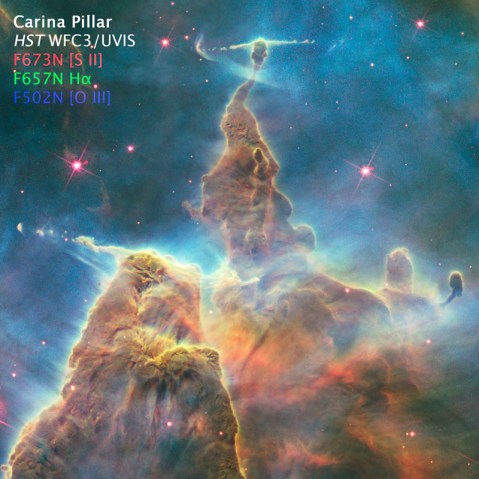
Here are some images of a pillar in the Carina Nebula, taken to celebrate Hubble’s 20th anniversary in 2010. The filters sample light emitted by atoms of hydrogen, sulfur and oxygen. The hydrogen and sulfur both emit red light and the oxygen is cyan (blue-green). The colors and brightness of emission from the various elements depends on the physical conditions in the nebula such as temperature and pressure, as well as the quantity and energy of radiation from surrounding stars causing the clouds shine.
When we apply the colors appropriate to the filters and make a color composite, the separate images look like this:
And the composite color image looks like:
It’s an interesting image, but doesn’t include a wide range of colors because we are starting with only two colors, red and cyan. Let’s try something a little different and shift the colors around a bit:
Here we are using red for the sulfur (the reddest, longest wavelength filter), green for the hydrogen and blue for the oxygen. It may be a little disconcerting; many people know that hydrogen usually shines in red light, but here we are showing it in green. But sulfur also shines in red light here, so the only way to visualize the structures that result from differences between the hydrogen and sulfur is to shift the colors.
If we make the color composite in this way though, see that we now have a fuller range of colors, like an artist’s palette with many more different paint colors. The combinations of colors (like mixed paints) in the composite image result from real differences between the emission coming from the various elements. If they are rendered in the same color those differences are eliminated in the composite. But if we separate their rendered colors, we can show more of the information inherent in the data.
Thanks again for the opportunity to contribute here. I hope this answers some questions about where Hubble’s color images come from. We all hope that Hubble continues beyond its extraordinary 20+ years of amazing science and we can see even more spectacular cosmic landscapes.
9 responses to “From data to art”
Trackbacks / Pingbacks
- - January 17, 2011


Thanks for this description of the process you use to bring these amazing images to us! Sometimes it’s hard for non-scientists to understand exactly what we are seeing when looking at astronomical images…this helps a lot.
Wonderful information well written. The pictures are AWESOME! Thanks
Very interesting blog. Thank you very much for posting.
JKHC.
Thanks for that excellent explanation.
Excellent and well illustrated article. Thanks for the explanations.
Fantastic blog. Really interesting. Thank you.
Is there any public source for the single band pictures? I would like to do some composites of my own.
In addition to playing with absolute spectra I would like to use absolute redshifts as a channel on deep sky images just for fun.
Please reply via email as well as here. (jhunley@gmail.com)
Thank you
Thanks for the feedback! Glad people find the information helpful.
Joshua, the most direct source for the data is the Hubble Legacy Archive (http://archive.stsci.edu/hst/ ). There are some tutorials etc. there to help get started. Be prepared for a big, complicated archive with lots of different kinds of images and other data. The examples in the blog are somewhat simplified. The data are made available in FITS format; you can use the FITS Liberator software from ESA (http://www.spacetelescope.org/projects/fits_liberator/) to make the images more useful.