
“Blue stuff” in the Illustris galaxy images
I think the most common question/comment we’ve been seeing for classifiers of the simulated Illustris galaxies is along the lines of: “What’s the blue stuff?”
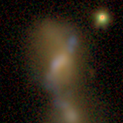
Image of a synthetic galaxy (AGZ00089n5) from the Illustris simulation, being classified in Galaxy Zoo. Blue-ish emission can be seen extending from the lower left to upper right of the center galaxy.
It’s a great question. Let’s talk about it in more detail.
The short answer is that the blue regions are the simulations’ method of reproducing the light emitted by young stars. A star’s lifetime generally scales as a function of its mass – the more massive the star is when it’s first formed, the hotter it is and the faster it burns fuel. Emission from hotter objects will tend to be bluer (ie, produce more photons at shorter wavelengths) compared to less massive stars. These are trends we see in optical images of stars in galaxies, including naked-eye views and composite color images. The exact color depends on the filters being used as well as processing of the images – that’s the difference between images you may have seen of star-forming regions being pink in some images and blue in others, such as those in Illustris.
A couple more specific questions that we’ve received:
What’s causing the blue colors in the galaxies? Are they caused by individual atomic or molecular lines that we can see in the spectra?
Volunteers who worked on the original GZ green peas project might be familiar with the term “nebular emission” – individual, narrow lines caused by ionized or hot gas surrounding stars, or whether they’re the result of the broadband colors of the stars themselves. The GZ-Illustris images use a stellar population model that only computes the broadband colors, due to some issues with unrealistic green images caused by the interaction of the codes that deal with both the emission lines and effects of dust. The model we’re using – based on work by Bruzual & Charlot (2003) – omits the emission lines for that reason. However, we’ve made extensive comparisons of the two sets of images and find that they agree very well for our scientific goals, including the morphology classifications.

A plot of the synthetic spectra for galaxies in the Illustris simulation; each thin horizontal line is the spectrum of an individual galaxy. The most massive galaxies are at the top, while the lowest mass galaxies are at the bottom. Wavelength increases from left to right, or going from bluer to redder colors. The lack of sharp features in this plot (which uses the BC03 model adopted by the Galaxy Zoo images) are a result of excluding the nebular line emission. Figure courtesy P. Torrey (MIT/Caltech).
How should visual morphology classifiers deal with the star-forming regions? Ignore them and look at the underlying stellar populations? Treat them as part of the galaxy? Something else?
This is a tough one. Many galaxies have the “blobby” star-forming regions but others have nicer looking disk or spiral distributions. Our analysis suggests is that this is a pretty tight function of the total star formation rate (higher SFR = more realistic looking features). We suggest that users treat them as part of the galaxy; it might lead to some odd results in lower mass galaxies, but we expect they should trace each other very well for the more massive galaxies. If you see geometry that’s distinctly different from a well-formed spiral disk or elliptical, don’t be hesitant to click the “Anything Odd” or “Other” buttons – that’s one of the simplest ways in which we can measure the unusual effects of the blue regions, given the constraints of our classification scheme.

One option for measuring the effect of the blue blobs is to select “Other” under the “Anything Odd” question.
The distribution of the blue blobs is often disconnected and/or in unusual shapes compared to Sloan. What determines the spatial distribution of the star forming regions?
This results from the extremely discrete sampling of the density of stars in the images. Stars can only form in “chunks” of about 1 million solar masses, instead of the more typical small clusters and regions that we know exist in the real Universe. Moreover, these chunks have their light spread over a significant fraction of ~1 kpc (which is pretty big, compared to a typical galaxy radius of ~20 kpc), and so they often won’t look much like real star-forming regions. This, coupled with the lack of dust, leads to what you see in the GZ images.
Thanks as always to everyone for your help. Please post here or on Talk if you have more questions!
This post was written with the help of researchers Gregory Snyder (Space Telescope Science Institute) and Paul Torrey (MIT/Caltech), who worked extensively on the development of Illustris and the generation of the mock images for Galaxy Zoo.
