Simulated AGN: An Example
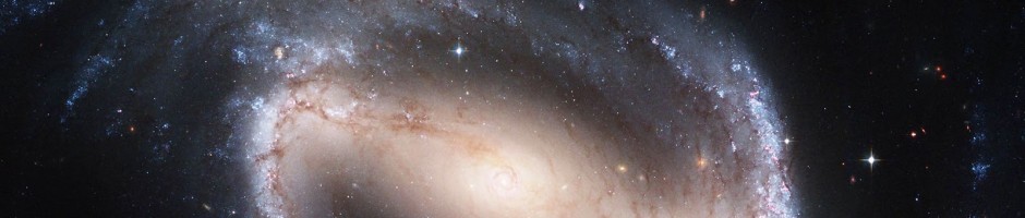
As a follow-up to my post describing the science behind simulating AGN for classification of their host galaxies, here is an example of one of the 116 galaxies that we used to create the 1740 simulated AGN in the sample.

Each galaxy was made into 15 different simulated AGN using 3 colors and 5 luminosity ratios.
If you’d like to see the full-size version, click on the image.
As some of you have pointed out, the cases where the simulated AGN is as bright as or brighter than the host galaxy do look a little like, well, simulations. But hopefully that doesn’t significantly affect the main science question: how does its presence affect the classification of the underlying galaxy (if at all)?
As Carie mentioned in her recent post on this topic, the results from the classification of these simulated AGN will be posted shortly.
Motivation to Simulate AGN
In order to understand the accuracy of studies of AGN host galaxies, extensive simulations of host galaxy morphology are required.
This is discussed in great more in two paper Pierce et al. 2010 (http://adsabs.harvard.edu/abs/2010MNRAS.408..139P) and Simmons & Urry 2008 (http://adsabs.harvard.edu/abs/2008ApJ…683..644S).
In the previous studies, the presence of a central brightness from an AGN does affect the measured properties of the AGN host galaxy, when that central point source becomes too bright. As Simmons and Urry wrote, “Results of these simulations are intended to inform data analysis of AGN host morphologies, to better infer intrinsic host galaxy shapes from fitted morphological parameters in the presence of a central point source”. In other words, by carefully modeling that effect we are able to use the information from the computer’s fits to study the host galaxy properties.
Stay tuned for more details about this from Brooke Simmons!
The Science Behind Classifying Simulated AGN
Hello Zooites,
This is a dual-purpose post: first, to introduce myself. My name is Brooke Simmons. I’m a graduate student in the final year of my PhD at Yale, and my scientific focus is on examining the co-evolution of supermassive black holes (SMBHs) and their host galaxies. My specialization is in the morphology of galaxies hosting active SMBHs, so naturally I’ve been very intrigued by the Galaxy Zoo project ever since it started. And I’m very impressed by the work that you all do. So when Chris and Carie asked me about simulating some AGN as part of the Galaxy Zoo project, I jumped at the chance. I have pretty extensive experience simulating AGN and host galaxies — more on that in a moment — and I was very excited to have the opportunity to extend that kind of science into the realm of Galaxy Zoo.
I heard later that there were some issues regarding the simulations, and that’s the other purpose of this post. I’d like to try and explain the reasons I think the simulations are important to the science being done in the Zooniverse, and clarify some of the details, if possible. I’m quite new here and I realize that there are many levels of experience reflected in the Zooite population, from newcomers to the field to those who are experienced at following up on objects of interest and searching the scientific literature. So I hope, in giving this science background, that those of you who have heard it before will bear with me, and those of you who haven’t (or, well, anyone really) will feel free to ask any questions that might come up.
In the field of galaxy evolution, it’s now clear there is some sort of mechanism that affects both the evolution of galaxies and the growth of their central black holes together, but we don’t really understand what it is (or what they are) — yet. In terms of scale, it’s rather incredible that they are connected at all. We may call them supermassive black holes, but they’re generally a small percentage of the total galaxy mass, and they’re absolutely tiny when compared to the size of the galaxy. I like to describe it in terms of a football match: the packed, somewhat chaotic crowd in the stands shouldn’t know or care what the ant right in the middle of the playing field is doing. Nor should the ant particularly be aware of how the cheering crowd is shifting and reacting. Yet it is well established that the crowd (the stars in the galaxy) and the ant (the central black hole) somehow know about each other.
How does this work? What forces (or combination of phenomena) act to influence both the single, massive point at the center of a galaxy and the billions of stars around it? Is it a one-sided influence, or is it a feedback mechanism that ends up causing them both to evolve in sync? The co-evolution of galaxies and black holes is one of the fundamental topics of galaxy evolution, and many questions remain unanswered. In order to try to answer these questions, we observe both central black holes and the galaxies that host them, at a variety of redshifts/lookback times, so that we can see how these two things evolve.
However, for all but very local galaxies, it’s very difficult to see a signal from a galaxy’s central SMBH amid all the stellar light from the galaxy. So, we turn to that subset of SMBHs that are actively accreting matter, which in turn heats up and discharges enormous amounts of energy as it falls into the gravitational potential of the black hole. Those, which we call active galactic nuclei (AGN), we can see much more easily, and out to very high redshift. They radiate across the whole of the electromagnetic spectrum, from radio to gamma rays. At optical wavelengths they are sometimes buried in dust and gas, which obscures their light and means they look identical to so-called “inactive” galaxies. But in other cases, the AGN are unobscured or only partially obscured, and then they are extremely bright — so much so that they can far outshine the rest of the galaxy.
So, looking at the central SMBHs of inactive galaxies is impossible for very distant galaxies, because the host galaxy swamps the dim signatures of the black hole. But looking at the hosts of active black holes (AGN) can be difficult too, because the AGN signal can swamp the host galaxy. It’s not impossible to disentangle the two in order to examine the host galaxy separately from the AGN, but it adds a level of complexity to the process. Morphological fitting programs executed by a computer do a reasonable job, but actually — as you all know — the human brain is excellent at this kind of pattern recognition. You all can clearly tell the difference between a host galaxy and its central AGN, to the point where many of you have been following up your classified objects and identifying spectral features of AGN. That is so impressive!
In fact, what you collectively do is new and different and in many ways a significant improvement over “parametric” methods that use automated computer codes to fit galaxy morphology models to images. Those have their uses, too, of course, but you all pick up nuances that parametric methods simply miss. And part of what that means is that the data we have on how the presence of an AGN (bright or faint) affects morphological classification may or may not apply to your work. Within the automatic fitting programs, there are subtle effects that can occur. For example, a small galaxy bulge may look the same to a parametric fitting routine as a central AGN, with the consequence that it may think it has found one when in fact it’s the other. Or, when both a small bulge and a central AGN are present, a computer code to fit the morphology might be more uncertain about how much luminosity goes with each component. I know all this because it has now been studied for automated/parametric morphology fitting codes:
- Sànchez et al. (2004) is mainly a data analysis paper on AGN host galaxies, but contains a subsection on simulations;
- Simmons & Urry (2008) is a paper describing two sets of AGN host simulations that combine for over 50,000 simulated galaxies (yes, that Simmons is me);
- Gabor et al. (2009) is another data analysis paper that contains AGN host simulations; and
- Pierce et al. (2010) is a dedicated simulations paper with a smaller sample than Simmons & Urry, but which also extends the analysis to host galaxy colors.
All of this analysis was undertaken with Hubble data, much like the images of simulated AGN that have been incorporated into Galaxy Zoo. These are small effects that only impact a fraction of classifications, but the simulations are crucial because they both let us know the limits of our classification methods and, just as importantly, enable us to quantify precisely how confident we are that the classifications are accurate. The parametric methods are very accurate, but it is absolutely essential that we find out just how the presence of an AGN affects classification in this setting, which is of course quite different.
It’s always exciting for a scientist to say “I don’t know the answer, but I know how we can find out.” And in this case, that means extending the simulations that we have done to the case of visual classification. There are a few ways to simulate AGN, but the key process is to create a situation where the analysis takes place on a known quantity so that you can compare what you know to what the analysis finds. In this case (which is similar in method to the first set of simulations in Simmons & Urry), that means:
- Start with a set of galaxies for which we know the initial “answer,” i.e., the morphology;
- Add a simulated signal from a central SMBH, using a wide range of luminosity ratios between galaxy and SMBH, and a range of AGN colors;
- Repeat the classification process in exactly the same way as for the initial set of galaxies, to see if the answers change.
Now, it may be that the answers change in some subtle way, as they do when the morphological analysis is done by a computer. If that’s the case, then the analysis quantifies that effect so that we can understand it and account for it. Or, it may be that you see right through it — and if so, that’s great! If you look at a galaxy with an AGN and say, “of course I can tell that that galaxy has an AGN in it, and I can still classify the galaxy in the same way,” fantastic. It potentially means you all are doing better science than a traditional parametric analysis in yet another way. Either way, the answer is very useful.
I know this post is already quite long, but I think it’s important to make one other point about the simulations. When you’re simulating something like this to understand the effects of a new feature on analysis you think you understand very well, it’s very important to try to push the limits of that analysis. In this case, that means simulating AGN that are both so faint that there’s pretty much no way you could possibly see them in their host galaxies, and so bright that they will be blindingly obvious to anyone paying attention.
And you all are most definitely paying attention. In reading comments on other blog posts, I saw that some Zooites were displeased with the way the very brightest simulated AGN looked strange, and even artificial. And I know there were some communication issues regarding the release of the simulations; for that I apologize. Actually, though, knowing which objects you found odd is a part of the science, too. Simulations like this can be used not only to understand the science of determining galaxy morphology, but also to understand the science of separating the AGN itself for later analysis — as I said earlier, both are needed to understand the co-evolution of black holes and galaxies. So questions like, “when does the AGN get lost in the galaxy?” and “when does the AGN totally overtake the galaxy?” are vital. It is also definitely the case that we were pushing the limits of not just the classification, but also of the software that is used to make the simulated AGN. That’s why the very brightest of them look a bit… weird. I do think the science is still possible even if it’s clear that it’s a simulation on first glance, and I really appreciate your patience with both me and the software on that issue.
By the way, I have a feeling you all are going to turn out to be considerably better at classifying galaxies with AGN in them than the computer is, but of course that’s just my hypothesis — it’s important to actually go through the process of classifying simulated galaxies. That way, when someone comes up to us and says, but how do you know all these citizen scientists are really that accurate? AGN can have a subtle effect on the fitted morphologies of galaxies, after all, we can say, “but we do know they’re that accurate — and here’s how we know.”
Thanks all for reading — if you got this far, that probably deserves an award in itself — and please feel free to ask any questions you might have. If you have a concern that you feel I didn’t address, please let me know that as well. I would very much appreciate your input!
Simulating AGN
Since there was so much interest our quest to understand how the presence of an AGN influences the classification of the host galaxy morphologies, I’m going to expand on that topic here.
AGN in nature come with a large variety of luminosities. Some are so bright that we cannot even tell they are inside of a large galaxy (so-called Quasars) and some are so faint that we have no way of detecting their presence in our data. The AGN that I have been studying are somewhere in between these two extreme cases. So we were wondering how much a bright-ish point source might alter our ability to determine the host galaxies classifications. (Note: this is not an issue of the ability of Zooites to classify galaxies, but a question of when the brightness of the central AGN begins to hide or distort the visible features of the galaxy.)
Here are a few of the actual AGN from the HST images: I would not be able to identify these as AGN just from the images and for some of them – not even the spectra reveal the presence of the AGN.
We teamed up with Brooke Simmons, a PhD student at Yale and an expert image analyzer to create these images. We selected 116 normal galaxies (with no AGN) and then added a central point source of varying brightness to each. We selected the brightness of point sources to cover the range of the types of AGN that are found in the deep Hubble surveys. All together using the 116 normal galaxies with the sampled range of AGN luminosities, we ended up with 1740 total simulated AGN galaxies.
Stay tuned: we’ll be posting the results from these classifications shortly.
Taffy Bridges
This week’s OOTW features an OOTD posted by Lightbulb500 on the 22nd of February 2011.

Lurking in the constellation Pegasus is this beautiful pair of active galaxies. Their catalogue names are UGC 12914 and UGC 12915, and their more imaginative name is the Taffy Galaxies.
In the words of Lightbulb:
The galaxies are located around 60 megaparsecs from Earth (or 196 million light years).
Both were once normal spiral galaxies, but are now in the midst of a high speed collision that has already stripped them of most of their hydrogen gas.
The pair will likely merge together at some point in the future.
What earns this pair their ‘Taffy’ designation is quite unusual. There is a bridge of hydrogen gas linking the two galaxies that is emitting large quantities of radio waves and is also producing at least a few stars. It is the presence of this intergalatic gas bridge that makes these Taffy galaxies.
While searching around for info I came across an interesting paper on this galaxy pair by J Braine et al (PDF here); it’s well worth a read. According to the paper, the galaxies collided more or less head on 20 million years ago, creating that widening bridge composed of anything between 2-9 x 10^9 solar masses of interstellar gas! The green tint in between the galaxies would be from H-alpha emissions, showing where the bridge is churning out newborn stars, or, where the collision sent out shockwaves, ionizing parts of the bridge.
Want to help Waveney with his research?
Clicks are needed at the Irregulars Hunt: http://www.wavwebs.com/GZ/Irregular/Hunt.cgi
Cooking Galaxies
This week’s OOTW features an OOTD by Alice, which was posted on the 27th of January 2011.
Today’s OOTW is a lovely silly one; here’s a screenshot:


Most of the images came from the pure art thread, a place full of fun pictures made from images from the SDSS!
Alice also mentioned a survey of our experiences on the Zooniverse for us all to do. It’s a citizen science research project by Peter Darch! There’s more info here 🙂
And also a congratulations to Half65, who through his work in the overlapping galaxies project is now a co-author of a galaxy zoo paper!
More Chandra data coming in…
Update on the Chandra program to observe the Galaxy Zoo mergers. After getting the first data late last year, Chandra has now observed five of the twelve approved targets and two more are in the long term schedule for the coming weeks.
Taking Citizen Science Seriously
Today’s post is from forum member Waveney who is embarking on his own science project:
Three years ago I stumbled upon the Zoo, started clicking, wandered into the forum and made friends. Then there was a request by Chris on the forum for people to check images for mergers, for which I wrote a website in 4 hours (including leaning SQL). This software with modifications has been used for all three Pea hunts, the Voorwerpje hunting, a few private hunts and for the Irregulars Project.
A couple of years ago Kevin asked for ideas for a student project. Several ideas were made, including the irregulars. After the student went on to do something else (Peas), Jules and I carried on talking. As the Zoo was quiet (between Mergers finishing and Zoo2 starting), we launched our own project to categorise the irregular galaxies in the forum topic. This was endorsed by Chris, who initially acted as the project’s supervisor.

What an amazing shape – what causes this?
There has been a lot of work on the big impressive ellipticals and spirals, on mergers and detailed studies on a few nearby irregulars. However there has not been a large scale quantitative study of them. The project aims to fill that gap. We are using data originally collected by the Forum, not used by any of the Zookeepers so are not treading on anybody’s toes.
What are irregulars?
These are the galaxies that don’t fit into any other category. They are not elliptical, they are not spiral, they are not involved in a merger. In general they are small, numerous and most are blue with star forming regions. Are they one homogenous group or is their more than one type? Are their old irregulars? Where are they? How do they compare with other galaxies? These are just a few of the questions the project is looking at.
How I started the project:
We started with the galaxies reported in the irregular topic on the forum, added those from a few related topics and started. Alice joined us in a supporting role and Aida came on board finding lots of other candidates, others have contributed lists and now the potential list is nearly 20,000 strong. I have managed the clicking on this in three data sets, the first 3,000 was the early reported – bright ones, then next 2,500 continued with the list in order of reported. However in the third set (nearing completion) I brought forward all those with spectra, so it contains 1500 ordinary candidates and another 2000 with spectra.
The website was setup (Note this has an independent login from the rest of the Zooniverse). It asks 10 questions about each image: is it an irregular, the clarity of the image, bright blue blobs, apparent proximity to other galaxies, appearance of any core, bar, arms or spiral structure.

How would you classify this?
What has been done so far:
Jules has looked at their 2D distribution across the sky and estimated the number that are too faint for SDSS to have taken their spectra. I have already studied the colour properties of irregular galaxies, their metallicity, masses and star-forming rates, hunted for AGNs (none found so far in irregulars), the equivalent width of the [OIII] 5007Å line in the same way that the Peas were analysed and the non-applicability of Photo Z algorithms for estimating Z without spectra to irregulars. I am currently studying galaxy density around irregulars (in 3D) and am looking for clusters of irregulars. I have not yet used the sub classification of the irregulars, just the “is it an irregular property” – this will come.
The project went rather quiet last year – I was terribly over worked and ended up with no spare time, this has changed recently and I have gone back and started looking again at the work we have done and thinking how to take it further. What is being found should be published – how does one do it? When the project had Chris as a supervisor the route was clear, I need to work with somebody in academia so I can present results, bounce ideas off, get ideas from and work with. Relying on the spare time of Zookeepers is not a satisfactory option – why not pay for the time. Then I thought back to a throwaway comment of Chris a year or so ago that “I had done half a PhD” – I recognise this means I have done 10%, but it got me thinking – why not do it properly. I don’t want to do this full time, I have a very full time job – but could I do it part time. Does the Open University do part time PhDs – a quick web search yes it does…
So I have signed up to take a part time PhD at the Open University on the irregulars. This will take several years, I will fund it myself. I am not totally new to doing formal research, in my professional life I had a lot to do with telecoms research: Proposing, taking part in, managing and cancelling many projects both company and EU funded at research houses and Universities, covering everything from social science through home networks to optical switching. I have even been on the other side of the table reviewing a couple of PhDs.
At this point I have applied, have a supervisor, met them once. Chris and Bill are my referees. The formal interview is in March and the formal start of the PhD is in September. However I am working hard looking at your results, reading, analysing, thinking and writing this.
I have created a blog on the forum to report day to day progress.
P.S. I could use a few more clicks.
From data to art
When I started writing my post series about the HST (which will be continued soon), I got an email from Zolt Levay from STScI in Baltimore (Space Science Institute, ‘Hubble headquarters’) about how the beautiful HST images are actually made there. We then decided that he would write this up as one of the posts here and we would post it once the GalaxyZoo: Hubble explanations are online on how those special images are made. Now that this has happened, it is time to posts Zolt’s much more general post here.
Enjoy!
Boris
______________________________________________________________

Star-forming region NGC 3603 from Hubble Space Telescope and Wide Field Camera 3
Thanks to Boris for inviting me as a guest blogger here. I have been fortunate to be able to work on the Hubble Space Telescope mission for quite some time. I have spent a lot of that time working with Hubble images. I wanted to use this opportunity to say a few words about how Hubble’s pictures come about. Along the way I hope to give a flavor of the sorts of choices we make to present the pictures in the best possible way, to answer some questions and to correct some possible misconceptions.
The images we see from Hubble and other observatories are a fortunate by-product of data and analysis intended to do science. Hubble’s images are especially high quality because they don’t suffer the distorting effects of the atmosphere since Hubble is orbiting high above the Earth. I won’t go into a lot more detail about Hubble’s technology since Boris has described that nicely in his post “Why build the Hubble Space Telescope?“.
We do aim to produce images that are visually interesting and that reproduce as much as possible of the information in the data. I should also say that these techniques are not unique to Hubble. The cameras used at every large telescope operate pretty much the same way and the same techniques are used to produce color images for the public.
We begin with digital images from Hubble’s cameras, which are built for science analysis. The cameras produce only black and white images because they are designed to make the most precise numerical measurements. They do include a selection of filters which allow astronomers to isolate a specific range of wavelengths from the whole spectrum of light entering the telescope. The black & white (or grayscale) data include no color information other than the range of wavelengths/colors transmitted by the filter. By assigning color and combining images taken through different filters, we can reconstruct a color picture. Every digital camera does this, though it happens automatically in the most cameras’ hardware and software.
We produce color images using a three-color system that reflects the way our eyes perceive color. Most of the colors we can see can be reproduced by a combination of three “additive primary” colors: red, green and blue. Every color technology depends on this technique with some variations: digital cameras, television and computer displays, color film (remember that?), printing on paper, etc.

Stephan's Quintet HST WFC3 grayscale images
Here are three images of the group of galaxies known as Stephan’s Quintet from Hubble’s new Wide Field Camera 3 (WFC3). The three exposures were made through different filters: I-band, transmitting red and near-infrared light (approximately 814nm in wavelength); V-band (yellow/green, 555nm), and B-band (blue, 435nm). It may not be obvious, but if you examine the image closely you can see there are differences between them. The spiral arms of the galaxies are more pronounced in the B image while the central bulges are smoother and brighter in the I.

Color applied to separate images
We can then assign a color (or hue) to each image. Two things mainly drive which colors we choose: the color of the filter used to take the exposure and the colors available in the three-color model. In this case we assign red to the I-band or reddest image, green to the V-band, and blue to the B-band or bluest image, which are pretty close to the visible colors of the filters. When we combine the separate color images, the full color image is reconstructed.

Reconstructed color composite of Stephan's Quintet
Because the colors we assigned are not too different from the visible colors of the filters, the resulting image is fairly close to what we might see directly. At least the colors that appear are consistent with the physical processes going on in the galaxies. The spiral arms trace regions of young, hot stars that shine with mostly blue light. The disks and central bulges of the galaxies are mostly made up of older, cooler stars that shine more in red light. Individual brighter stars — foreground stars in our own galaxy — show different colors based on their temperatures: cooler stars are redder, hotter stars are bluer.
We can apply some adjustments to make the picture more snappy and colorful, similar to what any photographer would do to improve the look of their photos. We also touch up some features resulting from the telescope and camera; that explanation may be something that can waits for another post.
Depending on the selection of filters — driven by science goals — and color choices, the images can be shown in various ways. But the motivation behind these and other subjective choices is always to show the maximum information that is inherent in the science data, and to make an attractive image, but also to remain faithful to the underlying observations. We don’t need to heavily process the images; they are spectacular not so much because of how they are processed, but because they are made from the best visible-light astronomy data available.
A variation on this image blending technique needs to be applied with filters that don’t correspond to the standard color model. Narrow-band filters are designed to sample the light emitted by particular elements (hydrogen, oxygen, sulfur, etc.) at specific physical conditions of temperature, density and radiation. These filters are used mostly to observe and study nebulae, clouds of gas and dust that glow because they are illuminated by strong radiation from nearby stars. This very diffuse gas emits light at very, narrow ranges of wavelengths so the color can be very strong or saturated. Some of the most spectacular images result from these clouds that come in all sorts of shapes and textures.
The wrinkle with this sort of observation is that the colors of the filters rarely match the primary colors we would like to use to reconstruct the images. We can choose to reconstruct the color image either by applying the color of the filter, by using the standard primaries or something else entirely. In general a more interesting image results from shifting some of the filter colors. The resulting colors are definitely not what we might see live through a telescope, but they do represent real physical properties of the target.
Here are some images of a pillar in the Carina Nebula, taken to celebrate Hubble’s 20th anniversary in 2010. The filters sample light emitted by atoms of hydrogen, sulfur and oxygen. The hydrogen and sulfur both emit red light and the oxygen is cyan (blue-green). The colors and brightness of emission from the various elements depends on the physical conditions in the nebula such as temperature and pressure, as well as the quantity and energy of radiation from surrounding stars causing the clouds shine.

Separate narrow-band images of a pillar in the Carina Nebula from HST WFC3
When we apply the colors appropriate to the filters and make a color composite, the separate images look like this:

Color applied to grayscale images of Carina Pillar
And the composite color image looks like:

Reconstructed color composite of Carina Pillar
It’s an interesting image, but doesn’t include a wide range of colors because we are starting with only two colors, red and cyan. Let’s try something a little different and shift the colors around a bit:

Primary colors applied to grayscale images of Carina Pillar
Here we are using red for the sulfur (the reddest, longest wavelength filter), green for the hydrogen and blue for the oxygen. It may be a little disconcerting; many people know that hydrogen usually shines in red light, but here we are showing it in green. But sulfur also shines in red light here, so the only way to visualize the structures that result from differences between the hydrogen and sulfur is to shift the colors.

Color composite of Carina Pillar from HST WFC3
If we make the color composite in this way though, see that we now have a fuller range of colors, like an artist’s palette with many more different paint colors. The combinations of colors (like mixed paints) in the composite image result from real differences between the emission coming from the various elements. If they are rendered in the same color those differences are eliminated in the composite. But if we separate their rendered colors, we can show more of the information inherent in the data.
Thanks again for the opportunity to contribute here. I hope this answers some questions about where Hubble’s color images come from. We all hope that Hubble continues beyond its extraordinary 20+ years of amazing science and we can see even more spectacular cosmic landscapes.
