The Hubble Tuning Fork
The gold standard for galaxy classification among professional astronomers is of course the Hubble classification. With a few minor modifications, this classification has stood in place for almost 90 years. A description of the scheme which Hubble calls “a detailed formulation of a preliminary classification presented in an earlier paper” (an observatory circular published in 1922) can be found in his 1926 paper “Extragalactic Nebulae” which is pretty fun to have a look at.
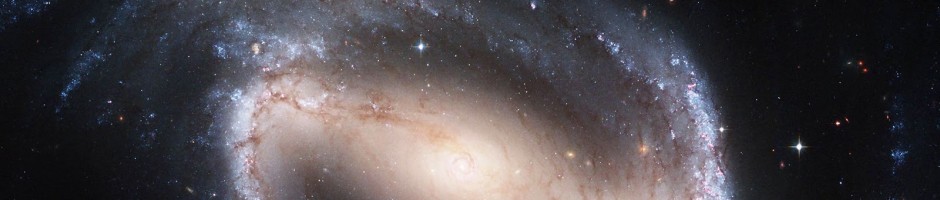
Hubble’s classification is often depicted in a diagram – something which is probably familiar to everyone who has taken an introductory astronomy course. Astronomers call this diagram the “Hubble Tuning Fork”. I have been meaning for a while to make a new version of the Hubble tuning fork based on the type of images which were used in Galaxy Zoo 1 and 2 (OK the prettiest ones I could find – these are not typical at all). Anyway here it is. The Hubble Tuning Fork as seen in colour by the Sloan Digital Sky Survey:

I should say that my choice of galaxies for the sequence owes a lot of credit to an excellent Figure illustrating galaxy morphologies in colour SDSS images which can be found in this article on Galaxy Morphology (arXiV link) written by Ron Buta from Alabama (Figure 48). I strongly recommend that article if you’re looking for a thorough history of galaxy morphology.
Inspired by the “Create a Hubble Tuning Fork Diagram” activity provided by the Las Cumbres Observatory, I also provide below a blank version which you can fill in with your favourite Galaxy Zoo galaxies should you want to. I have to say though, the Las Cumbres version of the activity looks even more fun as they also talk you through how to make your own colour images of the galaxies to put on the diagram.

Anyway I hope you like my new version of the diagram as much as I do. Thanks for reading, Karen.
What is a Galaxy?
What is a Galaxy?
“Any of the numerous large groups of stars and other matter that exist in space as independent systems.” (OED)
“A galaxy is a massive, gravitationally bound system that consists of stars and stellar remnants, an interstellar medium of gas and dust, and an important but poorly understood component tentatively dubbed dark matter.” (Wikipedia)
“I’ll know one when I see one” (Prof. Simon White, Unveiling the Mass of Galaxies, Canada, June 2009)
The question of “What is a galaxy” is being debated online at the moment, after it was posed by two astronomers – Duncan Forbes and Pavel Kroup in a paper posted on the arXiv last week. It’s an article written for professional astronomers, so doesn’t shirk the technical language in the suggestions for definitions, but in a very “zoo like” fashion (and following the model of the IAU vote on the definition of a planet which took place in 2006) invites the readers of the paper to vote on the definition of a galaxy. This has been reported in a few places (for example Science, New Scientist) and everyone is invited to get involved in the debate.
In fact Galaxy Zoo is cited in the press release about the work as one of the inspirations to bring this debate to a vote.
So what’s all the fuss about? Well it all started because of some very tiny galaxies which have been found in the last few years. There has been a debate raging in the scientific literature over whether or not they differ from star clusters, and where the line between large star clusters and small galaxies should be drawn. It used to be there was quite a separation between the properties of globular clusters (which are spherical collections of stars found orbiting galaxies – the Milky Way has a collection of about 150-160 of them) and the smallest known galaxies.

The globular cluster Omega Centauri. Credit: ESO
For example globular clusters all have sizes of a few parsecs (remember 1 parsec is about 3 light years), and the smallest known galaxies used to all have sizes of 100pc or larger. Then these things called ‘ultra compact dwarfs’ were found (in 1999), which as you might guess are dwarf galaxies which are very compact. They have sizes in the 10s of parsec range, getting pretty close to globular cluster scales.

UCDs in the Fornax Cluster. The background image was taken by Dr Michael Hilker of the University of Bonn using the 2.5-metre Du Pont telescope, part of the Las Campanas Observatory in Chile. The two boxes show close-ups of two UCD galaxies in the Hilker image. (Credit: These images were made using the Hubble Space Telescope by a team led by Professor Michael Drinkwater of the University of Queensland.)
Such objects begin to blur the line between star clusters and galaxies.
And there are things which have been called ‘ultra-faint dwarf spheroidal (dSph) galaxies’. These look nothing like the kind of galaxies you’re used to in SDSS images, although they were found in SDSS data – but perhaps not how you might expect. Researchers colour coded the stars in SDSS by their distance, and looked for overdensities or clumps of stars. So far several concentrations of stars at the same distance have been found. Some were new star clusters, but some look a bit like galaxies. If these are galaxies they are the smallest know, with only 100s of stars. Some are so faint that they would be outshone by a single massive bright star.

A map of stars in the outer regions of the Milky Way Galaxy, derived from the SDSS images of the northern sky, shown in a Mercator-like projection. The color indicates the distance of the stars, while the intensity indicates the density of stars on the sky. Structures visible in this map include streams of stars torn from the Sagittarius dwarf galaxy, a smaller 'orphan' stream crossing the Sagittarius streams, the 'Monoceros Ring' that encircles the Milky Way disk, trails of stars being stripped from the globular cluster Palomar 5, and excesses of stars found towards the constellations Virgo and Hercules. Circles enclose new Milky Way companions discovered by the SDSS; two of these are faint globular star clusters, while the others are faint dwarf galaxies. Credit: V. Belokurov and the Sloan Digital Sky Survey.
The paper suggests as a minimum that a galaxy ought to be gravitationally bound, and contain stars. They point out that this definition includes star clusters as well as all galaxies, so suggest some additional criteria might be needed. They make a list of suggestions, which we are invited to vote on. For full details (and if you are technically minded) I refer you to the paper. It’s a lesson in gravitational physics in itself (although as I said it is aimed at professional astronomers). Here is my potted summary of the suggestions they make:
1. Relaxation time is longer than the age of the universe. Basically this means that the system ought to be in a state where the velocity of a star in orbit in it will not change due to the gravitational perturbations from the other stars in a “Hubble time” (astronomer speak for a time roughly as long as the age of the universe). This will exclude star clusters which are compact enough to have shorter relaxation times, but makes UCDs and faint dSph be galaxies.
2. Size > 100 pc (300 light years). Pretty self explanatory. Sets a minimum limit on the size. This makes the UCDs not be galaxies.
3. Should have stars of different ages. (a “complex stellar population”). The stars in most star clusters are observed to have formed all in one go from one massive cloud of gas. But in more massive systems not all the gas can be turned into stars at one time, so the star formation is more spread out resulting in stars of different ages being present. However there are some (massive) globular clusters which are know to have stars of different ages, so they would become galaxies in this definition.
4. Has dark matter. Globular clusters show no evidence for dark matter (ie. their measured mass from watching how the stars move is the same as the mass estimated by counting stars), while all massive galaxies have clear evidence for dark matter. The problem here is that this is a tricky measurement to make for UCDs and many dSph, so will leave a lot of question marks, and may not be the most practical definition.
5. Hosts satellites. This suggests that all galaxies should have satellite systems. In the case of massive galaxies these are dwarf galaxies (for example the Magellanic clouds around the Milky Way), and many dwarf galaxies have globular clusters in them. But there are some dwarf galaxies with no known globular clusters, and UCDs and dSph do not have any.
The paper finished by describing some of the most uncertain objects and provides the below table to show which would be a galaxy under a given definition. I’ve tried to explain what some of these all are along the way, and here is a short summary:
Omega Cen (first image above) is traditionally thought to be a globular cluster (ie. not a galaxy). Segue 1 is one of the ultra faint dSphs found by counting stars in SDSS images (3rd image). Coma Berenices is a bit brighter than a typical ultra faint dSph, and a bit bigger than a typical UCD. VUCD7 is (the 7th) UCD in the Virgo cluster (not the most imaginative name there!), so simular to the Fornax cluster UCDs shown in the second image. M59cO is a big UCD – almost a normal dwarf galaxy but not quite. BooII (short for Bootes III) and VCC2062 are objects which may possibly be material which has been tidally stripped off another galaxy. Or they might be galaxies.

Anyway if you’re interested you can join in the debate here. And if you read the paper you can vote. I voted, but I think in the interest of letting you make up your own mind I’m not going to tell you what my decision was.
Oh and I just started a forum topic on it in case you want to debate inside the Zoo before voting.
Want to help Waveney with his research?
Clicks are needed at the Irregulars Hunt: http://www.wavwebs.com/GZ/Irregular/Hunt.cgi
Taking Citizen Science Seriously
Today’s post is from forum member Waveney who is embarking on his own science project:
Three years ago I stumbled upon the Zoo, started clicking, wandered into the forum and made friends. Then there was a request by Chris on the forum for people to check images for mergers, for which I wrote a website in 4 hours (including leaning SQL). This software with modifications has been used for all three Pea hunts, the Voorwerpje hunting, a few private hunts and for the Irregulars Project.
A couple of years ago Kevin asked for ideas for a student project. Several ideas were made, including the irregulars. After the student went on to do something else (Peas), Jules and I carried on talking. As the Zoo was quiet (between Mergers finishing and Zoo2 starting), we launched our own project to categorise the irregular galaxies in the forum topic. This was endorsed by Chris, who initially acted as the project’s supervisor.

What an amazing shape – what causes this?
There has been a lot of work on the big impressive ellipticals and spirals, on mergers and detailed studies on a few nearby irregulars. However there has not been a large scale quantitative study of them. The project aims to fill that gap. We are using data originally collected by the Forum, not used by any of the Zookeepers so are not treading on anybody’s toes.
What are irregulars?
These are the galaxies that don’t fit into any other category. They are not elliptical, they are not spiral, they are not involved in a merger. In general they are small, numerous and most are blue with star forming regions. Are they one homogenous group or is their more than one type? Are their old irregulars? Where are they? How do they compare with other galaxies? These are just a few of the questions the project is looking at.
How I started the project:
We started with the galaxies reported in the irregular topic on the forum, added those from a few related topics and started. Alice joined us in a supporting role and Aida came on board finding lots of other candidates, others have contributed lists and now the potential list is nearly 20,000 strong. I have managed the clicking on this in three data sets, the first 3,000 was the early reported – bright ones, then next 2,500 continued with the list in order of reported. However in the third set (nearing completion) I brought forward all those with spectra, so it contains 1500 ordinary candidates and another 2000 with spectra.
The website was setup (Note this has an independent login from the rest of the Zooniverse). It asks 10 questions about each image: is it an irregular, the clarity of the image, bright blue blobs, apparent proximity to other galaxies, appearance of any core, bar, arms or spiral structure.

How would you classify this?
What has been done so far:
Jules has looked at their 2D distribution across the sky and estimated the number that are too faint for SDSS to have taken their spectra. I have already studied the colour properties of irregular galaxies, their metallicity, masses and star-forming rates, hunted for AGNs (none found so far in irregulars), the equivalent width of the [OIII] 5007Å line in the same way that the Peas were analysed and the non-applicability of Photo Z algorithms for estimating Z without spectra to irregulars. I am currently studying galaxy density around irregulars (in 3D) and am looking for clusters of irregulars. I have not yet used the sub classification of the irregulars, just the “is it an irregular property” – this will come.
The project went rather quiet last year – I was terribly over worked and ended up with no spare time, this has changed recently and I have gone back and started looking again at the work we have done and thinking how to take it further. What is being found should be published – how does one do it? When the project had Chris as a supervisor the route was clear, I need to work with somebody in academia so I can present results, bounce ideas off, get ideas from and work with. Relying on the spare time of Zookeepers is not a satisfactory option – why not pay for the time. Then I thought back to a throwaway comment of Chris a year or so ago that “I had done half a PhD” – I recognise this means I have done 10%, but it got me thinking – why not do it properly. I don’t want to do this full time, I have a very full time job – but could I do it part time. Does the Open University do part time PhDs – a quick web search yes it does…
So I have signed up to take a part time PhD at the Open University on the irregulars. This will take several years, I will fund it myself. I am not totally new to doing formal research, in my professional life I had a lot to do with telecoms research: Proposing, taking part in, managing and cancelling many projects both company and EU funded at research houses and Universities, covering everything from social science through home networks to optical switching. I have even been on the other side of the table reviewing a couple of PhDs.
At this point I have applied, have a supervisor, met them once. Chris and Bill are my referees. The formal interview is in March and the formal start of the PhD is in September. However I am working hard looking at your results, reading, analysing, thinking and writing this.
I have created a blog on the forum to report day to day progress.
P.S. I could use a few more clicks.
From data to art
When I started writing my post series about the HST (which will be continued soon), I got an email from Zolt Levay from STScI in Baltimore (Space Science Institute, ‘Hubble headquarters’) about how the beautiful HST images are actually made there. We then decided that he would write this up as one of the posts here and we would post it once the GalaxyZoo: Hubble explanations are online on how those special images are made. Now that this has happened, it is time to posts Zolt’s much more general post here.
Enjoy!
Boris
______________________________________________________________

Star-forming region NGC 3603 from Hubble Space Telescope and Wide Field Camera 3
Thanks to Boris for inviting me as a guest blogger here. I have been fortunate to be able to work on the Hubble Space Telescope mission for quite some time. I have spent a lot of that time working with Hubble images. I wanted to use this opportunity to say a few words about how Hubble’s pictures come about. Along the way I hope to give a flavor of the sorts of choices we make to present the pictures in the best possible way, to answer some questions and to correct some possible misconceptions.
The images we see from Hubble and other observatories are a fortunate by-product of data and analysis intended to do science. Hubble’s images are especially high quality because they don’t suffer the distorting effects of the atmosphere since Hubble is orbiting high above the Earth. I won’t go into a lot more detail about Hubble’s technology since Boris has described that nicely in his post “Why build the Hubble Space Telescope?“.
We do aim to produce images that are visually interesting and that reproduce as much as possible of the information in the data. I should also say that these techniques are not unique to Hubble. The cameras used at every large telescope operate pretty much the same way and the same techniques are used to produce color images for the public.
We begin with digital images from Hubble’s cameras, which are built for science analysis. The cameras produce only black and white images because they are designed to make the most precise numerical measurements. They do include a selection of filters which allow astronomers to isolate a specific range of wavelengths from the whole spectrum of light entering the telescope. The black & white (or grayscale) data include no color information other than the range of wavelengths/colors transmitted by the filter. By assigning color and combining images taken through different filters, we can reconstruct a color picture. Every digital camera does this, though it happens automatically in the most cameras’ hardware and software.
We produce color images using a three-color system that reflects the way our eyes perceive color. Most of the colors we can see can be reproduced by a combination of three “additive primary” colors: red, green and blue. Every color technology depends on this technique with some variations: digital cameras, television and computer displays, color film (remember that?), printing on paper, etc.

Stephan's Quintet HST WFC3 grayscale images
Here are three images of the group of galaxies known as Stephan’s Quintet from Hubble’s new Wide Field Camera 3 (WFC3). The three exposures were made through different filters: I-band, transmitting red and near-infrared light (approximately 814nm in wavelength); V-band (yellow/green, 555nm), and B-band (blue, 435nm). It may not be obvious, but if you examine the image closely you can see there are differences between them. The spiral arms of the galaxies are more pronounced in the B image while the central bulges are smoother and brighter in the I.

Color applied to separate images
We can then assign a color (or hue) to each image. Two things mainly drive which colors we choose: the color of the filter used to take the exposure and the colors available in the three-color model. In this case we assign red to the I-band or reddest image, green to the V-band, and blue to the B-band or bluest image, which are pretty close to the visible colors of the filters. When we combine the separate color images, the full color image is reconstructed.

Reconstructed color composite of Stephan's Quintet
Because the colors we assigned are not too different from the visible colors of the filters, the resulting image is fairly close to what we might see directly. At least the colors that appear are consistent with the physical processes going on in the galaxies. The spiral arms trace regions of young, hot stars that shine with mostly blue light. The disks and central bulges of the galaxies are mostly made up of older, cooler stars that shine more in red light. Individual brighter stars — foreground stars in our own galaxy — show different colors based on their temperatures: cooler stars are redder, hotter stars are bluer.
We can apply some adjustments to make the picture more snappy and colorful, similar to what any photographer would do to improve the look of their photos. We also touch up some features resulting from the telescope and camera; that explanation may be something that can waits for another post.
Depending on the selection of filters — driven by science goals — and color choices, the images can be shown in various ways. But the motivation behind these and other subjective choices is always to show the maximum information that is inherent in the science data, and to make an attractive image, but also to remain faithful to the underlying observations. We don’t need to heavily process the images; they are spectacular not so much because of how they are processed, but because they are made from the best visible-light astronomy data available.
A variation on this image blending technique needs to be applied with filters that don’t correspond to the standard color model. Narrow-band filters are designed to sample the light emitted by particular elements (hydrogen, oxygen, sulfur, etc.) at specific physical conditions of temperature, density and radiation. These filters are used mostly to observe and study nebulae, clouds of gas and dust that glow because they are illuminated by strong radiation from nearby stars. This very diffuse gas emits light at very, narrow ranges of wavelengths so the color can be very strong or saturated. Some of the most spectacular images result from these clouds that come in all sorts of shapes and textures.
The wrinkle with this sort of observation is that the colors of the filters rarely match the primary colors we would like to use to reconstruct the images. We can choose to reconstruct the color image either by applying the color of the filter, by using the standard primaries or something else entirely. In general a more interesting image results from shifting some of the filter colors. The resulting colors are definitely not what we might see live through a telescope, but they do represent real physical properties of the target.
Here are some images of a pillar in the Carina Nebula, taken to celebrate Hubble’s 20th anniversary in 2010. The filters sample light emitted by atoms of hydrogen, sulfur and oxygen. The hydrogen and sulfur both emit red light and the oxygen is cyan (blue-green). The colors and brightness of emission from the various elements depends on the physical conditions in the nebula such as temperature and pressure, as well as the quantity and energy of radiation from surrounding stars causing the clouds shine.

Separate narrow-band images of a pillar in the Carina Nebula from HST WFC3
When we apply the colors appropriate to the filters and make a color composite, the separate images look like this:

Color applied to grayscale images of Carina Pillar
And the composite color image looks like:

Reconstructed color composite of Carina Pillar
It’s an interesting image, but doesn’t include a wide range of colors because we are starting with only two colors, red and cyan. Let’s try something a little different and shift the colors around a bit:

Primary colors applied to grayscale images of Carina Pillar
Here we are using red for the sulfur (the reddest, longest wavelength filter), green for the hydrogen and blue for the oxygen. It may be a little disconcerting; many people know that hydrogen usually shines in red light, but here we are showing it in green. But sulfur also shines in red light here, so the only way to visualize the structures that result from differences between the hydrogen and sulfur is to shift the colors.

Color composite of Carina Pillar from HST WFC3
If we make the color composite in this way though, see that we now have a fuller range of colors, like an artist’s palette with many more different paint colors. The combinations of colors (like mixed paints) in the composite image result from real differences between the emission coming from the various elements. If they are rendered in the same color those differences are eliminated in the composite. But if we separate their rendered colors, we can show more of the information inherent in the data.
Thanks again for the opportunity to contribute here. I hope this answers some questions about where Hubble’s color images come from. We all hope that Hubble continues beyond its extraordinary 20+ years of amazing science and we can see even more spectacular cosmic landscapes.
Fake? AGN Galaxies!
Hidden deep inside the center of most massive galaxies is a central super-massive black hole. However, a in a few percent of galaxies, the black hole is growing in size by accretion of matter. These galaxies are called Active Galactic Nuclei (AGN) . By studying these galaxies we can piece together the picture of how galaxies assemble themselves, growing as stars form and their central super-massive black holes accrete matter. In the local universe , we used Galaxy Zoo’s classifications of AGN host galaxies for a study that revealed “The fundamentally different co-evolution of super-massive black holes and their early- and late-type host galaxies”.
But to really understand how most galaxies were built up, we need to look farther back in time, out to where most galaxies in the present day universe were growing most of their mass. Because the light from distant galaxies takes so long to reach us, in Hubble Zoo we are able to see galaxies as they were in the distant past. (In Hubble Zoo most of the galaxies we see are images from ~ 5-7 billion years in the past !). However, as you may have noticed, the Hubble Zoo galaxies appear much smaller. Because the light emitted near an actively growing black hole can be comparable to the light that we see in from an entire galaxy, in Hubble Zoo we have to be careful when classifying galaxies with these luminous centers. To understand what we’re seeing, a team of Galaxy Zoo Scientists have created images, artificially adding the luminous centers of AGN to some of the Hubble Zoo galaxies. These Fake AGN will allow us to determine if how accurately we can classify the host galaxies of the actual AGN in the Hubble Images.
Hanny's Voorwerp and Hubble
And here they are! The Hubble Space Telescope results on Hanny’s Voorwerp (and IC 2497) were just released during the Seattle meeting of the American Astronomical Society. You can see the press release and download several formats of the main image from STScI, download the poster presentation from the meeting, and view the abstract of the meeting presentation, but we can give you the whole story in detail here on the GZ blog. But before that, here’s the money shot:

This combines different filter sets for IC 2497 and Hanny’s Voorwerp, to give the best overall view in a single image. The Voorwerp shows up in [O III] and Hα emission, close to natural color were our eyes sensitive enough. The galaxy IC 2497 is rendered from red and near-IR filters, so it’s a bit redder than we see in other images (for example, from the SDSS or WIYN data). This version does a very attractive job of contrasting the two objects in both color and texture; for reasons you’ll read below, Zolt Levay and Lisa Frattare at STScI had a daunting task to make a single image look this nice from our disparate data sets.
Looking back, we proposed these observations early in 2008, as it was just becoming clear what an interesting object the Voorwerp is and what the right questions might be. It was our good fortune that these observations remained relevant with all we’ve leaned since then, including radio and X-ray measurements. Each data set was specified with a particular goal as to selection of filter or diffraction grating, location, and exposure time. We had images and spectra, the latter looking for material very close to the nucleus of IC 2497 so we could zero in on what’s happening there with much less confusion from its surroundings than we get from the Earth’s surface. Full details of the observation planning appeared in this blog post after our proposal was approved.
The released image product combines four filters and two cameras – the Wide Field Camera 3 (WFC3), installed during the 2009 shuttle servicing mission, and the Advanced Camera for Surveys (ACS), electronically repaired during that mission. WFC3 offers superior sensitivity and small enough pixels to exploit the telescope’s phenomenal resolution, while ACS has a set of tunable “ramp” filters that allow us to observe the wavelength of any desired spectral feature at a galaxy’s particular redshift. Our WFC3 images were designed to look at IC 2497, at wavelengths deliberately minimizing the brightness of the gas in the Voorwerp so we could also look for star clusters in its vicinity, that might tell us whether its gas came from a disrupted dwarf galaxy. (This turned out to be a good idea for a slightly different reasons). Our filter choices included one in the near-infrared, at 1.6 micrometers; one in the deep red, close to the SDSS i band, and one in the ultraviolet. Comparing these, we would be able to say something about the age of any star clusters we found. The UV image would also show whether there were any particularly bright clumps of dust, which could serve as “mirrors” so we could later measure the spectrum of the illuminating light source.
The ACS narrow-band filter data were designed to probe the Voorwerp itself, seeking fine structure that is blurred away in ground-based images. We use both the strong [O III] emission (which made it so recognizable when Hanny picked it up from the SDSS images), and the Hα line of hydrogen. Their ratio changes as the conditions ionizing the gas change, so we could watch for variations as conditions differ from place to place. This also netted us gains we hadn’t quite asked for. We also had to work for them. it was known before its repair that the CCD detectors on ACS had suffered from exposure to energetic particles in space during its decade in orbit; all such devices do to some extent. One result of this cumulative damage is that they don’t transfer charge as efficiently as they originally did, and in particular, after being struck by a charged particle (“cosmic ray”), when the image reads out, the detector registers not only a bright spot (which is easy to filter out) but a long trail, so long that it’s not at all easy to filter out without blacking out much of the image. The situation improves if you combine two images, moving the telescope slightly in between them. That lets the software reject the bright cosmic-ray spots, but even after tuning the rejection parameters, the streaks still remain down the device rows. We ended up using what we knew about the remaining trails to filter them out, at the expense of losing the dimmest, smooth regions of emission. Fortunately, these dim regions don’t have enough signal to show new features in Hubble data, so we used ground-based images to fill them in around the edges and in the fainter interior regions of the Voorwerp. This panel shows four successive stages in the process:

Processing steps for HST image of Hanny's Voorwerp
Now, as proud as I am of fixing this all up, you don’t really care – you want to know what we’ve actually learned from Hubble. I’m with you – here goes!
Stars are forming in a small part of the Voorwerp. We couldn’t see this from the ground because the regions involved are dim and blend with the overall gas emission. Hubble shows them in two ways. Our filters selected to minimize emission from the gas show bright blue spots, with the size and brightness of young star clusters, in a single area only 2 arcseconds long (about 2 kpc, 6500 light-years). Because the deep-ultraviolet spectrum of starlight is quite different than from an AGN, we see a second signature – the balance between light from [O III] and Hα tips in favor of Hα , again very different from the highly ionized gas elsewhere. In the picture at the top, that makes the star-forming regions show up as the reddish spots near the top bright region of the Voorwerp. These gaseous regions are likewise so small and comparatively dim that we couldn’t see them in even our best ground-based data. The hottest stars are so bright that it’s hard to tell how long these clusters have been forming stars; we know that they include stars so hot that they can be no more than a few million years old. It seems suspicious that we see these star-forming regions only in a small area, which lies closest to IC 2497 at least in our view (we don’t have enough information to be sure it’s really the part closest to the galaxy), and roughly lined up along the direction of outflowing material seen with radio telescopes. This all suggests that the star formation has been set off by compression as gas outflowing from the galaxy encounters the gas in the Voorwerp. We don’t see such star clusters anywhere else in the enormous trail of cold hydrogen of which the Voorwerp is the illuminated part, so their occurrence is connected to the Voorwerp specifically.
This kind of event – an active galactic nucleus blowing gas outward and driving formation of new stars – is one form of feedback, connections between AGN and their surrounding galaxies that seem to be important in regulating aspects of galaxy evolution. We see this process in some other galaxies, in some cases much more intensely than in Hanny’s Voorwerp. A favorite example is Minkowski’s Object, a brilliant emission-line object near the radio galaxy NGC 541 at only a third the distance of IC 2497. In Minkowski’s Object, the central AGN is almost solely a radio object, without the ultraviolet output that ionizes Hanny’s Voorwerp. In that case, where we see ionized gas, it’s lit up by hot, newly-formed stars. This object lies right in the path of the jet of radio-emitting plasma from NGC 541, which is disrupted right as it reaches the object; this looks like a cloud of gas, maybe a dwarf galaxy, that was quietly minding its own business until it was hit by a flow of relativistic particles. Star formation is happening over regions of about the same size in both Minkowski’s Object and Hanny’s Voorwerp, but there are important differences: gas is shedding back away from Minkowski’s Object much more violently than in the Voorwerp, the radio jet in NGC 541 is much more powerful than the small one in IC 2497, and it doesn’t have the additional UV output to light up the gas which is not forming stars. The point I take from this is that the outflowing material reaches the Voorwerp, but with only enough pressure to set off star formation in the densest and closest parts, without the massive reshaping we see in some other galaxies.

Minkowski's Object from Hubble Legacy Archive
The Hole This is probably the most obvious structural feature of the Voorwerp (sometimes seen as the space between the kicking frog’s legs). We wondered whether it might mark the site of some kind of titanic explosion, the space where a jet from IC 2497 drilled its way through the gas, or even the shadow cast by some dense cloud close to the galaxy nucleus. What we learned on this was mostly negative – we do not see streamers of gas blasting away from the hole, or the ionization of the gas being any higher near it, as we would expect for a jet or explosion. The idea of a shadow still makes sense, but we’d still like to know more (maybe from some Gemini-North velocity data still being analyzed).
The nucleus has faded dramatically, but it still knows how to make other kinds of fireworks.One idea we have been investigating, since we saw the first spectra, has been that the nucleus of IC 2497 might have faded in its output of ionizing radiation by hundreds of times since the light that we see reaching the Voorwerp left it. (Ignore for a moment the odd complications of verb tenses involved in light-travel time discussions). What Hubble could add is the ability to measure spectra from very small regions free of the mixing with light from the surroundings that occurs from the ground. This way we could get a good look at the nucleus of IC 2497, how much ionization its gas sees, and whether there might be shreds of highly ionized gas peeking through surrounding obscuring dust and gas which otherwise obscures our view. For this we used two spectra (blue and red) with the Space Telescope Imaging Spectrograph, newly restored to service by the astronauts of STS-125. We get a clearer measure of the gas – it sees a slightly weaker ionizing source than we thought from the ground because the gas is mostly closer to the core than we would have thought. This fits with the X-ray data in suggesting that the nucleus isn’t just hidden, it really has faded so we see its echo in the Voorwerp. (To indulge once again in a bit of geekdom, “It’s dead, Jim”.)
Or maybe not so much dead as… transformed. The spectra also show something else that we didn’t know to look for. Only a half arcsecond from the core we see a second set of emission lines, redshifted by about 300 km/second from the nucleus. At this location in the ACS images, we see a loop or bubble of Hα emission. The nucleus has been blasting out material, driving this wave into the surrounding gas. Depending on whether it has been slowed down as it snowplows into these surroundings, and on whether it lies exactly in the disk of the galaxy, this would have started less than about 700,000 years ago. This was probably well before the nucleus faded, but connects to an intriguing idea long suggested from looking at the various kids of active galaxies. There may be two modes of accretion power – one in which most of the energy comes out as radiation, and one in which it emerges as kinetic energy of expelled matter (“radio mode”). Has IC 2497 switched between them almost as we watched?
Here is that expanding loop. At left is the Hα image, showing it sticking out above the nucleus. In the middle is a broad-filter image taken to zero in the pointing to take the spectra – you don’t see the loop because it’s swamped by the starlight. At right, the spectrum near Hα showing the distinct emission-line clouds just above the nucleus.

IC 2497 expanding gas loop
IC 2497 has had a troubled past. It looked a bit odd in our earlier data, but the Hubble images make clear how disturbed this galaxy is. Spiral arms are twisted and warped out of a single plane, and thick dust patches also show that it has yet to settle into a simple form after the disturbance. This looks a lot like the aftermath of a strong interaction – and since we see no other culprit nearby, probably a merger where the other victim is now part of IC 2497. The companion barred spiral just to the east (left) may be only an innocent bystander – it shares the redshift and distance of IC 2497, but is so symmetric and undisturbed that it’s hard to picture it being involved in a collision that wracked the larger galaxy (and tore loose 9 billion solar masses of hydrogen gas from somewhere). These dust patches, plus our better understanding of the Voorwerp’s continuous spectrum aided by the GALEX UV data, now suggest that instead of slightly in front of IC 2497, the Voorwerp is more likely slightly behind it, roughly over the pole of the galaxy. This means that we see the reprocessed radiation via the Voorwerp perhaps 200,000 years after it left the galaxy nucleus. Old news can still be very informative.
Putting it all together, here is the sequence of events that we think led to what we see today. Perhaps a billion years before our present view (which is itself 700 million years behind the times, and there’s nothing we can do about the speed of light), a merger led to IC 2497 forming from two progenitors, with its disk slowly settling but still warped. One product of this merger was an enormous tidal tail of gas, which came to stretch nearly a million light-years around IC 2497. During this process, material accreted into its central supermassive black hole, rapidly enough to produce the energy output of a central quasar as a byproduct, and illuminating and ionizing gas that was exposed to its radiation, to make the Voorwerp. About a million years before we see it, it started to blow material away (and this may have been when its radio jet and outflow started). Then, later still, the core faded, maybe as its energy output switched from being mostly in radiation to mostly powering the motion of material out of the galaxy. And now we see Hanny’s Voorwerp as a very lively echo of the past, as the last radiation from the fading core aces outward but has yet to complete the zigzag trip from galaxy to Voorwerp to us.
Of course, we’d like to test these ideas further. There are plans to improve the spectral mapping, and perhaps look at the history of star formation to tell when things happened to IC 2497. And we want to see whether this behavior is at all common in galactic nuclei – if so, there may have been more active galaxies lately than we thought, and it would change how we think about the relation between “normal” and active galaxies. Zooites have pushed us along greatly in finding smaller cousins – voorwerpjes. But that was a separate meeting presentation…
Live blog : Voorwerp press conference
As anyone who’s been following the twitter feed in the last few days knows, today is a very exciting day for Galaxy Zoo as the long-awaited Hubble Space Telescope image of Hanny’s Voorwerp is released. Kevin has already shown the image in a science talk this morning, and Bill’s poster is up in the conference hall giving more details, but the official release is in just a few minutes. I’m writing live from the press conference room at the American Astronomical Society’s meeting in Seattle, sitting next to the object’s discoverer and namesake Hanny van Arkel and Zooniverse developer Rob who will be keeping twitter up to date.
There’s a separate, long post from Bill ready to go live describing the results, including some very exciting new details, but I’ll use this post to keep you up to date with what happens in the press conference itself.
Three minutes to go…
12.44 : Kevin and Bill are on stage, alongside Leo Blitz of the University of California and Amy Reines from the University of Virginia, who will also be talking about their work during the conference.
12.47 : Press conference starting, but what’s this?
Hubble views Hanny’s Voorwerp
12:52 : Introductions from Rick Feinberg, AAS press officer are over, and Bill’s taking the stand.
12:54 : Bill : ‘Conclusive proof that we have seen a quasar turn off’. Giving the background to the Voorwerp, and introducing Hanny, who immediately became the focus of every camera in the room.
12.56 : The image appears on screen. It looks terrible under the press room lights. Go to the online version, everyone!
12.58 : On to Kevin – the quasar is either hidden or has shut down, in which case the Voorwerp would be an echo of light, not of sound. In the meantime, for those wanting gory details Bill’s blog post is up.
13:00 : IC 2497 does shine in x-rays, but it’s like looking for a floodlight through a bank of fog and finding only a laser pointer – totally inadequate to light up the Voorwerp.
13:04 : In fact, the difference is at least 10,000 times. The timescale on which the reduction must have happened is now believed to be 200,000 years or less (we used to think 70,000 years or less).
13:06 : Back to Bill for one of the major results from Hubble : The bright area close to IC2497 is an area of star formation – so the interaction is triggering star formation in the Voorwerp. We couldn’t have seen this without Hubble, but it fits with the Westerbork radio results that showed evidence for a jet and larger outflow of gas in this direction. We think these are compressing the gas – rather as happens in Minkowski’s object (which was mentioned in my original Voorwerp paper). Much milder in the Voorwerp, though.
13:10 : Spectrum of the main galaxy confirms x-ray results – but we also cut across another area, which seems to be a bubble being blown into the disk of the galaxy – another aspect of an outflow of gas fostered by the nucleus of IC 2497.
13:15 : Bill again : We think that one reason this object is important is because it would be a coincidence for us to get lucky only once, with the nearest quasar. The Galaxy Zoo volunteers have poured through 15,000 candidate images and found 18 related objects – which have been confirmed by follow up. Being presented in another poster, the lead author of which is a Galaxy Zoo volunteer (and undergraduate on a summer program).
13:15 : Dodgy internet connection – sorry! We’re going to try a ustream chat with Kevin, Bill and Hanny after the conference ends. I see Hanny’s mother is watching – we can confirm she’s been very well behaved.
13:22 : Leo Blitz moves us away from the Voorwerp – They believe they’ve found a missing link between galaxies that form stars and those that are dead. A major topic of astronomical interest is how galaxies loose their gas and become old, red and dead. NGC 1266 is an unremarkable galaxy, slightly less massive and smaller than the Milky Way. It has an active galactic nucleus, but to all appearances is otherwise dead. Observations of the molecular gas from which stars mind form show that it’s concentrated in the nucleus of the galaxy. Excitingly, it appears to be fueling a wind that’s been blowing for more than 2.5 million years, and moving fast enough to escape the galaxy. About 13 Sun’s worth of gas escapes each year, and so in about 85 million years’ time, at the current rate, the gas will have been exhausted and the galaxy will have completed its transition to an old galaxy.
13:26 : Our final speaker, Amy Reines, is introducing us to Heinze 2-10. It’s a small galaxy, and yet it hosts a super-massive black hole. In fact, the black hole is the same size as that in the Milky Way but the galaxy is closer to the Milky Way’s satellite galaxies, the Magellenic clouds.
13:30 : Possibly explanation is that black holes form before the bulges at the center of the galaxies do – which would answer an age-old chicken and egg problem! Now on to questions – my laptop is dying, but I’ll hang on as long as I can.
13:36 : Good question on Twitter from Ann Finkbeiner – ‘if the galaxy is 650 million LY away and the quasar turned off 200,000 years ago, how come we’re now seeing it with no quasar?’. We mean that we’re now seeing light that was emitted no more than 200,000 years after the quasar switched off.
When do we see the Hubble results? The final countdown.
Now it can be told – the Hubble results on Hanny’s Voorwerp and IC 2497 will be released in a press conference on Monday, January 10, at 12:45 p.m. Pacific Standard Time. This is during the meeting of the American Astronomical Society in Seattle, where two presentations will discuss recent work on Hanny’s Voorwerp (and a couple of additional poster papers deal with “voorwerpjes” from the Zoo). You will see some familiar names on the press event schedule, and more should be there for the event itself (we’re keeping a little bit of mystery still). That time converts to 2045 UT, 2145 in the Netherlands, and so on). At that time, the processed color display images will also be visible and available for download. Watch the blog – we will have a lot more to say at that time, with full background on what the data show and what it means.
Keep in mind – there will be a lot more detail to see than this image from the WIYN telescope shows! Not only that, but the Hubble data span from the ultraviolet to the near-infrared. That let us pick out PHRASE EMBARGOED and quite unexpectedly, see TOPIC NOT YET RELEASED. Only 11 days to go – I really need to get our presentation graphics finished!

Galaxy Zoo Multi Mergers
Our latest merger paper is called “Galaxy Zoo: Multi-Mergers and the Millennium Simulation.” We used the original catalogue of 3003 mergers from the previous mergers study to find the interesting subset of systems with three or more galaxies merging in a near-simultaneous manner. We found 39 such multi-mergers (which you can see in the image below) and from this we estimated the relative abundance of such multi-mergers as being ~2% the number of binary mergers (which were themselves ~3% the number of isolated ‘normal’ galaxies). We also examined the properties of these galaxies (colour, stellar mass and environment) and compared them to the properties of galaxies in isolated and binary-merger galaxies; we found that galaxies in multi-mergers tend to be more like elliptical galaxies on average: they’re large, red and in denser environments.

Describing what we see in the world is all well and good, but the equally important thing in science is to compare what we see with what others have claimed to see or to have predicted through theory. Since ours is effectively the first such catalogue of multi mergers, there simply are no other observational sets to compare to. We therefore compared these merger fractions and galaxy properties to a large and well-known simulation called the Millennium Run. This is a cosmic scale simulation of Dark Matter that starts off smoothly distributed (similar to the CMB) within a 500 Mpc box and, over time, clumps together to form structures. Now, galaxies are of course made out of normal matter, so to model how galaxies form and evolve within the Dark Matter, one can take the resulting clumps of Dark Matter from the simulation and, using sensible sounding rules (e.g. bigger Dark Matter clumps get more normal matter because they’ll gravitationally attract more), come up with predictions for numbers of stars formed within the simulation (and where, when, etc.). This means that one can create (with enough fiddling) predictions of what galaxies will look like in such a Dark Matter dominated Universe. These are called ‘Semi-Analytic Models’ and are an important strategy for simulating the Universe since computers would struggle to compute the many many additional interactions between particles in a full N-Body simulation with both Dark Matter and normal matter (Dark Matter is relatively easy since it only feels the 1/r^2 force of gravity).
So what we did in the paper was to compare the results of our multi-merger galaxies to those of the Semi-Analytic Models in the Millennium Simulation (double ‘n’ because it’s a largely German initiative). This is a good test of the Semi Analytic Models because there is no way they could have been fiddled to get the right answer because ours is the first such observational constraint on what multi-mergers look like. And what we found is that the Simulation did rather well – it predicted the relative abundance of multi-mergers to within a few percent and it predicted that galaxies in these systems should have properties more like a typical elliptical rather than a typical spiral. This gives us independent confidence that these Simulations are on the right track and that the assumptions that went into them are sensible ways to get at how the Universe behaves.
In the future, the Galaxy Zoo interface might well allow users to indicate the presence of multi-mergers!
Many thanks to you all for your help in making this interesting study happen.
