
First Result from Galaxy Zoo Hubble
Posted on behalf of Tom Melvin:
Hello everyone, my name is Tom Melvin and I’m a 3rd year PhD student at Portsmouth University. I have been part of the Galaxy Zoo team for over two years now, but this is my first post for the Galaxy Zoo blog, hope you enjoy it!
I’m very happy to bring you news of the latest paper based on Galaxy Zoo classifications, and the first paper based on Galaxy Zoo: Hubble classifications. Galaxy Zoo: Hubble was the first Galaxy Zoo project to look at galaxies beyond our local universe, using the awesome power of the Hubble Space Telescope. These images contained light from galaxies which have taken up to eight billion years to reach us, so we see them as they appeared eight billion years ago, or when the universe was less than half its current age! So what is the first use of this data? Well, we combine our Galaxy Zoo: Hubble classifications with Galaxy Zoo 2 classifications to explore how the fraction of disk galaxies with galactic bars has changed over eight billion years.
Here’s the title…..

Our work is based on a sample of 2380 disk galaxies, which are from the Cosmic Evolution Survey (COSMOS), the largest survey Hubble has ever done. To see how the bar fraction varies over such a large time-scale, we look at the number of disk galaxies and what fraction of them have bars in 0.3 Gyr (300 million year) time steps. In Figure 1 we show that eight billion years ago only 11% of disk galaxies had bars. By 4 billion years ago this fraction had doubled, and today at least one third of disk galaxies have a bar.

Figure 1: The evolving bar fraction with cosmic time (Figure 7 in the paper).
We know that bars tend to only form in disk galaxies which have low amounts of atomic gas and are in a relaxed state, or what we call ‘mature’. Combining this knowledge with our observations, we can say that, as the Universe gets older, the disk galaxy population as a whole is maturing. To see whether this is true for all disk galaxies, we split our sample up into three stellar mass bins, allowing us to look at the evolving bar fraction trends for low, intermediate and high mass disk galaxies.

Figure 2: Mass dependent evolution of the bar fraction with cosmic time (Figure 8 in the paper)
The results for this are shown in Figure 2, where we observe an intriguing result. The bar fraction increases at a much steeper rate with time for the most massive galaxies (red), compared to the lower mass galaxies (blue). From this we can say that the population of disk galaxies is maturing across the whole stellar mass range we explore, but it is predominantly the most massive galaxies which drive the overall time evolution of the bar fraction we observe in Figure 1.
At the end of the paper we offer an explanation as to why the time evolution of the bar fraction differs for varying stellar mass bins. We can make the reasonable assumption that, by eight billion years ago, the majority of massive disk galaxies have formed, and have been, and continue to form bars up to the present day – hence the steeply increasing bar fraction we observe. However, the same assumption is not true for the low mass galaxies. There are some which are ‘mature’ disk galaxies eight billion years ago, but not all are ‘mature’ enough to be classified as disks. As with the most massive galaxies, these low mass disks are forming bars at a similar rate up to the present day, but the difference with this low mass sample is that there are still low mass disks forming up to the present day as well – leading to the much shallower increase in the bar fraction with time we observe.
In addition to these results, we are also able to present an interesting subset of disk galaxies. Your visual classifications has allowed our work to include a sub-sample of ‘red’ spiral galaxies (like those found from Galaxy Zoo 2 classifications). This sub-sample is generally omitted from other works that have explored this topic, as their way of identifying disks is based on galaxy colours. This means that these ‘red’ galaxies would have been classified as elliptical galaxies! Figure 3 shows a few of these ‘red’ disk galaxies (with the full sample of 98 here), so why don’t you take a look and decide for yourself! Not only is it very cool that you are able to identify these ‘red’ disks, but they also influence the results we observe. Just like in our local universe, these ‘red’ disks have a high bar fraction, with 45% of them having a bar! Could this be a further sign that bars ‘kill’ galaxies, even at high redshifts?
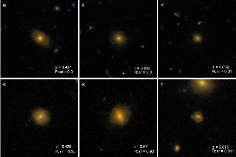
Figure 3: A sample of ‘red’ disk galaxies found by Galaxy Zoo volunteers (Figure 10 in the paper).
So that is a summary of the first results from Galaxy Zoo: Hubble. If you want more detail have a read of the paper in full here and take a look at the press release too! Thanks for all your hard work and help in classifying these galaxies!
Posted on behalf of Tom Melvin.
Galaxy Zoo and undergraduate research: spiral arms, colors, and brightnesses
The guest post below is by Zach Pace, an undergraduate physics student at the University of Buffalo. Zach worked at the University of Minnesota during the summer of 2013 through the NSF’s Research Experience for Undergraduates (REU) program. Zach is continuing to work with Galaxy Zoo data as part of his senior thesis.
Hi, everyone–
My name is Zach Pace. I’m an undergraduate physics student from the University at Buffalo, and I’ve been working on the Galaxy Zoo 2 project at the University of Minnesota since late May with Kyle Willett and Lucy Fortson. My investigation has been twofold: I have been diagramming specific morphological categories in color-magnitude space, and also fitting those data to mathematical functions.
As many readers probably know, a galaxy’s magnitude (overall brightness in the red band, on a log scale) and a galaxy’s color (the difference between the blue magnitude and a red band) are two important quantities for determining what a galaxy might look like (and how it might evolve). Brighter galaxies have more mass (more stars produce more light, of course), and bluer galaxies have a more recent star formation history (this is because young, bright stars tend to be large, bright, and blue). In terms of the whole population, we know, for instance, that elliptical galaxies tend to concentrate in a red sequence, and have typical colors between 2.25 and 2.75. Conversely, the vast majority of spiral galaxies concentrate in a blue cloud between colors 1.25 and 2.0. These two populations are clearly separated in color-magnitude space (this can be seen in the accompanying 2-D histogram, made from Zoo 2 data).

Color-magnitude diagram (CMD) for objects in Galaxy Zoo 2. The lines show fits to the two main populations of elliptical (red) and spiral (blue) galaxies, following the method of Baldry et al. (2004). The green line shows an approximate separation between them.
One of the main goals of Zoo 2 is to gauge the extent to which morphology informs physical characteristics like color and magnitude, so my objective for the summer was to come up with good representations of color and magnitude for all of the smaller sub-populations in Zoo 2.
Several of my results were interesting and surprising. For instance, it has been suggested that spiral galaxies with more arms and spiral galaxies with tighter arm winding (which is to say, a shallower pitch angle) tend to be brighter and bluer. This can be intuitively understood as follows: tighter winding of spiral arms and the presence of more spiral arms indicate, on average, denser gas clouds in those arms, which is tied to increased star formation and bluer color. However, I wasn’t able to measure this in the Zoo 2 data (all the differences were on the order of the histograms’ bin size, about 0.1 magnitude, or about a 10% difference in brightness). This suggests that spiral galaxies, no matter arm multiplicity or winding, are drawn from the same base population.

Color-magnitude diagram (CMD) for spirals in GZ2, split by the number of spiral arms identified in each galaxy. The distribution of colors and magnitudes for galaxies are statistically similar, no matter what the number of spiral arms.
I also came across something unexpected when looking at bulge sizes in face-on disk galaxies. The distribution of galaxies classified by users as bulgeless is starkly different from the distribution of obvious bulge and bulge-dominated galaxies. Furthermore, the population with a bulge that is just noticeable seems to form an intermediate population between the bulgeless and bulge. This observation is also borne out in edge-on disk galaxies: the population of bulgeless edge-on galaxies has a similar shape to the population of face-on galaxies, albeit with stronger reddening on the bright end.

Color-magnitude diagram (CMD) for disk galaxies in Galaxy Zoo 2, split by the relative size of the central bulge. Galaxies that appear to have no central bulge (top) have very different colors and luminosity than those with dominant bulges (bottom).
To fit the distributions, I used a method pioneered about 10 years ago by Ivan Baldry, which fits one parameter after another in our profile functions to find a distribution that converges onto the best fit. It works okay (but not great) for the whole sample, and it fails pretty badly when working with the smaller sub-populations. This is because I have to fit many parameters at once, and do that a bunch of times in a row for the fit to converge, so there are a lot of points of failure. I’m working now at Buffalo towards finding a different and better fitting routine, which will allow us to represent more distributions mathematically.
If you have any questions, feel free to comment below.
Studying the slow processes of galaxy evolution through bars
Note: this is a post by Galaxy Zoo science team member Edmond Cheung. He is a graduate student in astronomy at UC Santa Cruz, and his first Galaxy Zoo paper was accepted to the Astrophysical Journal last week. Below, Edmond discusses in more depth the new discoveries we’ve made using the Galaxy Zoo 2 data.
Observations show that bars – linear structures of stars in the centers of disk galaxies – have been present in galaxies since z ~ 1, about 8 billion years ago. In addition, more and more galaxies are becoming barred over time. In the present-day Universe, roughly two-thirds of all disk galaxies appear to have bars. Observations have also shown that there is a connection between the presence of a bar and the properties of its galaxy, including morphology, star formation, chemical abundance gradients, and nuclear activity. Both observations and simulations argue that bars are important influences on galaxy evolution. In particular, this is what we call secular evolution: changes in galaxies taking place over very long periods of time. This is opposed to processes like galaxy mergers, which effect changes in the galaxy extremely quickly.

Examples of galaxies with strong bars (linear features going through the center) as identified in Galaxy Zoo 2.
To date, there hasn’t been much evidence of secular evolution driven by bars. In part, this is due to a lack of data – samples of disk galaxies have been relatively small and are confined to the local Universe at z ~ 0. This is mainly due to the difficulty of identifying bars in an automated manner. With Galaxy Zoo, however, the identification of bars is done with ~ 84,000 pairs of human eyes. Citizen scientists have created the largest-ever sample of galaxies with bar identifications in the history of astronomy. The Galaxy Zoo 2 project represents a revolution to the bar community in that it allows, for the first time, statistical studies of barred galaxies over multiple disciplines of galaxy evolution research, and over long periods of cosmic time.
In this paper, we took the first steps toward establishing that bars are important drivers of galaxy evolution. We studied the relationship of bar properties to the inner galactic structure in the nearby Universe. We used the bar identifications and bar length measurements from Galaxy Zoo 2, with images from the Sloan Digital Sky Survey (SDSS). The central finding was a strong correlation between these bar properties and the masses of the stars in the innermost regions of these galaxies (see plot).

This plot shows the central surface stellar mass density plotted against the specific star formation rate for disks identified in Galaxy Zoo 2. The colors show the average value of the bar fraction for all galaxies in that bin. This plot shows that the presence of a bar is clearly correlated with the global properties of its galaxy (Σ and SSFR).
We compared these results to state-of-the-art simulations and found that these trends are consistent with bar-driven secular evolution. According to the simulations, bars grow with time, becoming stronger (they exert more torque) and longer. During this growth, bars drive an increasing amount of material in towards the centers of galaxies, resulting in the creation and growth of dense central components, known as “disky pseudobulges”. Thus our findings match the predictions of bar-driven secular evolution. We argue that our work represents the best evidence of bar-driven secular evolution yet, implying that bars are not stagnant structures within disk galaxies, but are instead a critical evolutionary driver of their host galaxies.
Galaxy Zoo Continues to Evolve
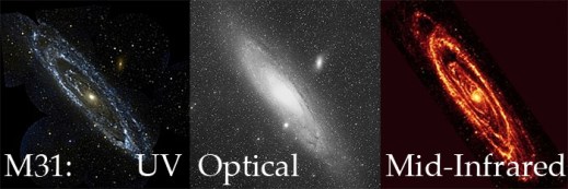
Over the years the public has seen more than a million galaxies via Galaxy Zoo, and nearly all of them had something in common: we tried to get as close as possible to showing you what the galaxy would actually look like with the naked eye if you were able to see them with the resolving power of some of the world’s most advanced telescopes. Starting today, we’re branching out from that with the addition of over 70,000 new galaxy images (of some our old favorites) at wavelengths the human eye wouldn’t be able to see.
Just to be clear, we haven’t always shown images taken at optical wavelengths. Galaxies from the CANDELS survey, for example, are imaged at near-infrared* wavelengths. But they are also some of the most distant galaxies we’ve ever seen, and because of the expansion of the universe, most of the light that the Hubble Space Telescope (HST) captured for those galaxies had been “stretched” from its original optical wavelength (note: we call the originally emitted wavelength the rest-frame wavelength).
Optical light provides a huge amount of information about a galaxy (or a voorwerpje, etc.), and we are still a long way from having extracted every bit of information from optical images of galaxies. However, the optical is only a small part of the electromagnetic spectrum, and the other wavelengths give different and often complementary information about the physical processes taking place in galaxies. For example, more energetic light in the ultraviolet tells us about higher-energy phenomena, like emission directly from the accretion disk around a supermassive black hole, or light from very massive, very young stars. As a stellar population ages and the massive stars die, the older, redder stars left behind emit more light in the near-infrared – so by observing in the near-IR, we get to see where the old stars are.
The near-IR has another very useful property: the longer wavelengths can mostly pass right by interstellar dust without being absorbed or scattered. So images of galaxies in the rest-frame infrared can see through all but the thickest dust shrouds, and we can get a more complete picture about stars and dust in galaxies by looking at them in the near-IR.

Even though the optical SDSS image (left) is deeper than the near-IR UKIDSS image (right), you can still see that the UKIDSS image is less affected by the dust lanes seen at left.
Starting today, we are adding images of galaxies taken with the United Kingdom Infrared Telescope (UKIRT) for the recently-completed UKIDSS project. UKIDSS is the largest, deepest survey of the sky at near-infrared wavelengths, and the typical seeing is close to (often better than) the typical seeing of the SDSS. Every UKIDSS galaxy that we’re showing is also in SDSS, which means that volunteers at Galaxy Zoo will be providing classifications for the same galaxies in both optical and infrared wavelengths, in a uniform way. This is incredibly valuable: each of those wavelength ranges are separately rich with information, and by combining them we can learn even more about how the stars in each galaxy have evolved and are evolving, and how the material from which new stars might form (as traced by the dust) is distributed in the galaxy.

1 galaxy, 4 redshifts.
In addition to the more than 70,000 UKIDSS near-infrared images we have added to the active classification pool, we are also adding nearly 7,000 images that have a different purpose: to help us understand how a galaxy’s classification evolves as the galaxy gets farther and farther away from the telescope. To that end, team member Edmond Cheung has taken SDSS images of nearby galaxies that volunteers have already classified, “placed” them at much higher redshifts, then “observed” them as we would have seen them with HST in the rest-frame optical. By classifying these redshifted galaxies**, we hope to answer the question of how the classifications of distant galaxies might be subtly different due to image depth and distance effects. It’s a small number of galaxies compared to the full sample of those in either Galaxy Zoo: Hubble or CANDELS, but it’s an absolutely crucial part of making the most of all of your classifications.
As always, Galaxy Zoo continues to evolve as we use your classifications to answer fundamental questions of galaxy evolution and those answers lead to new and interesting questions. We really hope you enjoy these new images, and we expect that there will soon be some interesting new discussions on Talk (where there will, as usual, be more information available about each galaxy), and very possibly new discoveries to be made.
Thanks for classifying!
* “Infrared” is a really large wavelength range, much larger than optical, so scientists modify the term to describe what part of it they’re referring to. Near-infrared means the wavelengths are only a bit too long (red) to be seen by the human eye; there’s also mid-infrared and far-infrared, which are progressively longer-wavelength. For context, far-infrared wavelengths can be more than a hundred times longer than near-infrared wavelengths, and they’re closer in energy to microwaves and radio waves than optical light. Each of the different parts of the infrared gives us information on different types of physics.
** You might notice that these galaxies have a slightly different question tree than the rest of the galaxies: that’s because, where these galaxies have been redshifted into the range where they would have been observed in the Galaxy Zoo: Hubble sample, we’re asking the same questions we asked for that sample, so there are some slight differences.
Top Image Credits and more information: here.
Astronomy & Geophysics Article on Arxiv
Just a quick note to say that the Astronomy & Geophysics article some of us wrote to review the Specialist Discussion we ran at the Royal Astronomical Society in May is now posted on the arxiv. A&G is the magazine of the RAS (so I get a copy, like all RAS members), but also makes some articles free to read for all (Free editors choice articles) – and in this case the entire magazine was made open access.
You might remember this article and the offer of a cover spot for a Galaxy Zoo related image sparked a vote for your favourite image, which was won by “The Penguin Galaxy”.
Here’s the lovely cover art to finish off the post.
Evolutionary Paths In Galaxy Morphology: A Galaxy Zoo Conference

This week much of the team has been in Sydney, Australia, for the Evolutionary Paths In Galaxy Morphology conference. It’s a meeting centered largely around Galaxy Zoo, but it’s more generally about galaxy evolution, and how Galaxy Zoo fits into our overall (ever unfolding) picture of galaxy evolution.

There’s a lot to that legacy already, and it’s still being written.
The first talk of the conference was a public talk by Chris, fitting for a project that would not have been possible without public participation. Chris also gave a science talk later in the conference, summarizing many of the different results from Galaxy Zoo (and with a focus on presenting the results of team members who couldn’t be at the meeting). For me, Karen’s talk describing secular galaxy evolution and detailing the various recent results that have led us to believe “slow” evolution is very important was a highlight of Tuesday, and the audience questions seemed to express a wish that she could have gone on for longer to tie even more of it together. When the scientists at a conference want you to keep going after your 30 minutes are up, you know you’ve given a good talk.
In fact, all of the talks from team members were very well received, and over the course of the week so far we’ve seen how our results compare to and complement those of others, some using Galaxy Zoo data, some not. We’ve had a number of interesting talks describing the sometimes surprising ways the motions of stars and gas in galaxies compare with the visual morphologies. Where (and how bright) the stars and dust are in a galaxy doesn’t always give clues to the shape of the stars’ orbits, nor the extent and configuration of the gas that often makes up a large fraction of a galaxy’s mass.

Karen explains her simple and clear diagram showing different galaxy evolutionary processes.
This goes the other way, too: knowing the velocities of stars and gas in a galaxy doesn’t necessarily tell you what kinds of stars they are, how they got there, or what they’re doing right now. I suspect a combination of this kinematic information with the image information (at visual and other wavelengths) will in the future be a more often used and more powerful diagnostic tool for galaxies than either alone.
Overall, the meeting was definitely a success, and throughout the meeting we tried to keep a record of things so that others could keep up with the conference even if they weren’t able to attend. There was a lot of active tweeting about the conference, for example, and Karen and I took turns recording the tweets so that we’d have a record of each day of the Twitter discussion. Here those are, courtesy of Storify:
Also, remember at our last hangout when we said we’d have a hangout from Sydney? That proved a bit difficult, not just because of the packed meeting schedule but also because of bandwidth issues: overburdened conference and hotel wifi connections just aren’t really up to the task of streaming a hangout. We eventually found a place, but then it turned out there was construction going on next door, so instead of the sunny patio we had intended to run the hangout from we ended up in an upstairs bedroom to get as far away from the noise as possible. Ah, well. You can see our detailed discussion of how the meeting went below, including random contributions from the jackhammer next door (but only for the first few minutes):
(click here for the podcast version)
And now we’ll all return (eventually) to our respective institutions to reflect on the meeting, start work on whatever new ideas the conference discussions, talks and posters started brewing, and continue the work we had set aside for the past week. None of this is really as easy as it sounds; the best meetings are often the most exhausting, so it takes some time to recover. I asked our fearless leader Chris if he had a pithy statement to sum up his feeling of exhilarated post-meeting fatigue, and he took my keyboard and offered the following:
gt ;////cry;gvlbhul,kubmc ;dptfvglyknjuy,pt vgybhjnomk
I’m sure that, if any tears were shed, they were tears of joy. This is a great project and it’s only getting better.

Left to Right: Tom, Kevin, Bob, Amit, Ed, Chris S, Bill, Kyle, Chris L, Ivy, Brooke, Karen, Julie
Quench Boost: A How-To-Guide, Part 4
Now that we’ve been initiated into the cool waters of Tools (Part 1), we’ve compared our *own* galaxies to the rest of the post-quenched sample (Part 2), and we’ve put your classifications to use, looking for what makes post-quench galaxies special compared to the rest of the riff-raff (Part 3), we’re ready for Part 4 of the Quench ‘How-To-Guide’.
This segment is inspired by a post on Quench Talk in response to Part 3 of this guide. One of our esteemed zoo-ite mods noted:
There are more Quench Sample mergers (505) than Control mergers (245)… It seems to suggest mergers have a role to play in quenching star formation as well.
Whoa! That’s a statistically significant difference and will be a really cool result if it holds up under further investigation!
I’ve been thinking about this potential result in the context of the Kaviraj article, summarized by Michael Zevin at http://postquench.blogspot.com/. The articles finds evidence that massive post-quenched galaxies appear to require different quenching mechanisms than lower-mass post-quenched galaxies. I wondered — can our data speak to their result?
Let’s find out!
Step 1: Copy this Dashboard to your Quench Tools environment, as you did in Part 3 of this guide.
- This starter Dashboard provides a series of tables that have filtered the Control sample data into sources showing merger signatures and those that do not, as well as sources in low, mid, and high mass bins.
- Mass, in this case, refers to the total stellar mass of each galaxy. You can see what limits I set for each mass bin by looking at the filter statements under the ‘Prompt’ in each Table.
Step 2: Compare the mass histogram for the Control galaxies with merger signatures with the mass histogram for the total sample of Control galaxies.
- Click ‘Tools’ and choose ‘Histogram’ in the pop-up options.
- Choose ‘Control’ as the ‘Data Source’.
- Choose ‘log_mass’ as the x-axis, and limit the range from 6 to 12.
- Repeat the above, but choose ‘Control – Merging’ as the ‘Data Source’.
The result will look similar to the figure below. Can you tell by eye if there’s a trend with mass in terms of the fraction of Control galaxies with merger signatures?
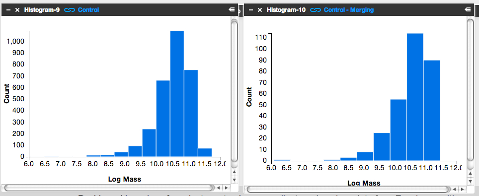
It’s subtle to see it in this visualization. Instead, let’s look at the fractions themselves.
Step 3: Letting the numbers guide us… Is there a higher fraction of Control galaxies with merger signatures at the low-mass end? At the high-mass end? Neither?
To answer this question, we need to know, for each mass bin, the fraction of Control galaxies that show merger signatures. I.e.,

Luckily, Tools can give us this information.
- Click on the ‘Control – Low Mass’ Table and scroll to its lower right.
- You’ll see the words ‘1527 Total Items’.
- There are 1527 Control galaxies in the low mass bin.
- Similarly, if you look in the lower right of the ‘Control – Merging – Low Mass’ Table, you’ll see that there are 131 galaxies in this category.
- This means that the merger fraction for the low mass bin is 131/1527 or 8.6%.
- Find the fraction for the middle and high mass bins.
Does the fraction increase or decrease with mass?
Step 4: Repeat the above steps but for the post-quenched galaxy sample.
You may want to open a new Dashboard to keep your window from getting too cluttered.
Step 5: How do the results compare for our post-quenched galaxies versus our Control galaxies? How can we best visualize these results?
- In thinking about the answer to this question, you might want to make a plot of mass (on the x-axis) versus merger fraction (on the y-axis) for the Control galaxies.
- On that same graph, you’d also show the results for the post-quenched galaxies.
- To determine what mass value to use, consider taking the median mass value for each mass bin.
- Determine this by clicking on ‘Tools’, choosing ‘Statistics’ in the pop-up options, selecting ‘Control – Low Mass’ as your ‘Data Source’, and selecting ‘Log Mass’ as the ‘Field’.
- This ‘Statistics’ Tool gives you the mean, median, mode, and other values.
- You could plot the results with pen on paper, use Google spreadsheets, or whatever plotting software you prefer. Unfortunately Tools, at this point, doesn’t provide this functionality.
It’d be awesome if you posted an image of your results here or at Quench Talk. We can then compare results, identify the best way to visualize this for the article, and build on what we’ve found.
You might also consider repeating the above but testing for the effect of choosing different, wider, or narrower mass bins. Does that change the results? It’d be really useful to know if it does.
Quench Boost: A How-To-Guide, Part 3
I’m very happy to be posting again to the How-To-Guide. We’ve made a number of updates to Quench data and Quench Tools. Before I launch into Part 3 of the Guide, here are the recent updates:
- The classification results for the 57 control galaxies that needed replacements have been uploaded into Quench Tools.
- We’ve applied two sets of corrections to the galaxies magnitudes: the magnitudes are now corrected for both the effect of extinction by dust and the redshifting of light (specifically, the k-correction).
- We’ve uploaded the emission line characteristics for all the control galaxies.
- We’ve uploaded a few additional properties for all the galaxies (e.g., luminosity distances and star formation rates).
- We corrected a bug in the code that mistakenly skipped galaxies identified as ‘smooth with off-center bright clumps’.
In Part 1 of this How-To-Guide to data analysis within Quench, you learned how to use Tools and were introduced to the background literature about post-quenched galaxies and galaxy evolution.
In Part 2 you used Tools to compare results from galaxies *you* classified with the rest of the post-quenched galaxy sample.
In Part 3 we’re going to use the results from the classifications that you all provided to see if there’s anything different about the post-quenched galaxies that have merged or are in the process of merging with a neighbor, and those that show no merger signatures.
The figure below is of one of my favorite post-quenched galaxies with merger signatures. Gotta love those swooping tidal tails!
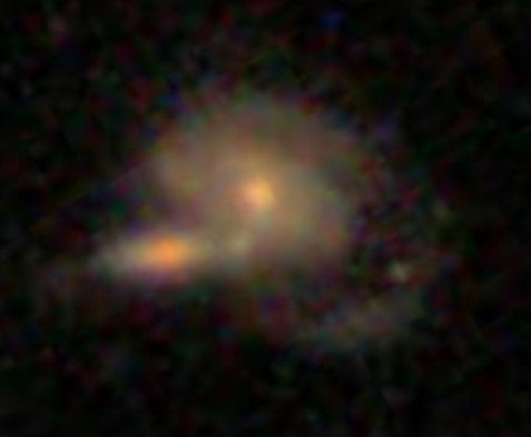
Let’s get started!
Step 1: Because of the updates to Tools, first clear your Internet browser’s cache, so it uploads the latest Quench Tools data.
Step 2: Copy my starter dashboard with emission line ratios ready for play.
- Open my Dashboard and click ‘Copy Dashboard’ in the upper right. This way you can make changes to it.
- In this Dashboard, I’ve uploaded the post-quenched galaxy data.
- I also opened a Table, just as you did in Part 2 of this How-To-Guide. I called the Table ‘All Quench Table’.
- In the Table, notice how I’ve applied a few filters, by using the syntax:
filter .’Halpha Flux’ > 0
- This reduces the table to only include sources that fulfill those criteria.
- Also notice that I’ve created a few new columns of data, just as you did in Part 2, by using the syntax:
field ‘o3hb’, .’Oiii Flux’/.’Hbeta Flux’
- That particular syntax means that I took the flux for the doubly ionized oxygen emission line ([0III]) and divided it by the flux in one of the Hydrogen emission lines (Hbeta).
- This ratio and the ratio of [NII]/Halpha are quite useful for identifying Active Galactic Nuclei (AGN).
- It’d be really interesting if we find that AGN play a role in shutting off the star formation in our post-quenched galaxies. A major question in galaxy evolution is whether there’s any clear interplay between merging, AGN activity, and shutting off star formation.
Step 3: Create the BPT diagram using the ratios of [OIII]/Hb and [NII]/Ha.
- BPT stands for Baldwin, Phillips, and Terlevich (1981), among the first articles to use these emission line ratios to identify AGN. Check out the GZ Green Peas project’s use of the BPT diagram.
- Click on ‘Tools’. Choose ‘Scatter plot’ in the pop-up options.
- In the new Scatterplot window, choose ‘All Quench Table’ as your ‘Data Source’.
- For the x-axis, choose ‘logn2ha’. For the y-axis, choose ‘logo3hb’.
- Adjust the min/max values so the data fits nicely within the window, as shown in the figure below.
- Remember that you can click on the comb icon in the upper-left of the plot to make the menu overlay disappear.
- Do you notice the two wings of the seagull in your plot? The left-hand wing is where star forming galaxies reside (potentially star-bursting galaxies) while the right-hand wing is where AGN reside. Our post-quenched sample of galaxies covers both wings.

Step 4: Compare the BPT diagram for post-quenched galaxies with and without signatures of having experienced a merger.
- To do this, you’ll need to first create two new tables, one that filters out merging galaxies and the other that filters out non-merging galaxies.
- Click on ‘Tools’. Choose ‘Table’ in the pop-up options.
- In the new Table window, choose ‘All Quench Table’ as the ‘Data Source’. Notice how this new table already has all the new columns that were created in the ‘All Quench Table’. That makes our life easier!
- Look through the column names and find the one that says ‘Merging’. Possible responses are ‘Neither’, ‘Merging’, ‘Tidal Debris’, or ‘Both’.
- Let’s pick out just the galaxies with no merger signatures.
- Under ‘Prompt’ type:
filter .Merging = ‘Neither’
- If you scroll to the bottom of the Table, you’ll notice that you now have only 2191 rows, rather than the original 3002.
- Call this Table ‘Non-Mergers Table’ by double clicking on the ‘Table-4’ in the upper-left of the Table and typing in the new name.
- Now follow the instructions from Step 3 to create a BPT scatter plot for your post-quenched galaxies with no merger signatures. Be sure to choose ‘Non-Mergers Table’ as the ‘Data Source’.
- You might notice that this plot looks pretty similar to the plot for the full post-quenched galaxy sample, just with fewer galaxies.
What about post-quenched galaxies that show signatures of merger activity? Do they also show a similar mix of star forming galaxies and AGN?
- To find out, create a new Table, but this time under ‘Prompt’ type:
filter .Merging != ‘Neither’
- The ‘!=’ syntax stands for ‘Not’, which means this filter picks out galaxies that had any other response under the ‘Merging’ column (i.e, tidal tails, merger, both). Notice how there are 505 sources in this Table.
- Now create a BPT scatter plot for your ‘Mergers Table’.
- Make sure this plot has a similar xmin,xmax,ymin,ymax as your other plots to ensure a fair comparison.
- You might also compare histograms of log(NII/Ha) for the different subsamples.
What do you find? Do you notice the difference? What could this be telling us about our post-quenched galaxies?!
Before you get too carried away in the excitement, it’s a good idea to compare the post-quenched galaxy sample BPT results against the control galaxy sample.
This comparison with the control sample will tell you whether this truly is an interesting and unique result for post-quenched galaxies, or something typical for galaxies in general. You might consider doing this in a new Dashboard, as I have, to keep things from getting too cluttered. In that new Dashboard, click ‘Data’, choose ‘Quench’ in the pop-up options, and choose ‘Quench Control’ as your data to upload. Now repeat Steps 1-4.
Do you notice any differences between your control galaxy and post-quenched galaxy sample results? What do you think this tells us about our post-quenched galaxies?
Stay tuned for Part 4 of this How-To-Guide. I’d love to build from your results from this stage, so definitely post the URLs for your Dashboards here or within Quench Talk and your questions and comments.
More Galaxies, More Clicks, More Science!
Just a quick update: recently we brought some of our high-redshift (i.e., very distant) galaxies out of retirement. There’s enough going on in these galaxies that having more clicks from you will really help tease out the nuances of the various features and make the classifications even better.
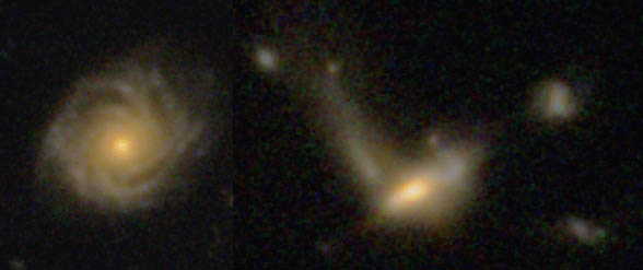
How would you classify these?
So, for those of you who noticed you hadn’t seen many CANDELS galaxies recently, well, you’re about to see a few more. I can’t promise they’ll always be easy to classify, but I hope they’ll at least be an interesting puzzle. As ever, thank you for your classifications!
Galaxy Zoo 2 data release
It’s always exciting to see a new Galaxy Zoo paper out, but today’s release of our latest is really exciting. Galaxy Zoo 2: detailed morphological classifications for 304,122 galaxies from the Sloan Digital Sky Survey, now accepted for publication in the Monthly Notices of the Royal Astronomical Society, is the result of a lot of hard work by Kyle Willett and friends.

Lead author Kyle, seen here taking a rare moment away from reducing Galaxy Zoo data.
Galaxy Zoo 2 was the first of our projects to go beyond simply splitting galaxies into ellipticals and spirals, and so these results provide data on bars, on the number of spiral arms and on much more besides. The more complicated project made things more complicated for us in turning raw clicks on the website into scientific calculations – we had to take into account the way the different classifications depended on each other, and still had to worry about the inevitable effect that more distant, fainter or smaller galaxies will be less likely to show features.
We’ve got plenty of science out of the Zoo 2 data set while we were resolving these problems, but the good news is that all of that work is now done, and in addition to the paper we’re making the data available for anyone to use. You can find it alongside data from Zoo 1 at data.galaxyzoo.org. One of the most rewarding things about the project so far has been watching other astronomers make use of the original data set – and now they have much more information about each galaxy to go on.

