Radio Galaxy Zoo is now available in Chinese!
We’re pleased to announce that Radio Galaxy Zoo has been
translated to traditional character Chinese. Many thanks
to the Zooniverse’s Chris Snyder for getting all the technical
things set up for the translation to go live and Mei-Yin Chou
at Academia Sinica’s Institute of Astronomy & Astrophysics
(ASIAA) for helping verifying the translation. What follows
is an announcement describing Radio Galaxy Zoo and the translation
in traditional character Chinese and then in English: 電 波星系動物園[中 文版]歡 迎你的加入!在此我們欣然宣佈本計畫中文版開始啟用。
感謝中央研究院天文及天文物理研究所 Dr. Meg Schwamb (Meg是 參與Planet
Hunters 和Planet Four計 畫的科學家)以 及天文推廣團隊成員黃珞文協助,
將英文內容翻譯轉換為繁體中文。在 許多星系核心深處其實隱匿著一些超大質量的黑洞,
其質量往往為太陽的幾億倍,這些大黑洞雖然無法直接看得到,不過有
時仍可看得到從星系核心噴出的巨大噴流。由 電波波段看到的天空和在「可見光」
波段所看到的(可見的意思就是人類肉眼所看得到的),此兩種景象有時大異其 趣。
譬如,有些星系中心根本沒有電波輻射發出,但卻會向外噴發電波噴流,
或有時這些噴流的外觀是筆直的直線,有時卻 是一團、只有單邊而非雙邊對稱、
甚或是彎曲弧線等。藉由大型全天電波普查觀測計畫,我們取得了各式各樣多達幾十萬個
電波噴流和團塊影像,它們需要和所屬的宿主星系做成匹配。因 此,我們邀請你加入我們的行列,
來認識一個「從未曾見過」的宇宙,也借用您眼所見的,協助辨識電波波段之噴流(或細絲),
再將它 們和紅外圖像進行比較及匹 配,這麼一來,在你的協助下,
噴流和宿主星系間本來付之闕如的關聯 性,未來將可建立成形。 http://radio.galaxyzoo.org/?lang=zh_twWelcome to Radio Galaxy Zoo (Chinese)! It is with great
pleasure that we announce the launch of the Chinese version
of our project. We are very grateful to Dr Meg Schwamb
(from Planet Hunters and Planet Four) and Lauren Huang from
Academia Sinica’s Institute of Astronomy & Astrophysics
(ASIAA) for their help with translating our project from
English to traditional Chinese characters. Supermassive black holes (~several hundred million times
the mass of our Sun) lie deep in the cores of many galaxies.
And though we cannot directly see these black holes, we do
sometimes see the huge radio jets originating from the galaxy
cores. Galaxies in the radio sky can look quite different from
the one seen in the optical wavelengths by instruments such
as our own eyes. Some galaxies do not have any central radio
emission but only radio jet(s) emanating outwards. Sometimes
these jets are straight but at other times, they can be blobby,
one-sided or bent. With very large all-sky radio surveys, we
have many hundreds of thousands of radio jets and blobs that
need to be matched to their host galaxies. Therefore we invite you to see the Universe as you have never
seen before and help us map the radio sky by matching the radio
jets and filaments to the galaxies (as seen in the infrared images) from
whence they came. http://radio.galaxyzoo.org/?lang=zh_tw

Remarkable Discoveries Underway – Citizen Scientists fire up Radio Galaxy Zoo
Radio Galaxy Zoo participants have been swamping the Science Team with an incredible number of interesting objects via Talk. Many of these are challenging our understanding of how radio galaxies work, both at their launching sites in supermassive black holes, and in the ways that the ejected jets of radio plasma interact with their environment.
We’ll be highlighting some of these curious discoveries in subsequent blogs, but here’s a recently found one that’s just “too good to be true.”
Today, we know that a galaxy’s redshift (the measure of how fast it is moving away from us — we use z = velocity/speed of light, approximately) is an excellent indicator of distance. This is due to the overall expansion of the Universe. So a galaxy with z=0.049 is moving away at 14,700 km/s, and is located about 650 million light years away, while a galaxy with z=0.26 is moving at about 89,000 km/s and is 3 billion light years away.
How, then, could two such galaxies each be a source of radio emission which appear to be connected with a thin radio filament? That’s exactly what the following picture shows, where the optical picture, in green, is from the Sloan Digital Sky Survey (SDSS) , and the purple structure, outlined in white contours, is radio emission from the Faint Images of the Radio Sky at Twenty cm (FIRST, from the Very Large Array).
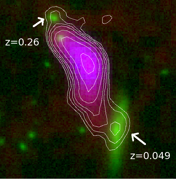
A cosmic coincidence
Radio Galaxy Zoo participants have looked at approximately 40,000 systems so far, so in such a large collection, this unusual object is likely just a coincidence, rather than some failure in our understanding of cosmic expansion. However, it would be nice to get some higher resolution radio images to see what the structure really looks like.
If you haven’t given Radio Galaxy Zoo a try yet – please join us at http://radio.galaxyzoo.org. We’re finding all kinds of fascinating new structures, while simultaneously creating a large database matching up radio emission with the supermassive black holes from which they were born.
Finished with Galaxy Zoo: UKIDSS!
I’m happy to announce that thanks to the hard work of more than 80,000 volunteers, we’ve recently completed classifying the infrared images of galaxies taken from the UKIDSS survey! There were more than 70,000 images of galaxies on the site that you helped to classify; once the data are reduced, one of our main goals is to compare your classifications to those from the Galaxy Zoo 2 project and study how morphology changes as a function of the wavelength in which those galaxies are observed. Melanie Galloway, a PhD student at the University of Minnesota, will be focusing on these this summer as part of her thesis work.
![]()
Some early results have shown that, as we predicted, features like galactic bars are often more prominent in the infrared. Below is a nice example of this phenomenon: the image is of the same galaxy (SDSS J115244.84+054059.1). In the optical image on the right (from GZ2), you can see a spiral galaxy with lots of star-formation, but the clumpy morphology of the gas clouds can hide the shape of the bar in the galaxy. In the UKIDSS image on the right, the blue gas clouds from star formation aren’t picked up in the infrared, and the stellar bar is much more clearly visible. This is supported by your classifications: the probability of a bar jumps from just 25% in GZ2 to 67% in GZ:UKIDSS.

Two images of the same galaxy; the infrared UKIDSS image on the left, and the optical SDSS image on the right. The strong bar in the galaxy is much more obvious in the infrared image.
This marks the third set of galaxy images we’ve completed since the relaunch of Galaxy Zoo in 2012 (following the high-redshift CANDELS images from Hubble and the artificially-redshifted images from FERENGI). There are still tens of thousands of galaxies from the SDSS left to classify in Galaxy Zoo, though, and we’ll be adding new sets of images in the coming months. Thanks again for your help, and we’ll report on the results of the UKIDSS data as it comes in!
Images and artifacts in Galaxy Zoo: UKIDSS
Last October, Galaxy Zoo began including new images from the UKIDSS survey on the main site. These are many of the same galaxies that were classified in GZ2, but the images come from a completely different telescope and a different wavelength — the infrared. While there’s a lot of science we’ll be able to do comparing galaxy morphologies at different wavelengths, many volunteers have noticed artifacts (features that aren’t real astronomical objects) in the UKIDSS images that can look very different from what you’re used to seeing in the SDSS or Hubble images:
- green squares
- rings and ghosts
- grid patterns and speckles
These are only a small percentage of the images we’re looking at, but it’s important to identify them and try to separate them cleanly from the galaxies we’re classifying. So here’s our “spotter’s guide” to UKIDSS image artifacts.
Green squares
All of the UKIDSS images you see in Galaxy Zoo are what we call “artificial-color” — we use images captured by the telescope’s infrared detector, and then combine the different infrared wavelengths into a single color image. For our images, we use data from the Y-band filter (1.03 microns) for the red channel, J-band filter (1.25 microns) for green, and K-band (2.20 microns) for the blue channel.
The images in Y, J, and K were taken at separate times and with different detectors and filters. So for changes in either the camera or the sky, these will often only show up in one color in the GZ images.
Some users have identified a persistent pattern in the images that looks like four little green pixels arranged in a square (looks a little like the UKIDSS logo!). This is from the J-band images.
The origin of the squares comes from the way that UKIRT processes data. Each patch of the sky is imaged in multiple exposures, and then these exposures are combined to get the final, deeper image. So each pixel in the image comes from four different locations on the detector. In the case of J-band images, the telescope actually took 8 different exposures during the dither pattern. For a few of the observing runs, the telescope lost the guidestar which keeps it positioned at the correct location; that means that the expected number of counts at the position of a bright star is lower due to the bad frame in the interlaced data. Normally, the software algorithms in UKIDSS drop the bad frames and correct for this effect; as GZ volunteers have identified, though, there are some cases where it didn’t work perfectly. (Many thanks to UKIDSS Survey Scientist Steve Warren at Imperial College London for his help in explaining this phenomenon.)
Since the exposure pattern is in a square, the bad pixels will show up where there’s a bright star and one of the four frames is bad (meaning counts are lower than they should be). That’s the origin of the pattern showing up in some images.
The four green dots in a square pattern on the left side of the image are from a single bad frame in the J-band processing of the data.
Grid patterns
As mentioned above, the telescope takes multiple exposures for each part of the sky that it images. To improve this, for some of the bands, it images the same part of the sky for a second round, but offsets the location of these by either an integer or half-integer pixel. The reason for this is so we can improve the angular resolution of the telescope – that is, distinguishing small features in the galaxy that are normally blurred out by either the Earth’s atmosphere or the limiting power of the telescope itself.
In the final data products, images from these offset frames are combined onto a fixed pixel scale in a process called interleaving. In some sources (bright ones especially), the gridding isn’t perfect and you can see some of the scale for this in the images.

Gridding pattern (the square pixels at the center of the bright blue star) are due to the interleaving process of combining data.
Green ghosts
Another feature people have spotted are what have been called “ghosts”: these can be either regular or irregularly shaped objects appearing in a couple specific colors. There might be multiple causes for these, but one of the most common is the presence of an actual contaminant (a speck of dust, for example) that got into the optics of the telescope. Since the telescope isn’t designed to focus on nearby objects, the point source is distorted, usually into a ring-like shape. The color of these images, like the green squares, depends on what band they were imaged in; red for Y-band, green for J-band, or blue for K-band.
Here’s one example: you can see the green and blue ring to the right of the galaxy in the color GZ image. The raw data (in black and white) shows the same ring in multiple locations, which tells us that it remained in the same position on the detector, but appears several times as the telescope moves over the sky.

This image has an artifact (blue/green ring) to the right of the spiral galaxy AGZ00077ec.

The raw Y-band image of the data shows the same artifact appearing multiple times as the telescope tracks across the sky.
Result
We hope this has been useful, but please continue to discuss these in Talk and on the forums; particularly if there are any artifacts that impede your ability to make a good galaxy classification. Happy hunting, and thanks for continuing to participate with us on Galaxy Zoo.
One Million for Zooniverse – and One for Galaxy Zoo!

Galaxy Zoo started in 2007 because astronomers had 1,000,000 galaxies that needed to be sorted, classified, and examined. After the incredible response from the public, the zookeepers realized that this kind of problem wasn’t limited to galaxies, nor even just to astronomy, and the Zooniverse was born.
Now, seven actual years, close to 30 projects, more than 60 publications, and hundreds of years’ worth of human effort later, the Zooniverse has just registered its 1,000,000th volunteer. Given that Galaxy Zoo was the project that led to the creation of the Zooniverse, it seems fitting that its millionth citizen scientist joined to classify galaxies! That volunteer (whose identity we won’t divulge unless s/he gives us permission) joins over 400,000 others who have classified galaxies near and far. That number is 40% of the Zooniverse’s overall total — meaning that, while Galaxy Zoo has a large and vibrant community of volunteers and scientists, most people who join Zooniverse start off contributing to a different project. Many of them try other projects after their first: over on the Zooniverse blog Rob described the additions we’ve made to the Zooniverse Home area so that everyone who brought us to a million can see their own contribution “fingerprint” on the Zooniverse. Here’s what mine currently looks like:

The blue at the left is Galaxy Zoo; the dark orange is Snapshot Serengeti. #addict
Our millionth volunteer gets a cheesy prize (but hopefully useful: a Zooniverse tote bag and mug), and while we’d like to give that same prize to the 999,999 who came before him/her and to everyone who contributes to Galaxy Zoo and all Zooniverse projects, perhaps it’s more fitting that we say to everyone what’s really on our mind right now:

Galactic-Scale Gratitude. You all are awesome.
The Green Valley is a Red Herring
Great news everybody! The latest Galaxy Zoo 1 paper has been accepted by MNRAS and has appeared on astro-ph: http://arxiv.org/abs/1402.4814
In this paper, we take a look at the most crucial event in the life of a galaxy: the end of star formation. We often call this process “quenching” and many astrophysicists have slightly different definitions of quenching. Galaxies are the place where cosmic gas condenses and, if it gets cold and dense enough, turns into stars. The resulting stars are what we really see as traditional optical astronomers.
Not all stars shine the same way though: stars much more massive than our sun are very bright and shine in a blue light as they are very hot. They’re also very short-lived. Lower mass stars take a more leisurely pace and don’t shine as bright (they’re not as hot). This is why star-forming galaxies are blue, and quiescent galaxies (or “quenched” galaxies) are red: once star formation stops, the bluest stars die first and aren’t replaced with new ones, so they leave behind only the longer-lived red stars for us to observe as the galaxy passively evolves.

Example images of galaxies classified by you. There are blue, green and red spirals, and blue, green and red ellipticals.

As @penguin galaxy (aka Alice) put it….
Blue Ellipticals & Red Spirals
The received wisdom in galaxy evolution had been that spirals are blue, and ellipticals are red, meaning that spirals form new stars (or rather: convert gas into stars) and ellipticals do not form new stars (they have no gas to convert to stars). Since you’re taking part in Galaxy Zoo, you know that this isn’t entirely true: there are blue (star-forming) ellipticals and red (passive) spirals. It’s those unusual objects that we started Galaxy Zoo for, and in this paper they help us piece together how, why and when galaxies shut down their star formation. You can already conclude from the fact that blue ellipticals and red spirals exist that there is no one-to-one correlation between a galaxy’s morphology and whether or not it’s forming stars.

The colour-mass diagram of galaxies, split by shape. On the right: all galaxies. On the left: just the ellipticals (or early-types) on top and just the spirals (or late-types) on the bottom. On the x-axis is the galaxy mass. On the y-axis is galaxy colour. Bottom is blue (young stars) and top is red (no young stars).
Blue, Red and…. Green?
A few years back, astronomers noticed that not all galaxies are either blue and star forming or red and dead. There was a smaller population of galaxies in between those two, which they termed the “green valley” (the origin of the term is rather interesting and we talk about it in this Google+ hangout). So how do these “green” galaxies fit in? The natural conclusion was that these “in between” galaxies are the ones who are in the process of shutting down their star formation. They’re the galaxies which are in the process of quenching. Their star formation rate is dropping, which is why they have fewer and fewer young blue stars. With time, star formation should cease entirely and galaxies would become red and dead.
The Green Valley is a Red Herring
Ok, why is this green valley a red herring you ask? Simple: the green valley galaxies aren’t a single population of similar galaxies, but rather two completely different populations doing completely different things! And what’s the biggest evidence that this is the case? Some of them are “green spirals” and others are “green ellipticals”! (Ok, you probably saw that coming from a mile away).
So, we have both green spirals and green ellipticals. First: how do we know they must be doing very different things? If you look at the colour-mass diagram of only spirals and only ellipticals, we start to get some hints. Most ellipticals are red. A small number are blue, and a small number are green. If the blue ellipticals turn green and then red, they must do so quickly, or there would be far more green ellipticals. There would be a traffic jam in the green valley. So we suspect that quenching – the end of star formation – in ellipticals happens quickly.
In the case of spirals, we see lots of blue ones, quite a few green one and then red ones (Karen Masters has written several important Galaxy Zoo papers about these red spirals). If spirals slowly turn red, you’d expect them to start bunching up in the middle: the green “valley” which is revealed to be no such thing amongst spirals.

We can time how fast a galaxy quenches. On the x-axis is the optical colour, dominated by young-ish stars, while on the y-axis is a UV colour, dominated by the youngest, most short-lived stars.
Galaxy Quenching time scales
We can confirm this difference in quenching time scales by looking at the ultraviolet and optical colours of spirals and ellipticals in the green valley. What we see is that spirals start becoming redder in optical colours as their star formation rate goes down, but they are still blue in the ultraviolet. Why? Because they are still forming at least some baby stars and they are extremely bright and so blue that they emit a LOT of ultraviolet light. So even as the overall population of young stars declines, the galaxy is still blue in the UV.
Ellipticals, on the other hand, are much redder in the UV. This is because their star formation rate isn’t dropping slowly over time like the spirals, but rather goes to zero in a very short time. So, as the stellar populations age and become redder, NO new baby stars are added and the UV colour goes red.
It’s all about gas
Galaxies form stars because they have gas. This gas comes in from their cosmological surroundings, cools down into a disk and then turns into stars. Galaxies thus have a cosmological supply and a reservoir of gas (the disk). We also know observationally that gas turns into stars according to a specific recipe, the Schmidt-Kennicutt law. Basically that law says that in any dynamical time (the characteristic time scale of the gas disk), a small fraction (around 2%) of that gas turns into stars. Star formation is a rather inefficient process. With this in mind, we can explain the behaviour of ellipticals and spirals in terms of what happens to their gas.

A cartoon version of our picture of how spiral galaxies shut down their star formation.
Spirals are like Zombies
Spirals quench their star formation slowly over maybe a billion years or more. This can be explained by simply shutting off the cosmological supply of gas. The spiral is still left with its gas reservoir in the disk to form stars with. As time goes on, more and more of the gas is used up, and the star formation rate drops. Eventually, almost no gas is left and the originally blue spiral bursting with blue young stars has fewer and fewer young stars and so turns green and eventually red. That means spirals are a bit like zombies. Something shuts off their supply of gas. They’re already dead. But they have their gas reservoir, so they keep moving, moving not knowing that they’re already doomed.

A cartoon version of how we think ellipticals shut down their star formation.
Ellipticals life fast, die young
The ellipticals on the other hand quench their star formation really fast. That means it’s not enough to just shut off the gas supply, you also have to remove the gas reservoir in the galaxy. How do you do that? We’re not really sure, but it’s suspicious that most blue ellipticals look like they recently experienced a major galaxy merger. There are also hints that their black holes are feeding, so it’s possible an energetic outburst from their central black holes heated and ejected their gas reservoir in a short episode. But we don’t know for sure…
So that’s the general summary for the paper. Got questions? Ping me on twitter at @kevinschawinski
Happy Valentine’s Day from Galaxy Zoo
Here are our ideas for #sciencevalentines from GalaxyZoo to help you out today.
First a heart shaped galaxy, as found on Talk.
In fact there’s a whole category of galaxy #hearts to check out.
Or how about saying “I love you” in galaxies with help from writing.galaxyzoo.org:

A Galaxy Zoo update for 2014
Exciting news for everyone who has been helping to classify (and discuss) the new images added to Galaxy Zoo just a couple of months ago. Back in October, we added two new sets of images to Galaxy Zoo: infrared images of galaxies from the UKIDSS survey, and optical images of galaxies that were processed to make them artificially redshifted (appear as if they were much further away). The second set is critically important for the data from GZ: Hubble and the CANDELS project; we need this to properly calibrate the classifications for effects like changing resolution and surface brightness as a function of distance.
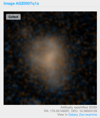
An example of an artificially-redshifted galaxy from Galaxy Zoo.
As of last week, we’re excited to announce that the classifications of the artificially redshifted galaxies have been finished! They’ll now be retired from active classification, and we’re excited to start working on the analysis right away to enable the science we want to do on high-redshift galaxies. In the meantime, please keep your classifications coming for both the SDSS and UKIDSS images on Galaxy Zoo. There’s plenty left to do, although we’re getting closer with your help!
Radio Galaxy Zoo: New tools in Talk
For Zooniverse projects, the science teams have always been really impressed by the users who actively participate in Talk and engage in close inspections and discussions. This is especially true for our newest project, Radio Galaxy Zoo, and the number of excellent questions about larger structure for the powerful radio jets has spurred us to add some new tools to the Talk interface.
The new tools we’ve set up (with the invaluable help of Zooniverse developer Ed) show images of the galaxies and their associated radio jets from other surveys. New images include radio observations from the NRAO VLA Sky Survey (NVSS) and optical images from the Sloan Digital Sky Survey (SDSS). We’ve also included direct links to the FIRST (radio) and WISE (infrared) datasets that we use to make the classification images in the first place.
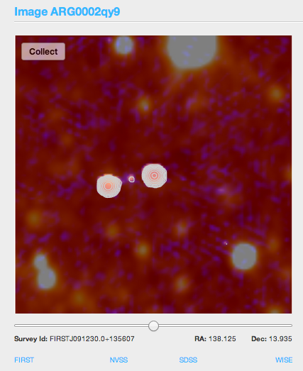
The new tools in RGZ now link to four catalogs (FIRST, NVSS, SDSS, and WISE) for each galaxy along the bottom of each image. FIRST and NVSS are radio surveys, SDSS is optical, and WISE is infrared.
Radio images with wider fields of view, such as NVSS, help to identify structures that may extend beyond the boundaries of the standard RGZ image. These include many of the images being labeled as #overedge in Talk. The NVSS images were taken using the same telescope (the Very Large Array in New Mexico) and at the same wavelength at the FIRST radio images. The main difference is the spacing of the telescopes used to take the observation. NVSS images have a much larger beam size, and are better at resolving large and extended structures. FIRST has a smaller beam size and are more sensitive to compact structures with very accurate positions. FIRST is also about 2.5 times more sensitive than NVSS.
By looking at the NVSS images, both RGZ volunteers and scientists have been able to work together and find potentially new examples of giant radio galaxies in these surveys. Larry Rudnick (@DocR) has started a great discussion on Talk, and we’re still identifying more as the project continues.
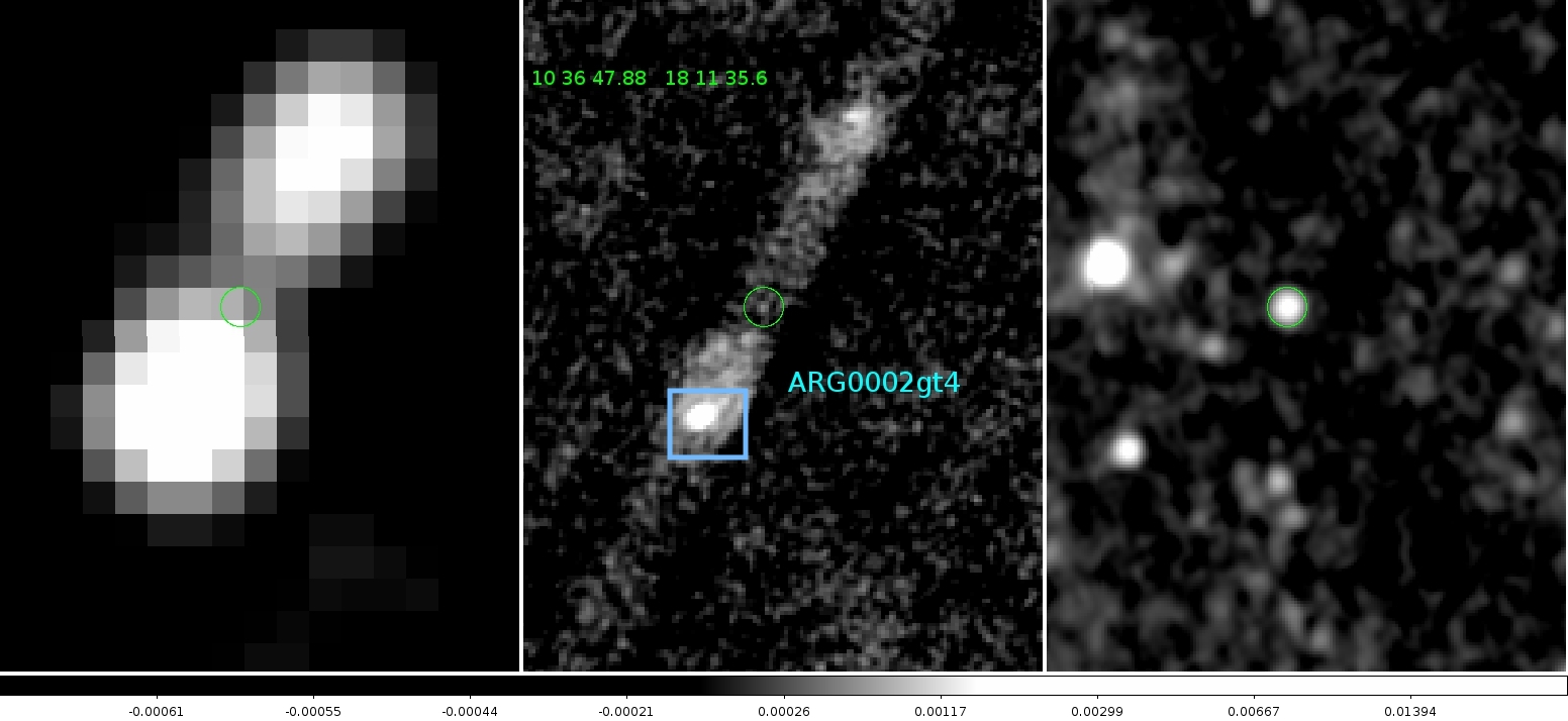
RGZ image ARG0002gt4, as seen in three of the surveys accessible in the new tools. The wide-field radio NVSS image of the jets is on the left; in the middle is the radio FIRST image, showing the better-resolved galaxy core, and on the right is the infrared WISE image showing the host galaxy. Image from Larry Rudnick (UMN).
We’ve also added links to the infrared and optical catalogs that show the galaxies themselves. The infrared images that we show in RGZ come from the WISE spacecraft, an orbiting infrared telescope that carried out an all-sky survey. The new link shows you infrared images of the galaxy in four different infrared bands (3.4, 4.6, 12, and 22 microns), as opposed to the single 3.4 micron image we normally show. Detecting the galaxy at longer wavelengths might mean that it contains more dust than expected, or show whether a feature in one band might be an artifact (not showing up in any of the other bands). We’ve also linked to the optical image from the SDSS; these dusty and distant galaxies are often too faint to show up there, but an optical detection there makes it much more likely that we already have a spectrum for the object.

WISE infrared images of the galaxy ARG0002h6v. Note how the central galaxy shows up strongly in the two bands on the left (3.4 and 4.6 microns), but is not detected in either of the bands on the right (12 and 20 microns).
Let us know if you have suggestions or questions about the new tools; we hope that they’ll continue to lead to many future discoveries with Radio Galaxy Zoo!
Announcing Galaxy Zoo’s machine-learning competition (with prize money!)
Since Galaxy Zoo began in 2007, our scientific results have relied on the classifications of our volunteers. These have always been checked (in small numbers) against expert classifications, and several papers have explored how the Galaxy Zoo data compares to results from computers. Galaxy Zoo has compared well with both expert and automated classifications, and that’s helped underscore the science that your observations have made possible.
While doing real science with the Zooniverse has always been our primary goal, we’re also looking to the future; upcoming telescopes like the SKA, LSST, and just-launched Gaia will have billions of new images and detected objects. This will simply be too large for citizen scientists to handle the full scope of data – even if literally everyone on the planet is involved.
This is where Galaxy Zoo will come in yet again. Our goal, which is shared by many groups of astronomers, is to improve the accuracy of the galaxy classifications that can be performed by computers. We’ve done some of this already (Banerji et al. 2010, Huertas-Company et al. 2011), but it’s still not good enough for much of the science we want to do. If we can make these algorithms better, future datasets for citizen science can be selected in advance; we can automatically process the bulk of the images, but still have citizen scientists play a key role in classifying at the more unusual objects. Citizen scientist results will also provide important calibration for the algorithms, and will continue to look for weird and wonderful discoveries like the Voorwerp.
With that goal in mind, we’re pleased to announce the launch of a data science competition for Galaxy Zoo. We’ve partnered with Kaggle, an online platform for predictive modeling that has a massive amount of experience in similar projects. Also working with us is Winton Capital: they’ve generously agreed to provide prize money for the winners of this competition. The first prize is $10,000 USD — we hope this will help incentivize some really great solutions!
Here’s how the competition works. On the Kaggle website, competitors will be given a large set of JPG galaxy images (taken from Galaxy Zoo 2), as well as a big text file with a few dozen variables for each image. These data are a modified version of the classifications that citizen scientists generated in GZ2 (and published in Willett et al. 2013). The goal for competitors is to come up with an algorithm that will predict what those classifications should be based only on the picture. These algorithms are submitted to Kaggle and tested against a second, private set of GZ2 images and classifications. The highest scores on the new set will win the prize money.

Galaxy Zoo’s machine learning challenge. Hosted by Kaggle and sponsored by Winton Capital.
We’re really excited about this competition. For Winton, this will help them identify promising candidates who are skilled at predictive analysis that they might be interested in hiring. For Galaxy Zoo, we’ll use the results for two major things: efficient selection of sources for upcoming citizen science projects, AND analyzing the results to see how the algorithms relate to physical properties of galaxies.
The competition is open to anyone in the world, and will run for three months, ending on March 21, 2014. Participants will need significant programming experience, and a math/astronomy background would probably help since the project relies on image analysis and machine learning. If you’re interested, check out the project at https://www.kaggle.com/c/galaxy-zoo-the-galaxy-challenge.
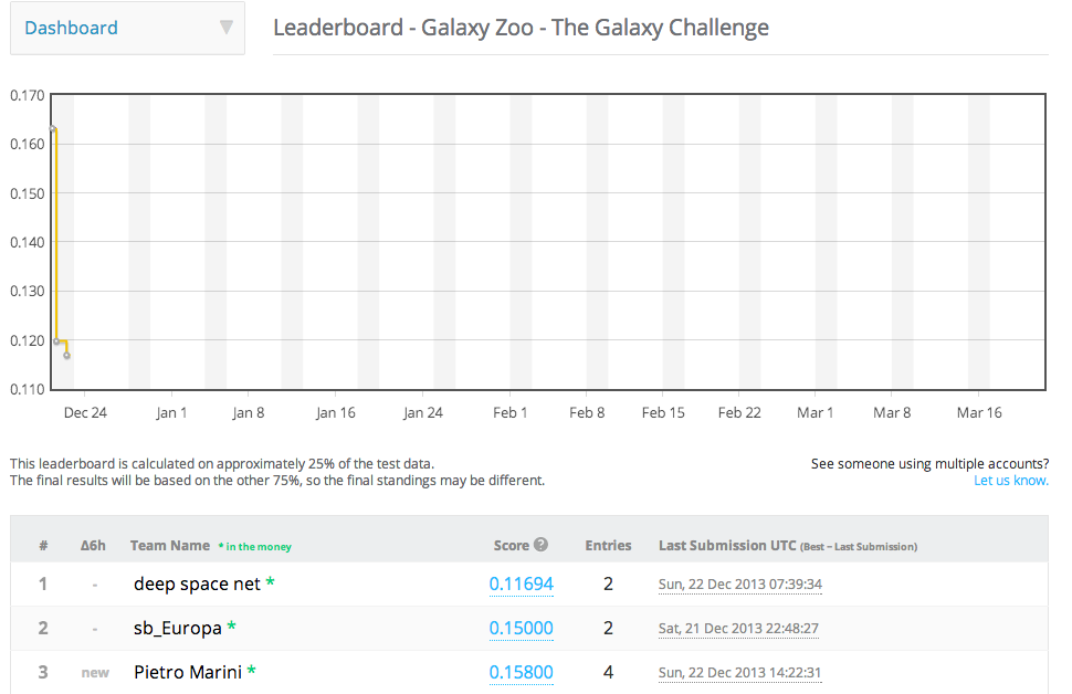
Galaxy Zoo Challenge Leaderboard, as of 22 Dec 2013.
