Galaxy Zoo: Now Available In Chinese (Mandarin)
 What follows is a press release from Academia Sinica’s Institute of Astronomy & Astrophysics, regarding the new Mandarin Galaxy Zoo. Below is some context for English speakers and regular Galaxy Zoo users.
在可觀測宇宙散佈千億星系,許多以美麗著稱。光芒閃耀的每個星系裡,都有數十億顆恆星。新推出的「星系動物園」網站中文版,和研究星系大有關聯,不管有沒有天文背景,只要有網路,無論愛上網咖還是宅宅A咖,只花二分鐘也可參與星系分類的Galaxy Zoo計畫,自2007年以來,在英、美、歐地區成為網民科普熱門運動,已經招募87萬名星系分類員(志工),大受歡迎。原來星星可以這樣數。
2013年10月份,在中研院年度開放日這天,由中研院天文所推廣成員共同翻譯完成的中文版網站,也選在這天首度公開試用,在場民眾只花二分鐘做星系形態辨識,分類結果就成為整個科學計畫資料庫的一部分,換言之,中文版的星系分類員是實際參與貢獻了科學研究,這吸引不少熱心學生和家長,「做天文只要二分鐘,很酷!而且學到新知識。」
從”Galaxy Zoo”到「星系動物園」,天文所推廣組表示,「兩年前就想過要做」的這個計畫,今年8月,一經天文所博士後研究Meg Schwamb再次提議,立刻獲得響應,網站中文化水到渠成,也讓台灣在全球天文學界再博得一次「亞洲第一」的小獎勵(註:目前該網站只有英文版和西語版)。推廣組表示,由於星系資料持續新增,分類員在圖像庫中撈到某個從未曾被人見過的星系,或「全球第一人」這樣的說法,確實所言不虛。
來自英國的Galaxy Zoo計畫主持人Chris Lintott表示,在網民科學網站傘狀計畫下的項目還有很多,天文類的譬如行星獵人(Planet Hunters)和火星氣候(Planet Four)。這些都必須靠各位地球人以好眼力來熱情相挺,電腦可幫不上忙。為什麼呢?歡迎上網一探究竟:http://www.galaxyzoo.org/?lang=zh
眨眼睛、動滑鼠、幫幫星系分分類!
Last weekend, led by Dr. Meg Schwamb (who is part of the Planet Hunters and Planet Four teams), a team of Taiwanese astronomers helped introduced a Chinese (Mandarin) version a Galaxy Zoo to the public on the Open House Day of Academia Sinica, the highest academic institution in Taiwan.
A big crowd of enthusiastic students and parents, attracted by the long queue itself, visited the ‘Citizen Science: Galaxy Zoo’ booth to try the project hands-on by doing galaxy classifications. They were excited to participate in scientific research and enjoyed it very much.
“Amazing! In just two minutes, we have helped astronomer doing their research, it’s so cool! Also, we learn new astronomical facts we never knew before. It’s a good show.”
The Education Public Outreach team of Academia Sinica’s Institute of Astronomy & Astrophysics (a.k.a. “ASIAA”), has helped translated Galaxy Zoo from English to Chinese (Mandarin). The main translator, Lauren Huang said, “we were keen to do a localized version for Galaxy Zoo since 2010, so when Meg brought up this nice idea again, we acted upon it at once.” In less than six weeks, it was done. The other translator, Chun-Hui, Yang, who contributed to the translation, said that she likes the website’s sleek design very much. “I think the honor is ours, to take part in such a well-designed global team work!” Lauren said.
Talking about the translation process process, Lauren provided an anecdote that she thought about giving “zoo” a very local name, such as “Daguanyuan” (“Grand View Garden”), a term with authentic Chinese cultural flavour, and is from classic Chinese novel Dream of the Red Chamber. She said, “because, my personal experience in browsing the Galaxy Zoo website has been very much just like the character Ganny Liu in the classics novel. Imagine, if one flew into the virtual image database of the universe, which contains all sorts of hidden treasures waiting to be explored, what a privilege, and how little we can offer, to help on such a grandeur design?” However, the zoo is still translated as “Dungwuyuan”, literally, just as “zoo “. Because that’s what some Chinese bloggers have already accustomed to, creating a different term might just be too confusing.
You can check out the Traditional Character Chinese (Mandarin) version of Galaxy Zoo at http://www.galaxyzoo.org/?lang=zh
Wish You Were All Here…
Today’s post is from Ivy Wong, Science Team member and PI of an upcoming new project. She also did an amazing job organizing our Galaxy Zoo conference in Australia. Read on for details!
It has been 2 weeks since the “Evolutionary Paths in Galaxy Morphology” meeting in Sydney and I am still recovering from the post-conference brain-melt, also described in Brooke’s blog post. Perhaps I am getting old.
The 4 days of cutting-edge science presentations and discussions went by all too quickly. And we are now left with new ideas for new projects and renewed motivation for finishing up current ones. It is also becoming clear that the term morphology is slowly evolving from a once vague division between early- and late-type galaxies (i.e. spheroids or spirals; as inferred from observations using optical telescopes) to include more specific descriptions of a galaxy’s form which includes the 3-dimensional dynamics and kinematics. Also, how a galaxy looks at a different wavelength will depend on factors such as how hot its interstellar medium is, how much gas it has, what state that gas is, how active is the galaxy’s central supermassive black hole and whether it is experiencing any harassment by its neighbours and local environment.
As our understanding of galaxy morphology evolves, so too will the Galaxy Zoo project. As you may have heard, the next generation Galaxy Zoo project will show us morphologies that will be completely alien to most of us, even those who enjoy a regular dose of science fiction. The new Radio Galaxy Zoo project will show us images observed in the radio wavelengths, typically coming from synchrotron radiation. Synchrotron emission results from accelerated charged particles moving at relativistic velocities and is usually seen as outflows/jets from a galaxy’s central supermassive black holes.
Though this already happened during the conference dinner, I’d like to take this opportunity to make a repeat of the toast (albeit virtually) to the >800,000 citizen scientists who has helped us thus far. It would have been lovely to have you all join us at the meeting, but we would have probably sunk our dinner boat. So if you’re interested in checking out some of the presentations from this meeting, please go to:
gzconf.galaxyzoo.org
The official conference program booklet will help put these presentations into context and can be found at:
atnf.csiro.au/research/conf…es/gzconf_booklet.pdf
Am definitely looking forward to the next big Galaxy Zoo conference. Perhaps somewhere up North next time?

A Galaxy Zoo conference is not complete without after hours drinks by the harbour. From left to right: Brooke, Karen, Jeyhan, Julie & Ivy in pic 1. Amit, Kyle, Bill, Chris L. & Chris S. in pic 2. (Photo credit: Amanda Bauer aka @astropixie)
Galaxy Zoo Continues to Evolve
Over the years the public has seen more than a million galaxies via Galaxy Zoo, and nearly all of them had something in common: we tried to get as close as possible to showing you what the galaxy would actually look like with the naked eye if you were able to see them with the resolving power of some of the world’s most advanced telescopes. Starting today, we’re branching out from that with the addition of over 70,000 new galaxy images (of some our old favorites) at wavelengths the human eye wouldn’t be able to see.
Just to be clear, we haven’t always shown images taken at optical wavelengths. Galaxies from the CANDELS survey, for example, are imaged at near-infrared* wavelengths. But they are also some of the most distant galaxies we’ve ever seen, and because of the expansion of the universe, most of the light that the Hubble Space Telescope (HST) captured for those galaxies had been “stretched” from its original optical wavelength (note: we call the originally emitted wavelength the rest-frame wavelength).
Optical light provides a huge amount of information about a galaxy (or a voorwerpje, etc.), and we are still a long way from having extracted every bit of information from optical images of galaxies. However, the optical is only a small part of the electromagnetic spectrum, and the other wavelengths give different and often complementary information about the physical processes taking place in galaxies. For example, more energetic light in the ultraviolet tells us about higher-energy phenomena, like emission directly from the accretion disk around a supermassive black hole, or light from very massive, very young stars. As a stellar population ages and the massive stars die, the older, redder stars left behind emit more light in the near-infrared – so by observing in the near-IR, we get to see where the old stars are.
The near-IR has another very useful property: the longer wavelengths can mostly pass right by interstellar dust without being absorbed or scattered. So images of galaxies in the rest-frame infrared can see through all but the thickest dust shrouds, and we can get a more complete picture about stars and dust in galaxies by looking at them in the near-IR.

Even though the optical SDSS image (left) is deeper than the near-IR UKIDSS image (right), you can still see that the UKIDSS image is less affected by the dust lanes seen at left.
Starting today, we are adding images of galaxies taken with the United Kingdom Infrared Telescope (UKIRT) for the recently-completed UKIDSS project. UKIDSS is the largest, deepest survey of the sky at near-infrared wavelengths, and the typical seeing is close to (often better than) the typical seeing of the SDSS. Every UKIDSS galaxy that we’re showing is also in SDSS, which means that volunteers at Galaxy Zoo will be providing classifications for the same galaxies in both optical and infrared wavelengths, in a uniform way. This is incredibly valuable: each of those wavelength ranges are separately rich with information, and by combining them we can learn even more about how the stars in each galaxy have evolved and are evolving, and how the material from which new stars might form (as traced by the dust) is distributed in the galaxy.

1 galaxy, 4 redshifts.
In addition to the more than 70,000 UKIDSS near-infrared images we have added to the active classification pool, we are also adding nearly 7,000 images that have a different purpose: to help us understand how a galaxy’s classification evolves as the galaxy gets farther and farther away from the telescope. To that end, team member Edmond Cheung has taken SDSS images of nearby galaxies that volunteers have already classified, “placed” them at much higher redshifts, then “observed” them as we would have seen them with HST in the rest-frame optical. By classifying these redshifted galaxies**, we hope to answer the question of how the classifications of distant galaxies might be subtly different due to image depth and distance effects. It’s a small number of galaxies compared to the full sample of those in either Galaxy Zoo: Hubble or CANDELS, but it’s an absolutely crucial part of making the most of all of your classifications.
As always, Galaxy Zoo continues to evolve as we use your classifications to answer fundamental questions of galaxy evolution and those answers lead to new and interesting questions. We really hope you enjoy these new images, and we expect that there will soon be some interesting new discussions on Talk (where there will, as usual, be more information available about each galaxy), and very possibly new discoveries to be made.
Thanks for classifying!
* “Infrared” is a really large wavelength range, much larger than optical, so scientists modify the term to describe what part of it they’re referring to. Near-infrared means the wavelengths are only a bit too long (red) to be seen by the human eye; there’s also mid-infrared and far-infrared, which are progressively longer-wavelength. For context, far-infrared wavelengths can be more than a hundred times longer than near-infrared wavelengths, and they’re closer in energy to microwaves and radio waves than optical light. Each of the different parts of the infrared gives us information on different types of physics.
** You might notice that these galaxies have a slightly different question tree than the rest of the galaxies: that’s because, where these galaxies have been redshifted into the range where they would have been observed in the Galaxy Zoo: Hubble sample, we’re asking the same questions we asked for that sample, so there are some slight differences.
Top Image Credits and more information: here.
Congratulations Edmond: another Galaxy Zoo paper accepted
A quick post to say congratulations to new Galaxy Zoo science team member Edmond Cheung, a PhD student from UC Santa Cruz, on the publication of his first Galaxy Zoo paper. Edmond approached us some time ago and was interested in doing further study on the barred galaxies in both Galaxy Zoo 2 and GZ: Hubble. This paper is the result of the excellent work he’s done looking at more detail on the properties of bars in the Galaxy Zoo 2 classifications.
The paper has recently been accepted to the Astrophysical Journal, and will appear on the arxiv very shortly.
The main result is a stronger proof than has ever before been seen that secular (that is, very slow) evolution affects the properties of barred galaxies, which grow larger bulges and slow down in their star formation the longer the bars grow (or the older the bars are).
Edit: This paper is now available on the arXiv at http://arxiv.org/abs/1310.2941
Quench Boost: A How-To-Guide, Part 4
Now that we’ve been initiated into the cool waters of Tools (Part 1), we’ve compared our *own* galaxies to the rest of the post-quenched sample (Part 2), and we’ve put your classifications to use, looking for what makes post-quench galaxies special compared to the rest of the riff-raff (Part 3), we’re ready for Part 4 of the Quench ‘How-To-Guide’.
This segment is inspired by a post on Quench Talk in response to Part 3 of this guide. One of our esteemed zoo-ite mods noted:
There are more Quench Sample mergers (505) than Control mergers (245)… It seems to suggest mergers have a role to play in quenching star formation as well.
Whoa! That’s a statistically significant difference and will be a really cool result if it holds up under further investigation!
I’ve been thinking about this potential result in the context of the Kaviraj article, summarized by Michael Zevin at http://postquench.blogspot.com/. The articles finds evidence that massive post-quenched galaxies appear to require different quenching mechanisms than lower-mass post-quenched galaxies. I wondered — can our data speak to their result?
Let’s find out!
Step 1: Copy this Dashboard to your Quench Tools environment, as you did in Part 3 of this guide.
- This starter Dashboard provides a series of tables that have filtered the Control sample data into sources showing merger signatures and those that do not, as well as sources in low, mid, and high mass bins.
- Mass, in this case, refers to the total stellar mass of each galaxy. You can see what limits I set for each mass bin by looking at the filter statements under the ‘Prompt’ in each Table.
Step 2: Compare the mass histogram for the Control galaxies with merger signatures with the mass histogram for the total sample of Control galaxies.
- Click ‘Tools’ and choose ‘Histogram’ in the pop-up options.
- Choose ‘Control’ as the ‘Data Source’.
- Choose ‘log_mass’ as the x-axis, and limit the range from 6 to 12.
- Repeat the above, but choose ‘Control – Merging’ as the ‘Data Source’.
The result will look similar to the figure below. Can you tell by eye if there’s a trend with mass in terms of the fraction of Control galaxies with merger signatures?
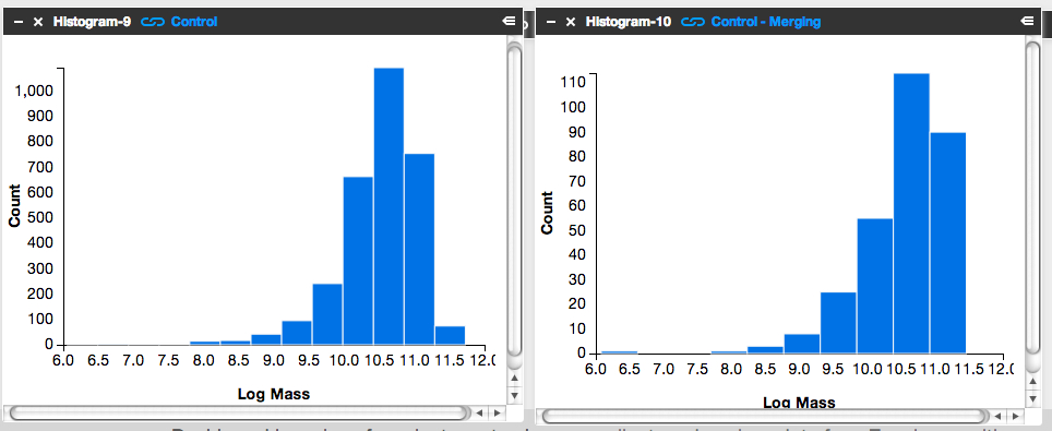
It’s subtle to see it in this visualization. Instead, let’s look at the fractions themselves.
Step 3: Letting the numbers guide us… Is there a higher fraction of Control galaxies with merger signatures at the low-mass end? At the high-mass end? Neither?
To answer this question, we need to know, for each mass bin, the fraction of Control galaxies that show merger signatures. I.e.,
![]()
Luckily, Tools can give us this information.
- Click on the ‘Control – Low Mass’ Table and scroll to its lower right.
- You’ll see the words ‘1527 Total Items’.
- There are 1527 Control galaxies in the low mass bin.
- Similarly, if you look in the lower right of the ‘Control – Merging – Low Mass’ Table, you’ll see that there are 131 galaxies in this category.
- This means that the merger fraction for the low mass bin is 131/1527 or 8.6%.
- Find the fraction for the middle and high mass bins.
Does the fraction increase or decrease with mass?
Step 4: Repeat the above steps but for the post-quenched galaxy sample.
You may want to open a new Dashboard to keep your window from getting too cluttered.
Step 5: How do the results compare for our post-quenched galaxies versus our Control galaxies? How can we best visualize these results?
- In thinking about the answer to this question, you might want to make a plot of mass (on the x-axis) versus merger fraction (on the y-axis) for the Control galaxies.
- On that same graph, you’d also show the results for the post-quenched galaxies.
- To determine what mass value to use, consider taking the median mass value for each mass bin.
- Determine this by clicking on ‘Tools’, choosing ‘Statistics’ in the pop-up options, selecting ‘Control – Low Mass’ as your ‘Data Source’, and selecting ‘Log Mass’ as the ‘Field’.
- This ‘Statistics’ Tool gives you the mean, median, mode, and other values.
- You could plot the results with pen on paper, use Google spreadsheets, or whatever plotting software you prefer. Unfortunately Tools, at this point, doesn’t provide this functionality.
It’d be awesome if you posted an image of your results here or at Quench Talk. We can then compare results, identify the best way to visualize this for the article, and build on what we’ve found.
You might also consider repeating the above but testing for the effect of choosing different, wider, or narrower mass bins. Does that change the results? It’d be really useful to know if it does.
Quench Boost: A How-To-Guide, Part 3
I’m very happy to be posting again to the How-To-Guide. We’ve made a number of updates to Quench data and Quench Tools. Before I launch into Part 3 of the Guide, here are the recent updates:
- The classification results for the 57 control galaxies that needed replacements have been uploaded into Quench Tools.
- We’ve applied two sets of corrections to the galaxies magnitudes: the magnitudes are now corrected for both the effect of extinction by dust and the redshifting of light (specifically, the k-correction).
- We’ve uploaded the emission line characteristics for all the control galaxies.
- We’ve uploaded a few additional properties for all the galaxies (e.g., luminosity distances and star formation rates).
- We corrected a bug in the code that mistakenly skipped galaxies identified as ‘smooth with off-center bright clumps’.
In Part 1 of this How-To-Guide to data analysis within Quench, you learned how to use Tools and were introduced to the background literature about post-quenched galaxies and galaxy evolution.
In Part 2 you used Tools to compare results from galaxies *you* classified with the rest of the post-quenched galaxy sample.
In Part 3 we’re going to use the results from the classifications that you all provided to see if there’s anything different about the post-quenched galaxies that have merged or are in the process of merging with a neighbor, and those that show no merger signatures.
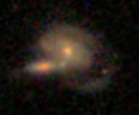
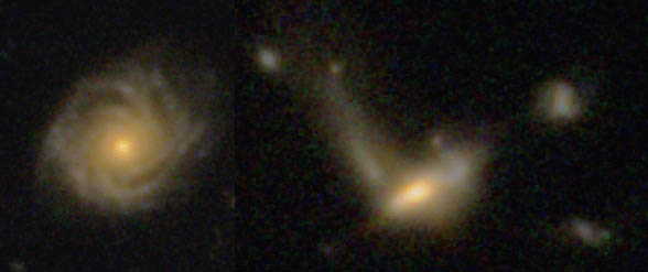
The figure below is of one of my favorite post-quenched galaxies with merger signatures. Gotta love those swooping tidal tails!
Let’s get started!
Step 1: Because of the updates to Tools, first clear your Internet browser’s cache, so it uploads the latest Quench Tools data.
Step 2: Copy my starter dashboard with emission line ratios ready for play.
- Open my Dashboard and click ‘Copy Dashboard’ in the upper right. This way you can make changes to it.
- In this Dashboard, I’ve uploaded the post-quenched galaxy data.
- I also opened a Table, just as you did in Part 2 of this How-To-Guide. I called the Table ‘All Quench Table’.
- In the Table, notice how I’ve applied a few filters, by using the syntax:
filter .’Halpha Flux’ > 0
- This reduces the table to only include sources that fulfill those criteria.
- Also notice that I’ve created a few new columns of data, just as you did in Part 2, by using the syntax:
field ‘o3hb’, .’Oiii Flux’/.’Hbeta Flux’
- That particular syntax means that I took the flux for the doubly ionized oxygen emission line ([0III]) and divided it by the flux in one of the Hydrogen emission lines (Hbeta).
- This ratio and the ratio of [NII]/Halpha are quite useful for identifying Active Galactic Nuclei (AGN).
- It’d be really interesting if we find that AGN play a role in shutting off the star formation in our post-quenched galaxies. A major question in galaxy evolution is whether there’s any clear interplay between merging, AGN activity, and shutting off star formation.
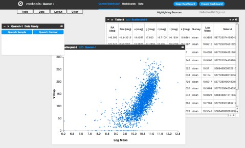
Step 3: Create the BPT diagram using the ratios of [OIII]/Hb and [NII]/Ha.
- BPT stands for Baldwin, Phillips, and Terlevich (1981), among the first articles to use these emission line ratios to identify AGN. Check out the GZ Green Peas project’s use of the BPT diagram.
- Click on ‘Tools’. Choose ‘Scatter plot’ in the pop-up options.
- In the new Scatterplot window, choose ‘All Quench Table’ as your ‘Data Source’.
- For the x-axis, choose ‘logn2ha’. For the y-axis, choose ‘logo3hb’.
- Adjust the min/max values so the data fits nicely within the window, as shown in the figure below.
- Remember that you can click on the comb icon in the upper-left of the plot to make the menu overlay disappear.
- Do you notice the two wings of the seagull in your plot? The left-hand wing is where star forming galaxies reside (potentially star-bursting galaxies) while the right-hand wing is where AGN reside. Our post-quenched sample of galaxies covers both wings.

Step 4: Compare the BPT diagram for post-quenched galaxies with and without signatures of having experienced a merger.
- To do this, you’ll need to first create two new tables, one that filters out merging galaxies and the other that filters out non-merging galaxies.
- Click on ‘Tools’. Choose ‘Table’ in the pop-up options.
- In the new Table window, choose ‘All Quench Table’ as the ‘Data Source’. Notice how this new table already has all the new columns that were created in the ‘All Quench Table’. That makes our life easier!
- Look through the column names and find the one that says ‘Merging’. Possible responses are ‘Neither’, ‘Merging’, ‘Tidal Debris’, or ‘Both’.
- Let’s pick out just the galaxies with no merger signatures.
- Under ‘Prompt’ type:
filter .Merging = ‘Neither’
- If you scroll to the bottom of the Table, you’ll notice that you now have only 2191 rows, rather than the original 3002.
- Call this Table ‘Non-Mergers Table’ by double clicking on the ‘Table-4’ in the upper-left of the Table and typing in the new name.
- Now follow the instructions from Step 3 to create a BPT scatter plot for your post-quenched galaxies with no merger signatures. Be sure to choose ‘Non-Mergers Table’ as the ‘Data Source’.
- You might notice that this plot looks pretty similar to the plot for the full post-quenched galaxy sample, just with fewer galaxies.
What about post-quenched galaxies that show signatures of merger activity? Do they also show a similar mix of star forming galaxies and AGN?
- To find out, create a new Table, but this time under ‘Prompt’ type:
filter .Merging != ‘Neither’
- The ‘!=’ syntax stands for ‘Not’, which means this filter picks out galaxies that had any other response under the ‘Merging’ column (i.e, tidal tails, merger, both). Notice how there are 505 sources in this Table.
- Now create a BPT scatter plot for your ‘Mergers Table’.
- Make sure this plot has a similar xmin,xmax,ymin,ymax as your other plots to ensure a fair comparison.
- You might also compare histograms of log(NII/Ha) for the different subsamples.
What do you find? Do you notice the difference? What could this be telling us about our post-quenched galaxies?!
Before you get too carried away in the excitement, it’s a good idea to compare the post-quenched galaxy sample BPT results against the control galaxy sample.
This comparison with the control sample will tell you whether this truly is an interesting and unique result for post-quenched galaxies, or something typical for galaxies in general. You might consider doing this in a new Dashboard, as I have, to keep things from getting too cluttered. In that new Dashboard, click ‘Data’, choose ‘Quench’ in the pop-up options, and choose ‘Quench Control’ as your data to upload. Now repeat Steps 1-4.
Do you notice any differences between your control galaxy and post-quenched galaxy sample results? What do you think this tells us about our post-quenched galaxies?
Stay tuned for Part 4 of this How-To-Guide. I’d love to build from your results from this stage, so definitely post the URLs for your Dashboards here or within Quench Talk and your questions and comments.
More Galaxies, More Clicks, More Science!
Just a quick update: recently we brought some of our high-redshift (i.e., very distant) galaxies out of retirement. There’s enough going on in these galaxies that having more clicks from you will really help tease out the nuances of the various features and make the classifications even better.
How would you classify these?
So, for those of you who noticed you hadn’t seen many CANDELS galaxies recently, well, you’re about to see a few more. I can’t promise they’ll always be easy to classify, but I hope they’ll at least be an interesting puzzle. As ever, thank you for your classifications!
Next GZ Hangout: 3rd of September, 3 pm GMT
The hangouts have returned from a midsummer hiatus! Our next hangout will be Tuesday, September 3rd, at 3 pm GMT. That’s 8 am PDT, 11 am EDT, 4 pm BST, 5 pm CET, 6 pm CAT. Unfortunately I think that’s 11 pm in Japan and midnight in Sydney, but hopefully we’ll have a hangout at a different time very soon!
Just before the hangout we’ll update this post with the embedded video, so you can watch it live from here. If you’re watching live and want to jump in on Twitter, please do! we use a term you’ve never heard without explaining it, please feel free to use the Jargon Gong by tweeting us. For example: “@galaxyzoo GONG dark matter halo“.
In the meantime, please feel free to leave a question in the comments below. See you soon!
Update: read a summary of the Hangout here: What is a Galaxy?… the Return
Quench Boost: A How-To-Guide, Part 2
It was amazing how quickly the new Quench classifications were completed. We posted them on Friday and you were already done by Sunday morning. Wow, that’s awesome! This means we can turn our full attention to making sense of the data. And we need your help!
In Part 1 of this How-To-Guide to data analysis within Quench, you learned how to use Tools, our analysis platform, and were inspired (or so I hope) about ways to play with the data as you read the background literature about post-quenched galaxies and galaxy evolution.
In Part 2 of this How-To-Guide, we’re going to help you navigate using Tools to compare results from galaxies *you* classified with the rest of the post-quenched galaxy sample.
You’re 12 small steps away from your first comparison plot between your galaxies and the full sample… let’s get started!
Step 1: Enter Tools and log in using your Zooniverse login information.
Step 2: Choose ‘Quench’ in the pull-down menu in the upper-left, next to the words ‘zootools’. Now click ‘Create Dashboard*’ in the upper-right, and give it a name, like: ‘My Data in Context’.
Step 3: Click ‘Data’ in the upper-left and choose ‘Zooniverse’ in the pop-up options.
Step 4: In the window that pops up, choose ‘Recents’ or ‘Collections’. Your choice.
If you classified galaxies in quench.galaxyzoo.org, they’ll be accessible through ‘Recents’. Choose the max number possible. If you created a Collection of interesting galaxies in Quench Talk or want to look at someone else’s Collection, you can access them by clicking ‘Collections’.
I’ve created a Dashboard* in Tools called ‘Example: My Data in Context’. Take a look and, if you’d like, you can even make edits by copying it into your Tools environment.
In my Dashboard ‘Example: My Data in Context’, I chose ‘Collections’. I love #Quencher SUMO_2011’s Collection of ‘Blue’ galaxies from Quench. If you go to that URL, the Collection ID is listed after the final ‘/’ in the URL. In this case, the Collection ID is CGSS00000x. I inputted that ID into the pop-up window in Tools, in the box next to ‘Enter Collection Id:”. I then clicked on ‘Import Data’.
Step 5: Now that you have your galaxies’ information imported into the Dashboard, it’s time to play with them. Click on ‘Tools’ in the upper-left and choose ‘Table’ in the pop-up options.
Step 6: In your Table window, choose ‘Zooniverse-1’ in the pull-down menu under ‘Data Source’. Now the Table knows to work with that set of data.
Step 7: As in Part 1 of this How-To-Guide (https://blog.galaxyzoo.org/2013/08/23/quench-boost-a-how-to-guide-part-1/), you’ll make a new column that has color information about your galaxies. You do this by subtracting the brightness of your galaxy in one filter from the brightness of your galaxy in another filter.
In the open space under ‘Prompt’ in your Table, write: field ‘My Galaxies Color u-r’, .u-.r
If you scroll to the right in your table, you’ll see that you created a new column of information, called ‘My Galaxies Color u-r’.
Step 8: Click ‘Tools’ in the upper-left and choose ‘Scatterplot’ in the pop-up options.
Step 9: In your Scatterplot window, choose ‘Table-2’ in the pull-down menu under ‘Data Source’. Now the Scatterplot knows to work with the Table, which includes your new column with Color information.
Step 10: Choose ‘log_mass’ for the X-axis and ‘My Galaxies Color u-r’ for the Y-axis. Recent star formation is seen strongly in the u-band while older stars dominate the r-band. The color, u-r, tells you about the star formation history for each of your galaxies. Check out this post for more details.
Step 11: How do your galaxies compare with the full sample of post-quenched galaxies? To answer this, we redo the steps 3-10 above, but for the post-quenched galaxy sample.
- Click on ‘Data’ in the upper-left and choose ‘Quench’ in the pop-up options.
- Click on ‘Quench Sample’ in the pop-up window.
- Click on ‘Tools’ in the upper-left and choose ‘Table’ in the pop-up options.
- In the new Table window, choose ‘Quench-4’ in the pull-down menu under ‘Data Source’. This loads the Quench Sample into that Table.
- In the open space under ‘Prompt’ in your Table, write: field ‘Quench Galaxies Color u-r’, .u-.r
- Click on ‘Tools’ in the upper-left and choose ‘Scatterplot’ in the pop-up options.
- In the new Scatterplot window, choose ‘Table-5’ in the pull-down menu under ‘Data Source’.
- Choose ‘log_mass’ for the X-axis and ‘Quench Galaxies Color u-r’ for the Y-axis.
- Zoom in on the data, for example, choosing Xmin: 7, Xmax: 12, Ymin: 1, and Ymax: 4.
Step 12: Place your two scatterplots side by side. For a fair comparison, make sure the x- and y-axis range is the same for both plots, otherwise the stretch might skew your analysis. I tend to make the axes ranges in the plot showing My Galaxies match the plot showing the Quench Sample.
What do you notice about your subsample of post-quenched galaxies compared to the full sample? Do they occupy a particle sub-space within the plot? Or are they randomly distributed throughout the quench space?
The figure below shows what you’ll see if, like me, you uploaded SUMO_2011’s Collection of blue galaxies. You’ll notice that all of the blue-collection galaxies are way bluer (closer to the bottom of the plot, near values u-r = 1.5) than the full post-quenched galaxy sample (which spread from u-r values of 1 to u-r values of 3.5 and higher). This is a reassuring reality check given what you see visually when you look at the color of the galaxies. The plot also tells us that since these blue galaxies have such low values of ‘u-r’, they’ve had more recent star formation than most of the post-quenched galaxies.
In looking at these two plots side-by-side, I wondered: Why are there so few massive post-quenched galaxies (log_mass > 11) with bluer colors (u-r < 2.0)? If we compare our post-quenched galaxies with our control galaxies, do I see any difference? Specifically, are there massive (log_mass > 11) control galaxies with bluer colors (u-r < 2.0)? If there are, what might that be telling me about our post-quenched galaxy sample?
Stay tuned for Part 3 of our How-To-Guide for taking part in the analysis phase of the research process. If you have suggestions for what you’d like to learn more about, please post here. Thank you all, and keep on Quenching!
*Dashboard is the place within Tools (tools.zooniverse.org) for volunteers to observe, collect, and analyze data from Zooniverse citizen science projects.

Quench Boost: A How-To Guide, Part 1
The reaction to GZ Quench has been amazing. It has been great to see the interest and enthusiasm for supporting citizen scientists in experiencing the full scientific process.
This morning’s post was about how we have a small sample of additional galaxies to classify. I’ve really enjoyed watching how fast those are being done… gotta love the counter at http://quench.galaxyzoo.org/. Thank you all!
This post is Part 1 of our How-To-Guide for analyzing our classification results. It’s clear that you’re interested in getting your analysis on, but it may be that you’re not sure where to start. That’s 100% understandable and we’re here to help. We’ve broken down the steps into bite-size chunks. Let’s get started.
The first thing to do is to meet Quench Tools. This is the web platform to help you play with the data. To enter Quench Tools, click here. An in-line Tutorial will automatically pop-up, and guide you through entering the Quench area, loading the data, and creating your first figure. For additional information about Tools, check out our GZ Hangout about Tools, our text-based Tools Tutorial, and this Quench Talk discussion forum post.
In parallel with getting to know Tools, you may be interested in understanding the science context for why post-quenched galaxies (the GZ Quench sample) are so interesting for galaxy evolution studies. A great starting place for getting a sense of the science context and motivation is to read the summaries (written for the general public) of science articles at http://postquench.blogspot.com/. It’s modeled after the astrobites blog, a great resource for any astronomy enthusiast!
As you read those posts, you might want to join the conversation within the Quench Talk discussion forum. There are also a slew of links to popular science articles and websites for additional information about post-quenched galaxies and galaxy evolution.
And if you feel it would help to take a step back and see the big picture, definitely check out our initial GZ Quench blog post and this Quench Talk post.
Stay tuned for Part 2 of our How-To-Guide. In it, I’ll guide you through the next bite-size piece of this adventure – playing with your own classification results!