Galaxy Zoo featured in first Euclid data release!

We’re delighted to share that Galaxy Zoo (and you!) are featured in the first Euclid data release announced today!
Back in August 2024, we launched an intensive Euclid campaign where 9,976 of you classified over 380,000 galaxies. Thanks to your hard work and efforts, you trained the newest iteration of Zoobot and powered the first Euclid data release! Read the paper here.
Thanks again for your participation and help making this science possible!
Galaxy Zoo Team
Cosmic Disco: Help us characterize galaxy merger stages!
You have helped classify the morphologies of millions of galaxies through various Galaxy Zoo campaigns! Among those several millions are colliding galaxies (aka galaxy mergers) that are experiencing a significant change in their morphology and physical nature. Previously you have answered questions about the presence of disturbed morphological features (e.g., major or minor disturbance). As the process of galaxy merging can take several millions to a billion years, the merging galaxies we observe present to us in a plethora of configurations depending on their merging stage.

Identifying the stage of merging can help us better associate the impact of mergers to specific changes in the galaxy properties. An alternative approach is to use the disturbed morphological signatures (also called tidal features) as a proxy for merger staging. We are launching a new project Cosmic Disco: Characterizing Galaxy Collisions where you can help characterize the images containing mergers into objective categories.

We are looking forward to doing awesome science with your help! Happy Classifying!
Letting Things Slide: A New Trial Interface for Expressing Uncertainty
“How many spiral arms are in the image – is it two or three? Is that a disk viewed edge-on? I think so, but I’m not quite sure…” If you’ve interacted with Galaxy Zoo before, you may have asked yourself questions like these. Real galaxy images can be confusing. You may be uncertain!
Until now, you have always had to make a choice. There was no way to express uncertainty in your annotations. But now there is! Try it here.
We are trialing a new experimental interface that lets you express your confidence in your annotations by dragging on a slider. This design is motivated by recent research indicating that we may be able to learn more, faster, by collecting annotator uncertainty [see this paper, this paper, this paper, this paper]. Allowing you to express your uncertainty by dragging a slider means that you – Zooniverse Friend – are providing more information with each click.
We believe this slider design might help us – through your support – discover more about galaxies, faster!
This is the second trial project we’re starting, adding to the Tags trial that Hayley introduced earlier on the blog. The big picture here is that we’re trying to think about how Galaxy Zoo could evolve in the coming years. As with any science project, we need to gather data and test our ideas.
Join in here and help us improve Galaxy Zoo.
We’ll run this trial for a short time – perhaps a couple of months – to gather your annotations and feedback. You can still use the current Galaxy Zoo that you know and (hopefully) love, at www.galaxyzoo.org.
Thank you for helping us,
Mike, Katie, and Ilia.
Galaxy Zoo UKIDSS Classifications Now Public
We’re happy to announce that we recently made all the classifications from the Galaxy Zoo: UKIDSS phase of the project public with a short paper (arxiv link) describing what’s available.
At Galaxy Zoo, we are really committed to making your classifications open access and publicly available. We want to do this to maximise the science output from all of your work. However, as we’re a pretty small science team, sometimes it takes us a bit longer than other times. In this case it’s 10 years since we showed the UKIDSS images on the site, but we hope it’s better late than never for releasing this sample, which, as far as we can tell is the largest set of morphological classifications of galaxies images in the near infrared range of the spectrum.

We decided to publish Galaxy Zoo: Morphologies Based on UKIDSS NIR Imaging for 71,052 Galaxies as a “Research Note of the American Astronomical Society” (RNAAS, or “Research Note” for short); a relatively new (and completely open access) publication venue from the American Astronomical Society journals. The length of these “Notes” is very limited, and you are only allowed one figure, but it gets published very quickly once it’s ready, so it seemed ideal for this short notice of the classifications being made public.
To read more about what UKIDSS is, and why we wanted to have the near-infrared galaxy images from it classified by you, you might enjoy this blog post explainer from 2013. We also talked about the UKIDSS images in this post from 2015 “Eight Years and Eight Different Types of Galaxy Images”.
As always, thanks again for your classifications, and in this case, also for your patience in waiting for us to get them processed and out to the astronomical community for use.
Announcing the Galaxy Zoo: Euclid project!
We are thrilled to announce the launch of the Galaxy Zoo: Euclid project, with 820,000 galaxy images fresh from ESA’s Euclid Space Telescope’s first year of operations! This will be the public’s first chance to see survey images from the Euclid telescope. If you take part in the project, you could be the first human to ever see that image from Euclid. Not only that, you could be the first human in the Universe to ever lay eyes on the galaxy in the image. These classifications will help the Galaxy Zoo and Euclid science teams answer questions about how the shapes of galaxies have changed over time, and which processes in the Universe have caused these changes.

First off, if you’re not familiar, let’s start with the Euclid Space Telescope. The European Space Agency’s (ESA) Euclid space telescope launched in July 2023 and has begun to take its survey of the sky. Euclid has been designed to look at a much larger region of sky than the Hubble Space Telescope or the James Webb Space Telescope, meaning it can capture a wide range of different objects all in the same image – from faint to bright, from distant to nearby, from the most massive of galaxy clusters, to the smallest nearby stars. With Euclid, we will get both a very detailed and very wide view (more than one third of the sky) all at once.
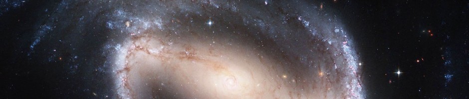
In November 2023 and May 2024, the world got its first glimpse at the quality of Euclid’s images with Euclid’s Early Release Observations which targeted various astronomical objects, from nearby nebulae, to distant clusters of galaxies. Below is an incredible image of the 1000 galaxies in the nearby Perseus cluster taken by Euclid. What you’ll notice in the background though is a plethora of distant galaxies all ready for their shapes to be classified! At the latest count, there’s 100,000 background galaxies in this one image alone.

The sheer volume of data from Euclid is a huge challenge to us astronomers; Euclid is set to send back 100GB of data per day for six years. That’s a lot of data, and labelling that through human effort alone is incredibly difficult. So we will once again be deploying our AI algorithm, called Zoobot, for this project. If you want to know more about Zoobot, Mike wrote a great blog post explaining it in more detail last year. In short, Zoobot learns from Galaxy Zoo volunteers to predict what they would say for new galaxy images. After being trained on the human answers that you will contribute in the next few months, Zoobot will then be able to give us detailed classifications for hundreds of millions of galaxies found by Euclid over its next six years of observations, creating the largest detailed galaxy catalogue to date and enabling groundbreaking scientific analysis on topics like supermassive black holes, merging galaxies, and more.
Zoobot will sift through the Euclid images first to classify the “easier” galaxies that we already have a lot of examples of from previous telescopes. However, for the galaxies where Zoobot is not confident in its classification, perhaps because the galaxy is unusual, it will send those images to volunteers on Galaxy Zoo to get their human classifications, which then help Zoobot to learn more. The Galaxy Zoo: Euclid project will therefore see AI and humans working together to learn more about our Universe.
We’re really excited about this project on the team, not least because it’s been in the pipeline for a long time! But also, because of the science that will be made possible thanks to this project. Given Euclid’s unique design that gives us both a very detailed and very wide view, we’ll be able to classify the shapes of galaxies out to much greater distances than ever before. This means we can see further back in time in the Universe’s history to trace how the shapes of galaxies have changed earlier in cosmic time. While JWST also makes this possible, the images from JWST are from a much smaller area of sky. Euclid, however, will cover one third of the entire sky and give us a look at the entire galaxy population that’s visible to us from within the Milky Way. Even as I’m typing this I’m getting excited at the population statistics that GZ: Euclid will make possible!
What’s more is that Euclid’s main focus has always been to understand the distribution and effects of dark matter in our Universe. Dark matter is matter that we know is there because of its gravitational effect on things around it, but it doesn’t emit, reflect, or absorb light, so we can’t see it. The Euclid team are planning to make a 3D map of the positions of all the galaxies they find, and trace out where all the visible and dark matter is. Combining this map with your classifications of the shapes of galaxies, we will for the first time be able to ask the question: how does dark matter affect the shapes of galaxies over cosmic time?
So I hope I’ve convinced you about how exciting this project is and you are now ready and raring to go with your classifications. You can find a link to the project below. If you do decide to take part: THANK YOU! We appreciate every single click. Join us and classify now.
Becky Smethurst, on behalf of the the Galaxy Zoo and Euclid science teams
P.S. Some of you might notice that metadata is absent for these images for now. This is because the images you’re seeing are not yet publicly available. Extra data will be added upon Euclid’s first data release in 2025.
A Retrospective on the Evolution of Galaxy Zoo and a New Era in Galaxy Classification
So as to not bury the lede, we’re testing a new method for classifying galaxies with Galaxy Zoo Tags! If you want to skip my musings about the evolution of Galaxy Zoo, you can jump directly to the section introducing this new method here.
First, as a quick introduction, my name is Hayley Roberts and I’m a postdoctoral astrophysicist and data scientist for Zooniverse based at the University of Minnesota. I finished my PhD last year at the University of Colorado Boulder, studying a rare phenomenon found in extreme galaxy mergers called OH megamasers. As a postdoc, my work has broadened to studying galaxy evolution through major mergers and starburst galaxies. This has included evaluating how well our galaxy classification schemes work for high redshift, or more distant, galaxies.
Our Evolving View of Galaxies
When Galaxy Zoo (GZ) launched in 2007, the first campaign utilized data from the Sloan Digital Sky Survey (SDSS), a pioneering survey enabled by innovative instrumentation and data handling techniques. It cannot be overstated how much SDSS data revolutionized our understanding of many aspects of astronomy, but particularly galaxy evolution and morphology, through new insights such as the color-magnitude relation and galaxy environment. However, the galaxies in this SDSS sample have a median redshift of z~0.1 (~1.3 billion light-years away), meaning this first GZ campaign was limited to only our nearest neighboring galaxies. This is reflected in the earliest iteration of the GZ classification workflow, which only asked volunteers to determine if a galaxy was a spiral (edge-on, clockwise, or anti-clockwise), an elliptical, or a merger. Clearly, we had a long way to go before the myriad of potential other options reflected in the current GZ workflow were conceived.
What drove the expansion of the classification choices in Galaxy Zoo workflow?
Two things: you and the data. Before the launch of the first iteration of GZ, the hope was to get 20,000–30,000 volunteers to participate in the first few months — the actual number ended up surpassing 100,000. This fundamentally altered the outlook on what GZ was expected to be able to do. The first GZ data release included classifications for nearly a million galaxies, an order of magnitude more than previous comparable studies. This data enabled numerous studies on unprecedented scales (such as studying the properties of dust in spiral galaxies, compiling the largest sample of mergers at the time, and exploring the co-evolution of host galaxies and their AGN), and led to new discoveries (including green peas and voorwerpjes). These first couple years demonstrated that your classifications were enabling GZ to achieve extraordinary scientific results.
Since GZ’s launch, our view of the galaxies in our universe has expanded in number, diversity, and distance. Surveys, such as DESI, have allowed GZ volunteers (you!) to classify millions of galaxy images. The diversity of galaxies classified have inspired aspects of GZ classification tree iterations over the years or entire spinoff projects. However, over the years, the biggest change to the galaxies being classified on GZ has been evident through new technology and telescopes.
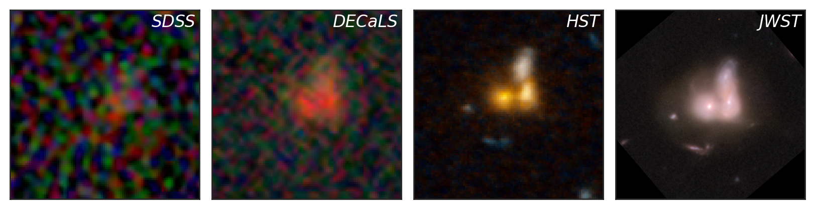
Above shows images of a galaxy obtained by four different telescopes or surveys that have starred in different GZ campaigns: SDSS, DECaLS, HST, and JWST. This galaxy, CANDELS J141937.3+525050.3, has a redshift of z=0.73 (~6.5 billion light-years away) and is a spectacular demonstration of just how our view of the universe has evolved. The SDSS and DECaLS images, the first and second panels, show a distant, unremarkable smudge of a galaxy. However, the images taken by HST and JWST, the third and fourth panels, unveil a spectacular merger between three galaxies. The higher sensitivity and resolution achieved over the years has given us unparalleled views of the galaxies in our neighborhood. Additionally, the number of high redshift galaxies in GZ has vastly increased, as well as the maximum redshift of these galaxies, particularly for JWST.
High redshift galaxies, those that are very distant and therefore seen as they were in the early universe, often defy traditional categories like spiral and elliptical galaxies. The universe was much younger and more dynamic when these galaxies formed, leading to a greater variety of shapes and structures. Unlike their more mature counterparts, high redshift galaxies frequently exhibit irregular and clumpy morphologies, complicating morphological measurements and making them harder to classify using traditional frameworks. Understanding high redshift galaxy morphology may require new classification schemes with less rigidity that account for their unique properties and the evolving state of the early universe.
Introducing Galaxy Zoo Tags: An Experimental New Way to Classify Galaxies
As we push the boundaries of our observations, the classification of high redshift galaxies presents new challenges, as discussed above. To address these challenges, we’re testing an alternative way to classify galaxies called Galaxy Zoo Tags! This workflow allows you to assign multiple “tags” (morphological features) to each galaxy without the restriction of working within the classification tree. This should allow for substantially more flexibility in classifications and feature combinations that might not be fully captured in the traditional classification tree.
You can start classifying using this new workflow right now on a sample of galaxy images from DECaLS and CEERS data from JWST. All images in this test period have been previously classified using the traditional classification tree. The goals of testing this method are to:
- Compare the results of the two different classification methods (tagging vs. traditional GZ tree), and
- Collect your thoughts and feedback on this new approach.
To help with the second goal, we’ve set up this Google form for you to provide feedback on this new classifying method. It’s also linked in the banner on the GZ Tags page. We would greatly appreciate your time testing this new method out and any thoughts or opinions you may have about it. If you have any questions, you can come chat with us on this Talk board.
We don’t have any plans to remove or replace the current GZ classification system at the moment. The future of this workflow style will be determined both by how helpful/informative the data is and your response. This is just one new approach, but there are likely many others we could pursue. As always, your input, feedback, and ideas are imperative to designing any potentially updated classification schemes, so please do consider testing out this new method and providing feedback via the Google form.
Thank you all again for your efforts and making this all possible.
Slow strong bars affect their hosts the most
Hi everyone, my name is Tobias. I finished my PhD at the University of Oxford almost a year ago now, and I am currently a postdoc at the University of Toronto. I work a lot with Galaxy Zoo classifications, specifically to study bars in galaxies. We’ve just submitted a new paper (which can be found here), but I thought it would be fun to go over some of the main results in this blogpost. I heavily relied on classifications from Galaxy Zoo in order to identify the bars, so this work would not have been possible without your help!
Introduction
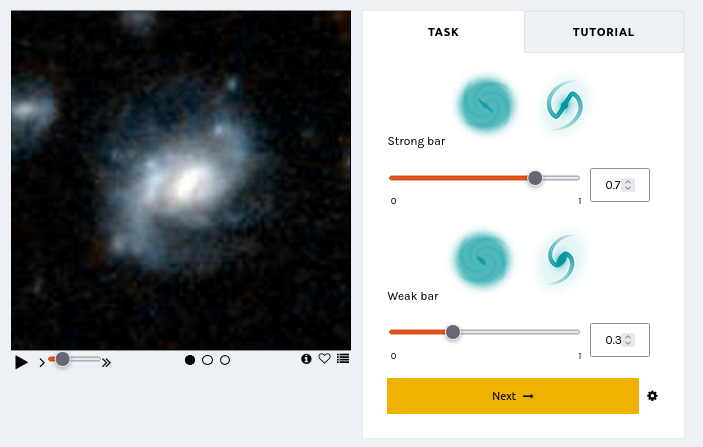
There are different ways to classify a bar in a galaxy. One you are all doubtlessly very familiar with, is a classification based on morphology: bars can be classified as either weak or strong. This is what Galaxy Zoo has been asking volunteers to do since GZ DECaLS.
However, another useful approach to classify bars is based on how they move (i.e. the kinematics). Bars will rotate around the centre of their host galaxy with a specific speed, often called the bar pattern speed (
In a previous paper, we tried to measure the kinematics of bars in a bunch of galaxies (this paper can be found here). Bar strength has been reasonably well studied over the last few years, but the kinematics of bars hasn’t been studied observationally to the same degree. Even more, the interplay between bar strength and kinematics (i.e. does a strong slow bar behave the same way as a strong fast bar?) has not really been looked at yet in much detail. This is exactly the topic of our new paper. I have been working on this problem for a while now, and I have recently finished! I’ll go over some of the main findings below, but if you want to learn more, please feel free to check out the actual paper itself: https://arxiv.org/abs/2405.05960
Intermezzo: different regions of a barred galaxy
Before we continue, I want to spend a little time to clarify different regions of a bar. The names are relatively intuitive. The picture below shows a famous barred galaxy called NGC 1300. All credits of the original picture go to NASA, ESA and the Hubble Heritage Team. Overlaid on this image are the different regions of the bar that I will talk about. The bar itself is bounded by the dashed box. The centre of the bar typically coincides with the centre of the galaxy. The bar then has two arms that stretch out either side. The bar-end region is where, as the name implies, the bar ends. The bar-end region where the bar sometimes transitions into spiral arms (as is the case here) or a large ring structure, but this is not always necessarily the case.

How do we study bar kinematics?
We want to study how bar strength and bar kinematics affect their host. Specifically, we will look at how bar strength and kinematics affect the distribution of star formation. I won’t go into too much detail on this now, but the amount of star formation is related to a quantity called the equivalent width of H
In order to measure how the star formation changes in different locations within the bar, we will create so-called radial plots, which is explained using the Figure below. Panel (1) shows the image of a galaxy. Panel (2) shows the amount of EW[H

Effect of bar strength
We can then compare different radial profiles of different groups of galaxies. For example, below, we compare the radial profiles of unbarred (grey), weakly (blue) and strongly barred galaxies (orange). There is a lot going on in these plots, but I’ll walk you through the most important parts. Firstly, the full line is the median radial profile of a group of galaxies (e.g. all strongly barred galaxies), constructed as discussed above. The contours around it show the 33th and 66th percentiles, which can be interpreted as the uncertainty around the median of the radial profile. The bottom part of the figure shows the difference between two radial profiles. Additionally, the size of the dot shows how significant the difference is. A large dot implies that the difference is very significant, while a small dot implies that it is not significantly different.

There are multiple things that we notice. Firstly, the shape of the strongly barred radial profile, when you only look at R < 1.5, is shaped like a “V”: there is a peak in the centre of the galaxy, a minimum in the arms of the bar (at R = 0.5), and a second peak just beyond the bar-end region. This distinct shape is only seen for strongly barred galaxies. The shape of weakly barred and unbarred galaxies are similar to each other: it simply increases slowly with radius. These observations are consistent with the picture that strongly barred galaxies collect gas from the galaxy, and funnel them through the arms of the bar to the centre of the galaxy. This gas is then used in the centre (and to a smaller extent, just beyond the bar-end) to form stars. We can only conclude this for strong bars, not for weak bars.
Effect of bar kinematics
Now that we’re familiar with radial profiles and how to use them, we’ll move to the main point of the paper: what happens when we look into bar kinematics as well? This is done in the Figure below, where we look at the radial profiles of EW[H


So, we see some effect of bar kinematics on the radial profile of strongly barred galaxies, but it is not significantly different, presumably due to low sample sizes. Perhaps we can tease out any potential differences in another way. Remember that the radial profiles were constructed by looking at the area around the barred region, by choosing the pixels that were contained within a box placed parallel on the bar (the red box in the example below). We can compare that to a box placed perpendicular to the bar (the blue box in the example below). By comparing these “on bar” and “off bar” radial profiles with each other we can directly assess the effect the bar has on its host, and perhaps learn more about the importance of bar kinematics.

This is exactly what we did in the Figure below. Here, we show radial profiles for on-bar regions (the red lines) and off bar regions (blue lines). We have done this for four subsets of barred galaxies: slow strong bars (top-right panel), fast strong bars (top-left panel), slow weak bars (bottom-left panel) and fast weak bars (bottom-right panel). There are a lot of different things to look at in this plot, but the main take-away is that the largest differences observed in EW[H


Why would kinematics even matter?
We have shown that slow bars effectively increase the star formation along the bar. But why? To help see why this might be the case, it is helpful to go back to the definitions. As I mentioned above, a slow bar typically moves much slower than the stars in the disc at the bar-end. This means that the difference in velocity between the bar and the stars and gas in the disc is relatively large, as visualised in the left panel of the figure below. The stars and gas in the disc will continuously overtake the bar. This also implies that the bar will come into contact with much more of the gas in the disc. We hypothesise that, because of this difference in velocity, the bar is much more efficient at collecting, funnelling and concentrating gas from the disc into the bar region. This would, in turn, concentrate the resultant star formation along the bar as well and increase the overall values of EW[H

In contrast, fast bars move with similar velocities to the stars and gas in the disc. They are always “in sync” with the disc at the bar-end region. This implies that fast bars do not come into contact with as much gas as their slower counterparts, and therefore will have lower amounts of gas and star formation along their barred regions.
Conclusion
We have talked about a lot of different things in this post. The two main points are summarised below:
1) Bar strength has a clear effect on the star formation distribution. Strong bars have higher amounts of star formation in their centre and beyond the bar-end regions, while they have lower amounts of star formation in the arms of the bar. Meanwhile, a weak bar does not seem to influence the star formation distribution of their host at all.
2) Bar kinematics matter as well. Slow bars increase the amount of star formation along the bar, likely because they come into contact with more of the gas of the galaxy and are more efficient at funnelling and concentrating gas. However, we only see this happen if the bar is also strong.
If you’re interested in learning more about this, please feel free to check out this newly released paper, found here. Of course, none of this work would have been possible without the efforts of citizen scientists, such as yourself. The bar strength classifications used in this work are directly based on your classifications, and we are all very thankful for that!
Cheers,
Tobias Géron
‘Astronomers Library’ Book Giveaway
Galaxy Zoo has meant a lot to me over the more than a decade I’ve been involved with the science team. I’ve been proud to work with many wonderful colleagues and students in the Galaxy Zoo science team and work on many investigations into the properties of galaxies enabled by your classifications.

So to celebrate the publication* of my latest popular science book “The Astronomers Library”, a beautiful pictorial walk through the history of books about astronomy, I am happy to be able to offer a giveaway to Galaxy Zoo volunteers. If you would like to have a chance to win a free signed copy of the book please sign up via this form. One volunteer will be randomly selected at the end of May 2024, and I’ll be in touch to arrange delivery.
As astronomers, our job involves many tasks, from data collection, analysis and interpretation, to presenting our work at conferences through talks and scientific posters. But there’s also a lot of writing. It’s often said that professional scientists are also professional writers. Lucky for me I happen to have come to really enjoy writing. I teach a class on writing in the sciences at Haverford College, and in recent years I’ve been delighted to find the opportunity to get involved in writing books intended for a popular audience. This book was particularly fun to work on for how it combines two of my favourite things – astronomy and books, and I’m delighted with the end result.
Karen (PI of Galaxy Zoo).
*For full transparency, while I was paid to write this book, I do not receive a commission per sale.
Planning for the Future of Galaxy Zoo – Science Team Meeting at ISSI
A large fraction of the Galaxy Zoo Science Team will be gathering at the International Space Science Institute (or ISSI) later this month to discuss the future of Galaxy Zoo, and in particular to work on the next phase of Galaxy Zoo now that there are large numbers of distant galaxies with publicly available JWST images.

This is part of a series of two funded meeting at ISSI that the Galaxy Zoo team was awarded with the goal of working on the next phases of Galaxy Zoo: JWST.
As the saying goes, if it isn’t broken don’t fix it. But also Galaxy Zoo has a tradition at being at the forefront of galaxy morphology techniques. So we want to use this meeting as an opportunity to spend some time reassessing the entire method that Galaxy Zoo pioneered back in 2007, when it was still a new idea to invite volunteers to participate in online image analysis. Our understanding of how to analyze your votes has evolved a lot over the last 17 years and across the more than 70 peer-reviewed publications the team has worked on. The status of machine learning methods for galaxy image analysis has also changed significantly, so it makes sense to reassess the most effective approach for humans and machines to collaborate on understanding the shapes and structures of galaxies.
The Galaxy Zoo science team has always been really international and distributed, with astronomers based all over the world. We are all really excited that ISSI has provided funding for us to have this rare gathering in person. We hope that by spending a week working together in person we can have some really productive discussions around the future of the project. We also have specific plans to work on getting the JWST images ready for your classifications as well as analyzing the results from the JWST:CEERS images you have already classified using our standard method.
As always we welcome volunteer input, not just via your classifications, but if you have opinions on what you would like to see in future versions of Galaxy Zoo, we invite you to share them on the Talk Forum.
Return of Galaxy Zoo Mobile
Galaxy Zoo Mobile is back!
This time, we have two challenges for you; understanding rings and finding gravitational lenses. Both can be accessed through the Galaxy Zoo Mobile project on the Zooniverse app. Dive in and start swiping!
Get the Zooniverse app on Android iOS and find Galaxy Zoo under ‘All Projects’ or ‘Space’. You can also use your browser if you prefer.
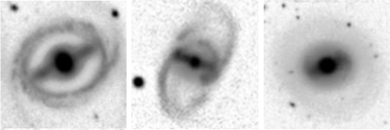
Understanding Rings
You already helped us find ringed galaxies; galaxies with a ring of stars around them. But there are many ways to “have a ring”; detached rings, pseudo rings and winding rings to name a few! Help us divide the ringed galaxies you found into all these different types.
We’re also on the lookout for anything truly weird, as we know there are bound to be some crazy never-before-seen ring structures out there. The images you will see are the most likely to have rings from a suite of 9 million galaxies – so you’re going to see some truly spectacular shapes and sizes.
We don’t know how rings work. Help us find out.
Finding Gravitational Lenses
Following on from the success of one of Galaxy Zoo’s latest iterations, Galaxy Zoo: Cosmic Dawn, we want to double-down on identifying all images containing a very rare type of object: gravitational lenses. These are galaxies surrounded by the light of a second galaxy directly behind them, with gravity distorting this light into beautiful arcs and rings. These objects can be used to help shed a light on dark matter and the early Universe, if we can find them!
For some of Galaxy Zoo: Cosmic Dawn, we used AI to help speed up the classification process and let you focus on the most interesting images. But our AI doesn’t understand rare objects like gravitational lenses, many of which may have been missed as a result. So, we ask you to take part in identifying these elusive objects hidden in over 20,000 Hyper-Suprime Cam (HSC) images from the Hawaii Two-0 (H20) Cosmic Dawn survey. Start searching on the Zooniverse app.


Thank you, as always, for your time and support.
James P, (also) James D, and Mike, on behalf of the Galaxy Zoo team
